
Fullscreen Slit Slider with jQuery and CSS3 A tutorial on how to create a fullscreen slideshow with a twist: the idea is to slice open the current slide when navigating to the next or previous one. Using jQuery and CSS animations we can create unique slide transitions for the content elements. View demo Download source In this tutorial we’ll create a fullscreen slideshow with a twist: we’ll slice the current slide open in order to reveal the next or previous slide. Using different data-attributes, we’ll define the type, rotation angle and scale of a slide’s parts, giving us the possibility to create unique effects of each slide transition. We’ll be using jQuery cond, jQuery plugin by Ben Alman for chainable “if-then-else” statements. The animal icon font that we’ll be using is by Alan Carr and you can find it here. The images in the second demo are by Majownik and they are licensed under a Creative Commons Attribution License. Let’s start with the HTML. The Markup So, our first slide will have something like this: Now, let’s style it!
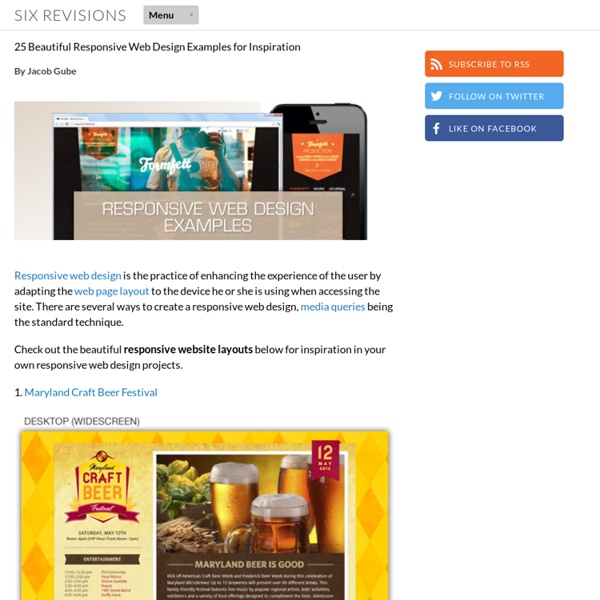
Hongkiat | 30 Responsive Portfolios For Your Inspiration One of the latest major trends across the web industry is the increase in responsive web design – where websites were designed to respond to the size of the browser and change their layout accordingly. Responsive design requires designers to write code that inspects the physical characters of whatever device is displaying the content, using things like media queries. This gives users across different devices a fluid, consistent experience. The creatives have found responsive technology to be a great advantage in portfolio design. If you haven’t refactored your portfolio for the responsive world, that’s something you need to look into, pronto. Recommended Reading: Responsive Web Design series of posts Andy Taylor Ryan Johnson JC Suzanne Artographik Jan Mense Gary Garside Patrick Allen Grady Henry Brown Red Root Movmt Zachary Miller Lynn Fisher Owltastic David Murray City & Wool John Jacob Michela Chiucini Trent Walton J Taylor Design Dave Gamache That Made Tim Boelaars Jonathan Krause Viljamis Work Diary Colly
30 illustrations vectorielles personnalisables à télécharger gratuitement Source de l’illustration Parmi les amateurs de dessin vectoriel, les concepteurs ont toujours besoin de graphismes vectoriels gratuits pour illustrer un site, et parfois il peut être un peu difficile de trouver le bon. Voici donc 30 images vectorielles libres très variées : illustrations, fonds d’écran, carte de visite professionnelle, affiche de festival, bannières de promotion, stickers, boutons etc, que vous pourrez utiliser en les adaptant à vos besoins. Source des bannières de promotion Source de l’illustration Source de l’affiche Source du bon de réduction Source de la citation Source de la carte de visite professionnelle Source du flyer de location Source du flyer commercial Source de l’illustration Source de l’offre spéciale Source de la carte Source de l’arrière-plan floral Source des bannières florales Source de l’illustration Source de l’illustration Source des stickers Source du graphique Source du graphique Source des boutons Source de l’illustration Source du badge étoilé Trackbacks
Avex Designs | Best Responsive Websites October 2013 | Inspiration | I do a lot of web browsing (we all do). Mostly to look at websites for inspiration and other stuff… But let’s stick to the web inspiration for now. These are some of the best responsive websites October 2013, that I’ve recently found and I’m going to try to post every week / month, sharing some inspiration. Gravity The Movie Although, not responsive down to mobile phones, the Gravity website is very fluid, expanding to fit giant monitors. Cinnamon Toast – Creative A very cool, responsive website, with some stop motion type video in the background. Bold and Noble A very clean, responsive e-commerce website. Whisperism Minimal, sleek and sexy. House – Fall Collection A very trendy website, but a great experience.
11 Beautiful Portfolios to Keep you Inspired Your portfolio is the main channel for you to show your work to your clients, so it’s very important to put some effort into it. Designers, photographers and other creative professionals can take advantage of images, type, icons and other elements to deliver an impressive portfolio. From simple and clean approaches, to bright colors and animations, every professional has their own style and vision when creating a portfolio. Today we selected some beautiful and inspiring portfolios to show you. Make sure to check out all of them to keep your inspiration flowing. You may even get inspired to rethink your own portfolio. Tyler Copeland Thomas Ciszewski The Brave Man – Florian Wacker isnostudio – Christophe Bouche Brad Hogan Dennis Field Roman Kirichik Ryan Barlow Tim Brack Michael Ngo Frank Chimero About the Author Gisele Muller loves communication, technology, web, design, movies, gastronomy and creativity. Related Posts 540 shares 11 Inspiring Examples of Dark Colors in Web Design Read More 490 shares
Web Design Ledger | 21 Fresh Examples of Responsive Web Design Responsive design is something a lot of designers talk about. And considering the importance of responsiveness and all the buzz around it, it’s impressive the amount of websites that are still not responsive. By now, with the amazing growth of mobile usage, every single website should be responsive to be able to attend to every user’s “screen size needs.” Today I gathered some fresh examples of responsive sites to reinforce the importance of adapting your layout to every screen. Probably you will recognize a few websites from past lists, but they are so good that they deserve to be back here. British America Household Staffing Designed to Move Fhoke Evolve Digital Atelier Andrew Lohman Yaron Schoen Friends of the Web Simon Foster Nudge Johann Lucchini Roy Barber Face.Works. Lab Fiftyfive oak.is FortyOneTwenty Colorkite Louis Gubitosi Substrakt Julie Lavergne The Brigade Responsive Design Books Responsive Web Design by Ethan Marcote Responsive Design (Smashing eBook Series) About the Author Related Posts
12 Original Flat Web Designs for Your Inspiration | My Visual BriefMy Visual Brief As we are all aware, one of the trending styles these days for mobile & web UI projects is flat design. Designers have grown quite fond of flat design and it has been the chosen design direction for most up and coming websites. Flat design places the importance on functionality over design. In a nutshell, no more shadows, gradients, beveled edges, and reflections. Flat design is all about contributing to a digital experience through visual clarity, bold typography and illustrations. Today we’d like to share with you some of the more original examples of flat web design that we’ve discovered while keeping My Visual Brief’s design database up to date. The Big Picture Here are some interesting examples of websites which use big photos for the backgrounds… 1. As you can see, this website for Folklore Surf is a beautiful example of original flat design. 2. Bold, bold, bold! Sunera’s website by Anna Reshetova. 3. Can you say, “wow?” Interact with me! 4. 5. 6. What’s your special today? 7. 8. 9.
Responsive Deck | Gallery Archives David Urankar first drew attention with the campaign for Mura collection 2008/09. This responsive web design was created by @lumeaa and suggested by @davidurankar for inclusion in the responsive websites gallery collection. Rally Interactive is an application development firm from Park City, Utah. With a focus on latest technologies to build digital things for clients. Tynan D’arcy is an award winning UK based design agency, to provide creative solutions for some of the world’s biggest brands. Adviso is a firm of experts in strategy and internet marketing. Easy Readers books are skillfully and cleverly written publications that explore best practices and web standards for seasoned and aspiring web professionals. Buffalo is a small web design & development agency based in Brighton, UK. @StyleTiles is a design deliverable consisting of fonts, colors and interface elements that communicates the evolution of a visual brand for the web.