
http://bradfrostweb.com/blog/web/responsive-nav-patterns/
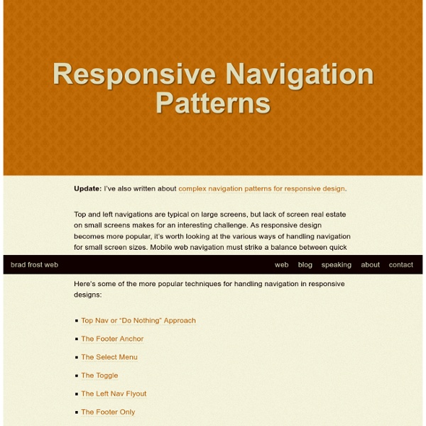
Responsive Navigation Patterns Update: I’ve also written about complex navigation patterns for responsive design. Top and left navigations are typical on large screens, but lack of screen real estate on small screens makes for an interesting challenge. As responsive design becomes more popular, it’s worth looking at the various ways of handling navigation for small screen sizes. Mobile web navigation must strike a balance between quick access to a site’s information and unobtrusiveness. Here’s some of the more popular techniques for handling navigation in responsive designs: UI Kits PSD - Free High Quality PSD A picture is worth a thousand words. Most of the time, I found that a complex idea can be comprehend far more effectively with drawing/images. Infographic is a good example.
Pull Down for Navigation 27th February, 2012 Tom Kenny Tutorials Mobile screen real estate is at a premium and one of the biggest problems to solve is how to display navigation when screen widths become quite narrow so I decided to have a look and see what I could come up with using some nifty CSS and a touch of jQuery. Trying to condense a navigation down onto a mobile screen tends to push the actual content of the site down and out of initial view. Luke Wroblewski has explored some solutions in Mobile First but I’ve developed something that I haven’t come across just yet. In fact, in the process of writing this tutorial, Brad Frost released a great roundup of responsive navigation patterns so I suppose this could be an additional technique to add to his list. Pull Down to Refresh
Progressive And Responsive Navigation Advertisement Developing for the Web can be a difficult yet rewarding job. Given the number of browsers across the number of platforms, it can sometimes be a bit overwhelming. But if we start coding with a little forethought and apply the principles of progressive enhancement from the beginning and apply some responsive practices at the end, we can easily accommodate for less-capable browsers and reward those with modern browsers in both desktop and mobile environments.
Mobile UI Design Patterns: 10+ Sites for Inspiration By Jacob Gube User interface design patterns are solutions to common design challenges, such as navigating around an app, listing data or providing feedback to users. Mobile apps and sites have unique UI design requirements because, compared to their desktop counterparts, they’re used in smaller screens and, at least with today’s modern mobile devices, rely on fingers instead of a keyboard and mouse as input mechanisms. Whether you’re designing a mobile app UI for the first time or in need of specific design solutions, these mobile UI design pattern resources will surely help! 1.
A Trend to Watch: ‘Reader-Aware’ and ‘Responsive Content’ Right now we’re focused on responsive design. Perhaps after that comes responsive content. If you’re a reader of Nieman Reports, you’ll remember the cover story from early this fall, “Breaking News: Mastering the Art of Disruptive Innovation in Journalism.” Nieman Fellow David Skok along with James Allworth co-wrote the piece with Clay Christensen, one of Harvard’s brilliant and popular business faculty. One of Christensen’s main areas of academic focus is the concept of disruptive innovation and competition in business; this widely-shared article applied Christensen’s analysis – which has helped revitalize numerous businesses before his years academia – to the news industry, where an understood problem is figuring out how to survive and how to thrive.
10 Incredible Examples of Responsive Web Design With more people surfing the web from their mobile devices, designers and developers have been trying to figure out the best way to cater to visitors on both mobile devices and computers. When internet capable phones first began gaining popularity the method was to have two separate sites, a mobile site and a “full” site. But that would limit the mobile viewers experience because the site would be so basic it would cause you to wonder if it was coded by chisel and stone. That was then, now everyone is jumping on the “Responsive Web Design” bandwagon and finding it to be a rather happy median. Responsive web design refers to a site that is developed to degrade nicely across multiple screen sizes and resolutions, from the largest Mac display down to the minutest mobile device. It also works wonders on frame size, square or widescreen, as well as window size, as not everyone prefers their browser to be full screen.
Web development blog, news and reviews - Developer Drive Responsive web design is widely thought of as a design trend, but it’s much more than that. It is an approach to web development that allows a website to break itself down smoothly across multiple monitor sizes, screen resolutions, and platforms, be it a computer, tablet or mobile device. It allows the developer to create a site that is optimized for each platform, both in navigation, readability and load time. In this tutorial, we take a look at what responsive web design entails for the developer. Using Multiple Image Sizes
Responsive Web Design in #highered: eduStyle Awards founder on converting your website to RWD I’ve just completed my article about responsive design in higher education. It will be published in University Business in a couple of months (February 2012 issue). I did a few extensive interviews with early adopters as part of my research for this piece. Mobile web content adaptation techniques Introduction This article will help you pick from amongst the many techniques for building a mobile website. It doesn't describe how to do it, rather it instead tries to help you to pick the right approach. Before we begin it's worth clarifying exactly what the goal of the exercise is.
Stowe Boyd — Responsive Web Design, Mobile First, and the Future of Content Consumption - Lindsey Kirkbride A different form of creative destruction … The result of a survey on how many times people kiss when they greet a friend in France 25 jQuery Plugins to help with Responsive Layouts The most popular topic of discussion at the moment is undoubtedly responsive layouts in web design. Without going into it too much, a responsive layout allows you to offer a specific and optimised screen size based on whatever device (mobile, tablet…) the visitor uses. You would typically use Media Queries to resize the overall layout, but what about all of those individual elements and features that make your page unique? Navigation, forms, images, sliders, carousels… they all need to be optimised as well. That is were this post comes in, by highlighting 25 jQuery plugins that will help you optimise and resize those trickier web elements. Response.js
Best Responsive WordPress Themes This is a collection of the best responsive WordPress themes. These responsive, fluid, or adaptive WordPress themes, automatically adapt to the screen size, resolution and device on which they are being viewed for on. This means your website will look great whatever the screen size or device your visitors uses to visit your site, from desktop computers to tablets to mobile phones. jquery responsive web what is it? it is a simple jquery plugin helping design more responsive and adaptive websites and web applications with almost no setup. what does it do?