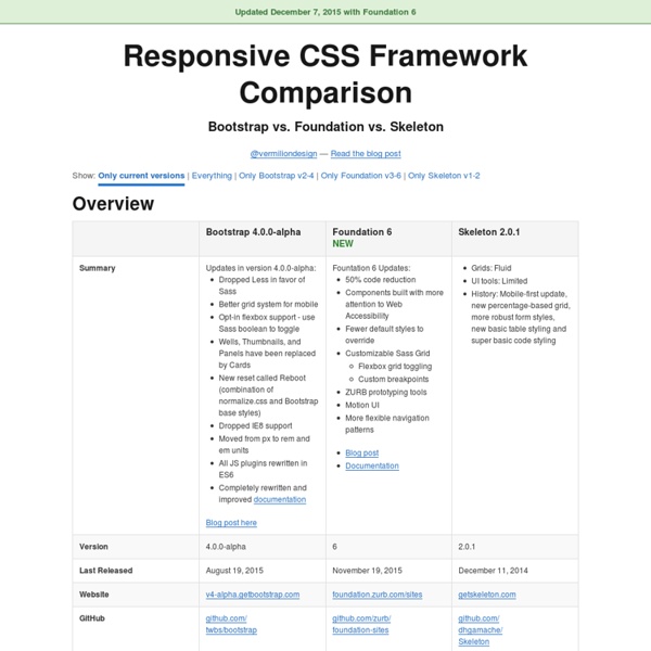
Bootstrap 4 alpha
19 Aug 2015 Today is a special day for Bootstrap. Not only is it our fourth birthday, but after a year of development, we’re finally shipping the first alpha release of Bootstrap 4. Hell yeah! Bootstrap 4 has been a massive undertaking that touches nearly every line of code.
Responsive Navigation: Optimizing for Touch Across Devices
As more diverse devices embrace touch as a primary input method, it may be time to revisit navigation standards on the Web. How can a navigation menu be designed to work across a wide range of touch screen sizes? In these demos, Jason Weaver and I decided to find out. The Demos
User experience design
In most cases, user experience design (UXD or UED) fully encompasses traditional human-computer interaction (HCI) design, and extends it by addressing all aspects of a product or service as perceived by users.[1] User experience is any aspect of a person's interaction with a given IT system, including the interface, graphics, industrial design, physical interaction, and the manual.[2] History[edit] The field of user experience design has roots in human factors and ergonomics, a field that, since the late 1940s, has focused on the interaction between human users, machines, and the contextual environments to design systems that address the user's experience.[3] With the proliferation of workplace computers in the early 1990s, user experience became an important concern for designers. Elements of User Experience Design[edit]
How to build a responsive HTML5 website - a step by step tutorial
Rating: 8.6/10 (1247 votes cast) Required knowledge level: intermediate In this responsive web design tutorial we will create an awesome responsive HTML5 website starting from scratch.
CSS and the Golden Ratio
A few weekes ago while at Brooklyn Beta, I was lucky enough to sit next to Scott Kellum during lunch. He mentioned how recently he had been interested in the idea of making fractals using nested CSS shapes with sizes defined by ems. I was excited to play with the idea, and so I began working with the golden ratio (1.618033988...). (after 4 years of architecture school, it still has a soft spot in my heart.) Getting the basic shape was easy enough, though I needed to do some tweaking with the positioning to keep the rectangles radiating from the center.
Less.js
Compile .less files to .css using the command line Heads up! If the command line isn't your thing, learn more about GUIs for Less. Installing lessc for Use Globally Install with npm npm install less -g
The orientation media query
Page last changed today Right now Jason Grigsby’s excellent summary of the orientation media query is making the round of blogs and tweets, and that’s well deserved. Media queries will become extremely important in the near future, when we have to build websites that work on any device resolution from 300px to 1280px or more. Still, there’s one tiny nitpick I’d like to make, so that you fully understand when to use orientation and when to use device-width.
20 Best Responsive Web Design Examples of 2012
The Boston Globe The largest responsive website to date, The Boston Globe handles loads of content effortlessly, keeping the site intuitive and the content easily accessible on the device of your choice. Smashing Magazine I love this site. I really do.
The Top 25 Responsive Design Tools
Note: this piece was originally published on Net Magazine, who recently nuked about 10,000 articles when they moved over to Creative Bloq. In an effort to preserve the writing I did for them, I’m republishing those articles here on my blog. This article is still alive over at Creative Bloq, so you can also read it there. As responsive web design evolves, Brad Frost looks at some of the best tools, resources and thinking for crafting exceptional responsive experiences This article first appeared in issue 241 of .net magazine – the world’s best-selling magazine for web designers and developers. Over the past few years we’ve seen an explosion of web-enabled devices with varying resolutions, capabilities, form factors, pixel densities, interaction methods and more.
