
Apprendre les langues, c'est dépassé ! Apprenez plutôt les polices d'écriture ! A l'école, on apprend à lire, à écrire, on apprend une ou plusieurs langues étrangères. Pourtant, à l'heure du numérique, il pourrait être utile de connaître les polices d'écriture. Si c'était une discipline reconnue, cette petite fille de seulement deux ans serait une experte en la matière. Suivez Gizmodo sur les réseaux sociaux ! Elle s’appelle Scarlett, elle n’a que deux ans, donc, et elle est capable, en un coup d’œil, d’identifier la police avec laquelle est écrit un texte, que dis-je, seulement deux mots ! Inutile, idiot, abrutissant, honteux, étonnant, impressionnant, etc. Impressionnant, vraiment !
Skout™ A magic mirror for e-commerce One of the most vexing problems for e-commerce sites is that some would-be purchasers simply won’t buy an item they can’t try on first. Enter Intel's (Nasdaq: INTC) “Magic Mirror.” The tech giant has reportedly been working on a high-tech mirror that would let consumers stand in front of an LCD monitor and have parametric technology simulate their body type and figure out how fabrics would fit based on their weight, height, and measurements. The Magic Mirror, which could turn our computer screens into digital fitting rooms, is three to five years from fruition, reports USA Today. From USA Today: Within 10 years, retail as we know it will be unrecognizable, says Kevin Sterneckert, a Gartner analyst who follows retail technology. The video below from Holition Augmented Reality, which is already providing try-on technology for jewelry and watch brands among others, gives a peek at what could be in store when the Intel mirror comes out. Teresa Novellino Email
The Egg The Egg By: Andy Weir You were on your way home when you died. It was a car accident. And that’s when you met me. “What… what happened?” “You died,” I said, matter-of-factly. “There was a… a truck and it was skidding…” “Yup,” I said. “I… I died?” “Yup. You looked around. “More or less,” I said. “Are you god?” “Yup,” I replied. “My kids… my wife,” you said. “What about them?” “Will they be all right?” “That’s what I like to see,” I said. You looked at me with fascination. “Don’t worry,” I said. “Oh,” you said. “Neither,” I said. “Ah,” you said. “All religions are right in their own way,” I said. You followed along as we strode through the void. “Nowhere in particular,” I said. “So what’s the point, then?” “Not so!” I stopped walking and took you by the shoulders. “You’ve been in a human for the last 48 years, so you haven’t stretched out yet and felt the rest of your immense consciousness. “How many times have I been reincarnated, then?” “Oh lots. “Wait, what?” “Well, I guess technically. “Sure.
Brush Fonts Brush fonts are hotter than ever and we are seeing them more often on professionally designed websites. Thick, bold and beautiful… their relaxed, casual feeling and sexy curves make them a perfect fit for designers who want to break the mold and steer away from the typical serif and sans serif font choices. Some of them crossover into the script font world, while retaining their thick lines and curves. These types of fonts are also now widely used for logo designs and packaging as they easily bring added interest and creativity. Here are 20 beautiful brush fonts that you may wish to use in your designs. 1. 2. 3. 4. 5. 6. 7. 8. 9. 10. 11. 12. 13. 14. 15. 16. 17. 18. 19. 20. Do you know of any other great examples?
9 Free Icon Sets to Diversify your Library Every designer needs to be ready to go wherever their projects take them. This is why you need to have a diverse library to count on. To help you with this task, we have some very stylish free icon sets to share. From weather to food and much more, you will have some fresh and beautiful icons to count on for your next project. Enjoy. 61 Outlined Weather Icons Collection In The Kitchen – Free Icon Set Line icon set for UI & more Cooking icons set Weather icons pack Flatty Icon Pack Free Set Colorful Ficons Icons 42+ Flat Icons Set Free Icons for the Weather Situations About the Author Gisele Muller loves communication, technology, web, design, movies, gastronomy and creativity. Related Posts shares 10 Super Useful jQuery Plugins for Better Typography No one ever said that web typography is easy, but it has gotten easier in recent years with the wide spread adoption of web fonts, the introduction of helpful typography tools, and as we see in this post, super useful jQuery plugins. Read More
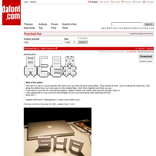
100 Free Fonts Fonts have already been among the essential materials used by designers. Whether it is a web design project or a logo design – font is the element, capable of attracting people’s attention, rendering the key idea, and communicating the necessary message. That is why, thousands of free fonts reside today in multiple online font repositories. Clean fonts contain the samples of free fonts of the sans serif family with classic proportions, distinct lines, and clean backgrounds. 1. Delicious-Roman DiavloBook-Regular HattoriHanzo-LightItalic LT Oksana Bold Champagne & Limousines Vegur-Regular Caviar Dreams Bold Ageone Aldo SemiBold Zrnic Zero Threes Yanone Kaffeesatz Regular WendelinHalbfettKursiv SF Quartzite Bold Italic Padaloma Italic Monoglyceride Mabella Moloko Langó Italic Gordon Regular Good Times GeosansLight Cantarell Bold Garrison Cond. SansSerifExbFLF-Italic SF Fourche SC Milford Condensed Bold Italic Aller Light Italic D3 Archism Italic Decker Cardiff Bold Italic Droid Serif Bold GalileoFLF-BoldItalic 2. Outlaw
Pc wallpaper Video AOL is part of the Yahoo family of brands The sites and apps that we own and operate, including Yahoo, AOL, Engadget, Rivals, In The Know and Makers.Yahoo family of brands. When you use our sites and apps, we use Cookies Cookies (including similar technologies such as web storage) allow the operators of websites and apps to store and read information from your device. provide our sites and apps to you authenticate users, apply security measures, and prevent spam and abuse, and MeasurementWe count the number of visitors to our pages, the type of device they use (iOS or Android), the browser they use and the duration of their visit to our websites and apps. If you do not want us and our partners to use cookies and personal data for these additional purposes, click 'Reject all'. If you would like to customise your choices, click 'Manage privacy settings'.