
Detecting and Responding to iPad Orientation Change in Adobe Edge Animate With the help of Simon Widjaja and friends’ Edge Commons Dirty Little Helpers library I have extended the Flexible Layouts Using Adobe Edge Animate and the Edge Commons Library tutorial to work on an iPad. Simon’s tutorial/demo works well on a browser when resizing and this demo takes that one stage further and uses the ‘window.orientation‘ event to trigger the resize code uses a simple <meta content> tag to ensure the device as it 100% and recognises the change in dimensions. You can still trigger the resize code in your desktop browser but this is designed to detect your iPad’s orientation too. Designing for Touch Screen Now, this post was supposed to go out about two weeks ago, and since then it seems that every designer under the sun has written on the same subject – That’ll teach us for being lazy. Nonetheless, we decided to publish it anyway, just in case anyone missed any of the other great posts out there… By now you should all have heard of the iPad, and if not then you must have been living under a rock for the last few months! Touch screen devices are here to stay and you need to start thinking about how to design and develop to get the most out of them.
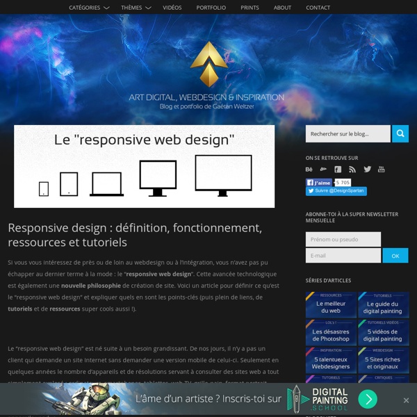
50 fantastic tools for responsive web design As introduced/coined by Ethan Marcotte in both his article "Responsive Web Design" as well as his best-selling book, one needs three elements to make a site responsive: A flexible/fluid grid Responsive images Media queries There are plenty of other great articles that cover motives, concepts, and techniques regarding responsive web design, so we'll keep the focus of this article on some top tools that will help you become responsibly responsive. Tools for starting out Package Search Results Some results have not been displayed due to the search parameters. You have searched for packages that names contain dpkg in all suites, all sections, and all architectures. Found 23 matching packages. Exact hits Package dpkg Other hits
9 Free Programming Books That Will Make You A Pro Advertisement What’s better than a free book? Nine free books! Calling all programmers, whether new, old, or aspiring: we’ve found a great selection of free (as in beer) books to boost your coding skills to the next level. There’s a little bit of everything for everybody, so hop in and enjoy. Splash Vector Graphics on your Responsive Site - HTML5 Rocks Creating mobile content that dazzles means balancing the amount of data downloaded against maximal visual impact. Vector graphics are a great way to deliver stunning visual results using minimal bandwidth. Many people think of canvas as the only way to draw a mixture of vectors and rasters on the web, but there are alternatives that have some advantages. A great way to achieve vector drawing is through the use of Scalable Vector Graphics (SVG) which is a key part of HTML5. We all know responsive design is a big part of handling varying screen sizes, and SVG is ideal for handling different size screens with ease.
Content Choreography The concept of permanently placing content on a web page for a single browsing width or resolution is becoming a thing of the past. Media-queried responsive & adaptive sites afford us the ability to re-architect content on a page to fit its container, but with this exciting new potential come equally exciting challenges. Web designers will have to look beyond the layout in front of them to envision how its elements will reflow & lockup at various widths while maintaining form & hierarchy. Media queries can be used to do more than patch broken layouts: with proper planning, we can begin to choreograph content proportional to screen size, serving the best possible experience at any width. As I step into my 3rd responsive project with Paravel, I’ve made a habit out of picking apart media-queried sites I happen across, noting how things get rearranged at various widths. At times, it seems as though all of the site architecture & planning goes out the window as content reflows.
Creating a Responsive WordPress Site Your Mobile Users Will Love As more and more people get online using a variety of mobile devices and screen sizes, it’s essential that your WordPress site is responsive and device-agnostic. Heck, you may even be reading this article on your phone right now. (How does our site look? Okay? Good.) How To Invert Screen Colors in (Ubuntu-based) GNU/Linux Distros Are your eyes getting tired of reading black text on a white background? Particularly if you read in a dark room? (Now a previous post describes how Evince, a freedom-respecting alternative to Adobe’s bloated PDF reader, can do this automatically with PDF files.) To have your screen invert colors, all it requires is a one-line script once you download one small package! ).
How to use spaced repetition with Anki to learn to code faster Imagine you could speed up your learning and better remember programming fundamentals, techniques, and commands. Today I tell you how to do just that, using spaced repetition and a free open source tool called Anki. Many have attested to the benefits of spaced repetition: Jeopardy! champion Robert Craig says he owes some of his success to using Anki for memorizing trivia.Googley as Heck, who studied full-time for 8 months for a Google interview, says “Spaced repetition is the key to memorization…You become an expert by revisiting and reviewing over time. If you do so, you’ll get to the point where [you] can’t forget details.”And Derek Sivers, founder of CDBaby, writes that spaced repetition is “the most helpful learning technique I’ve found in 14 years of computer programming.”
20 tools to help you create responsive web designs Building responsive design has become a huge trend in the web design world. There is a good reason for that: responsive websites are much more relevant than fixed web designs in a time where a lot of internet traffic comes from mobile devices. In this article we take a look at some of the most useful tool to help you with the creation of responsive designs. Sketching / wireframing tools First things first, responsive design need to be well-thought or you’ll get much more work than you would have otherwise. css3-mediaqueries-js - css3-mediaqueries.js: make CSS3 Media Queries work in all browsers (JavaScript library) css3-mediaqueries.js by Wouter van der Graaf is a JavaScript library to make IE 5+, Firefox 1+ and Safari 2 transparently parse, test and apply CSS3 Media Queries. Firefox 3.5+, Opera 7+, Safari 3+ and Chrome already offer native support. UPDATE: Google discontinued the downloads section. Download newest version 1.0 from here: