
Matt Cutts: Gadgets, Google, and SEO Fitbit has discontinued their Fitbit One step trackers, which seems like a good opportunity to step back and reflect on wearing one for the last decade or so. I’ve enjoyed using Fitbit trackers, but the One devices seemed like they broke down too often. I’m pretty proud that I ended up earning all the activity-related Fitbit badges though: In 2013, I ran a 50 mile race and I took 110,472 steps that day.
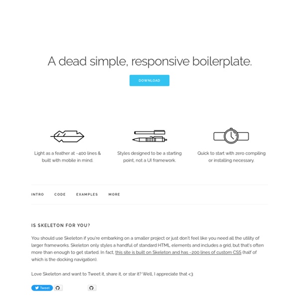
Less Framework 4 I called Less Framework "a CSS grid system for designing adaptive websites". It was basically a fixed-width grid that adapted to a couple of then popular screen widths by shedding some of its columns. It also had matching typographic presets to go with it, built with a modular scale based on the golden ratio. Building a Responsive Layout With Skeleton: Starting Out Dave Gamache's Skeleton Boilerplate provides the perfect foundations upon which to build responsive websites rapidly and reliably. We're going to use Skeleton and build a responsive page based on the Magazine design featured on Webdesigntuts+ recently. We'll be looking at everything from multiple background images, through to media queries, flexible media and mobile-friendly navigation. Let's get started! First Steps In this first video we'll download the Skeleton Boilerplate and prepare our project.
Pure CSS Buttons with Hover effect and Active Pseudo-element You may remember the days when we used to lookout for custom image buttons. And for getting the hover and active states, we used to deploy JavaScript codes to change the image on hover and click. But there were issues of loading of three images for each state. Free textures for your next web project. Nothing like a field of beautiful flowers. Download Download The Free Keyword Niche Finder - WordStream's Niche Keyword Research Tool Learn More about The FREE Keyword Niche Finder Want to know more about The Free Keyword Niche Finder, like what are "keyword niches," or what does "relative frequency" mean, or where do we get the data from for our keyword finder? Then, keep reading or you can use the links to the right to jump down to a particular topic of interest. What People are Saying about The FREE Keyword Niche Finder
Andy Clarke at Smashing Conference In his talk at Smashing Conference, Andy Clarke talks about how responsive design needs to transcend designers, we need to rework our design process, and we need to be more honest and open with our clients. Responsive design is not just our problem We need to fix our design process How to tell your client they’re an idiot to their face and not get fired. Responsive design is not just our problem Foundation: HTML Templates News or Magazine This template puts a focus on bold images, perfect for a magazine style site with eye catching content. Your stories are easy to find with large feature blocks. 25 Tutorials of User Interface CSS3 Effects (Advanced) Design and Development Agency based in Palma de Mallorca - Ma-No Web Design and Development We want to present a series of 25 well-explained tutorials of User Interface CSS3 Effects . These CSS effects give developers a quick and easy solution when it comes to enhancing impressive ui styling, and will work on most modern browsers. 1. Interactive Infographic with SVG and CSS Animations Learn how to build an interactive animated infographic using SVG, CSS and JavaScript.
How to create a parallax scrolling website using Skrollr.js Today’s parallax website tutorial is a detailed explanation of the Parallax Scrolling Effect using Skrollr.js published a few weeks ago. You will learn how to create a simple parallax scrolling website using Skrollr.js plugin. If you haven’t seen the demo already, go and check it out. 90 Questions to Ask Before Starting a Website Redesign When can you launch it? How much is it going to cost? These seem to be the only two questions clients really care about when it comes to redesigning a website. Yet, a redesign is an opportunity for so much more.
Just like Bootstrap for looking at your site on different devices by dpvagabond Apr 20