
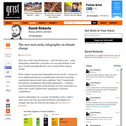
Mario Santos sur Twitter : "What's really warming the world? Great article by @eroston and @BlackiLi #NASA #globalwarming... David Juurlink sur Twitter : "@davidfrum Welcome indeed. One opioid death every 30 minutes in U.S. Much more beneath the surface, via @CDCgov. Raytracing a Black Hole. Geodesic raytracing in curved spacetime It's now clear I'm on a Black Hole binge (I can stop when I want, by the way).
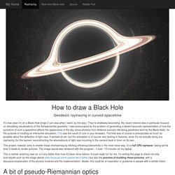
They're endlessly fascinating. My recent interest was in particular focused on simulating visualizations of the Schwarzschild geometry. I was preoccupied by the problem of generating a decent accurate representation of how the curvature of such a spacetime affects the appearance of the sky (since photons from distance sources ride along geodesics bent by the Black Hole), for the purpose of creating an interactive simulation. This was the result (it runs in your browser). This project, instead, aims to shatter these shortcoming by ditching efficiency/interactivity in the most naive way: it's a full CPU raytracer, taking all the time it needs to render pictures. This is neither anything new nor is it any better than how it's been done before. The shadow If you have already tried my live applet, you should be familiar with this view: Support Sarah Lazarovic creating comics, visuals, art, charts, good cheer. Hello.

Hi. Hello. I’m Sarah Lazarovic, maker of comics, illustrations and visual journalism. In recent years, I’ve tried to stop working for the man and start working for the Internet. It’s kind of working.
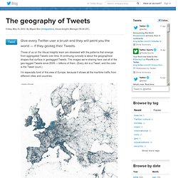
Toronto city council voting patterns. Free 35 000+ 3D models. Download without registration - Archive3D.net. Real-Time Media Map. Abundance of Elements. 40 maps that explain the world. Maps can be a remarkably powerful tool for understanding the world and how it works, but they show only what you ask them to.
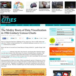
So when we saw a post sweeping the Web titled "40 maps they didn't teach you in school," one of which happens to be a WorldViews original, I thought we might be able to contribute our own collection. Some of these are pretty nerdy, but I think they're no less fascinating and easily understandable. A majority are original to this blog, with others from a variety of sources. I've included a link for further reading on close to every one. [Additional read: How Ukraine became Ukraine and 40 more maps that explain the world] 1. World worldviews Dallas shooting updates News and analysis on the deadliest day for police since 9/11. post_newsletter353 follow-dallas true after3th false Today's WorldView What's most important from where the world meets Washington Please provide a valid email address. Click to enlarge. He geography of Tweets. Give every Twitter user a brush and they will paint you the world — if they geotag their Tweets.
Those of us on the Visual Insights team are obsessed with the patterns that emerge from aggregated Tweets over time. A continuing curiosity is about the geographical shapes that surface in geotagged Tweets. The images we’re sharing here use all of the geo-tagged Tweets since 2009 — billions of them. (Every dot is a Tweet, and the color is the Tweet count.) I’m especially fond of this view of Europe, because it shows all the maritime traffic from different cities and countries. Seeing the clarity of the regional images led me to work up images for cities, too. Istanbul: Tokyo: New York: Visualizing the city built of data. Urban Data visualizations of the city, making the city smarter with data. The Motley Roots of Data Visualization in 19th Century Census Charts - Design. The U.S.
Census has long been a lightning rod for controversy. Does it wildly undercount minorities? The rare non-sucky infographic on climate change. There was a time in the distant past — call it the late 2000s — when infographics seemed like a good idea.
You can pack all kinds of info into a visually appealing file that’s easy to share! What could go wrong? What could go wrong is that infographics became the No. 1 answer of every middle-aged person in a meeting discussing how to get their organization exposure and create something “viral.” Consequently, the internet is chockablock with terrible infographics — cluttered, over-long flusterclucks that would be better, in every conceivable way, if they were “words” gathered into “paragraphs” to provide “explanations.” Colorbrewer: Color Advice for Maps.
Excel Hack Map. Lately I've been working on two unrelated projects that just happened to intersect in a useful way.
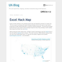
The first project was playing with spatial binning techniques as one of the ways to map relative proportions of things without being tied to (arbitrary) political boundaries. The second was messing around with Excel pivot tables to find meaningful long term time-of-day trending in traffic fatality data (inspired by Nathan Yau's work here). Here's a one degree by one degree pivot table in Excel that also happens to be a map. That same data with way more rows and columns.