
https://jonikorpi.com/less-framework/
Andy Clarke at Smashing Conference In his talk at Smashing Conference, Andy Clarke talks about how responsive design needs to transcend designers, we need to rework our design process, and we need to be more honest and open with our clients. Responsive design is not just our problem We need to fix our design process How to tell your client they’re an idiot to their face and not get fired. Responsive design is not just our problem HOW TO: Get Started with Less Framework The Web Development Series is supported by Rackspace, the better way to do hosting. Learn more about Rackspace's hosting solutions here. For the past few years, CSS grid systems have become increasingly popular with web designers. Thanks to efforts like Nathan Smith's 960.gs, designing with a grid is less complicated, and better looking sites can be crafted with ease. One of my favorite CSS grid systems of late is Less Framework. Now in its fourth revision, Less Framework takes the power of a CSS grid system and adds in support for CSS media queries to support multiple design and typography layouts.
A better Photoshop grid for responsive web design Posted on 20 January 2012 • 90 comments In making the move to responsive web design, one of the potential hurdles is the rather awkward maths for calculating the percentage-based widths necessary for fluid layouts. If, for example, you’re designing with a 960px grid in Photoshop and you have six columns, each 140px wide, you divide 140 by 960 to get your percentage-based width: 14.583333%. Liquid, Fluid and Elastic Layout Templates, Tools and Frameworks In recent years, screen resolutions are getting both bigger (large monitors) and smaller (in the mobile sense), as such, a static or fixed web layout may no longer be deemed completely viable. Maybe its time to change. Liquid, fluid and elastic layouts, have as many supporters as fixed layouts, despite what ever your feelings are on these styles of layouts, having some knowledge on adapting a site to liquid or elastic would most definitely be a plus in your arsenal. In this article you will find a collection of starter and basic fluid/liquid and elastic layouts, CSS frameworks and some useful tools to help you with your next project. Tiny Fluid Grid
Media Queries Abstract HTML4 and CSS2 currently support media-dependent style sheets tailored for different media types. For example, a document may use sans-serif fonts when displayed on a screen and serif fonts when printed. ‘screen’ and ‘print’ are two media types that have been defined. Media queries extend the functionality of media types by allowing more precise labeling of style sheets. A pixel is not a pixel is not a pixel Page last changed today Yesterday John Gruber wrote about the upped pixel density in the upcoming iPhone (960x640 instead of 480x320), and why Apple did this. He also wondered what the consequences for web developers would be. Now I happen to be deeply engaged in cross-browser research of widths and heights on mobile phones, and can state with reasonable certainty that in 99% of the cases these changes will not impact web developers at all. The remaining 1% could be much more tricky, but I expect Apple to cater to this problem by inserting an intermediate layer of pixels.
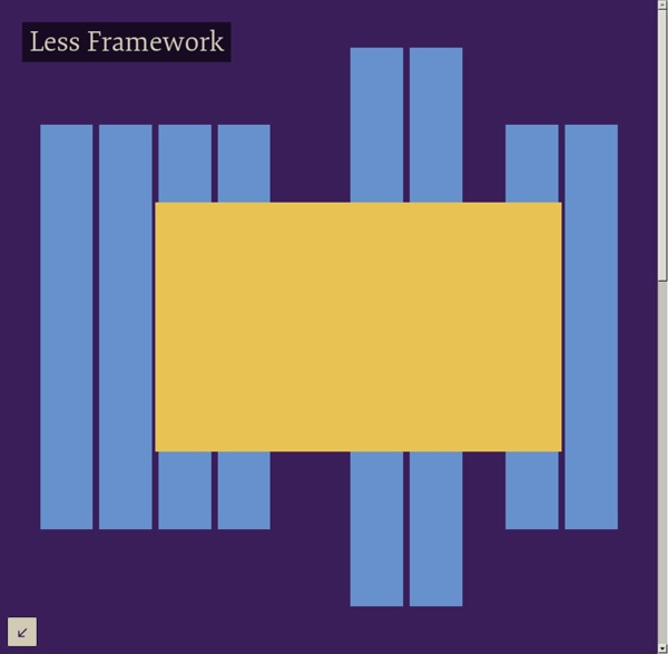
Video Screencasts #130: First Moments with Grunt There are all these tasks that we need to do as front end developers. Concatenate and compress our files. Less Framework 4 Every layout in Less Framework is based on a single grid, composed of 68 px columns with 24 px gutters. The only measures that change from layout to layout are the amount of columns and the width of the outer margins. The three sets of typography presets are aligned to a 24 px baseline grid; one is based on 16 px body text, one on 17 px, and one on 18 px. Both sets contain several harmonious type sizes calculated using the Golden Ratio. 65 Resources for Grid-Based Design Grid-based design is obviously a popular approach in modern web design. For designers that use grids, this post includes links to useful tools that can improve your efficiency and effectiveness, as well as some articles for advanced techniques. For those of you who are not as familiar with the details of grid-based design, there are plenty of articles and learning resources here.
5 Useful CSS Tricks for Responsive Design Making the design to be responsive is very easy as shown in my Responsive Design in 3 Steps tutorial, but maintaining the elements to look aesthetically balanced on all breakpoint layouts is an art. Today I’m going to share 5 of my commonly used CSS tricks along with sample cases for coding responsive designs. They are simple CSS properties such as min-width, max-width, overflow, and relative value — but these properties play an important part in responsive design.
That Web Guy - An introduction to responsive web design: using media queries Written December 29, 2011. 4 comments. You’ve no doubt heard the term by now, but what exactly is Responsive Web Design? As the name suggests, Responsive Web Design (from hereon in referred to as RWD) is about designing your web site with the use of media queries so that it responds (changes the presentation) to the web browser width, or in the case of mobile devices, the capabilities of said device. Essentially it’s about building a web site that’s device unbiased.
Perfect Full Page Background Image Learn Development at Frontend Masters This post was originally published on August 21, 2009 and is now updated as it has been entirely revised. Both original methods are removed and now replaced by four new methods. The goal here is a background image on a website that covers the entire browser window at all times. Let’s put some specifics on it: Designing With Grid-Based Approach Advertisement The main idea behind grid-based designs is a solid visual and structural balance of web-sites you can create with them. Sophisticated layout structures offer more flexibility and enhance the visual experience of visitors. In fact, users can easier follow the consistency of the page, while developers can update the layout in a well thought-out, consistent way. However, it’s quite hard to find your way through all the theory behind grid systems: it isn’t easy at all. Some important notions and related key-facts can help to learn basics and keep essential techniques in mind.