
The Heads-Up Grid Responsive web design, as described/defined by Ethan Marcotte anyway, is the act of creating various forms of the same basic site design that are optimized for different ranges of browser window widths. Luckily, the way that I originally constructed the Heads-Up Grid made it relatively easy to adapt to the needs of responsive web design. You can quickly and easily define as many different grids as you need by way of basic JavaScript conditional statements. Even if you are not extremely comfortable with JavaScript, if you are ambitious enough to tackle responsive web design you will most likely have no problem figuring this out. To create a responsive grid use the following code as a template. This template is fairly self-explanatory if you are familiar with CSS Media Queries.
An iOS scrolling emulator for jQuery Click + Drag to see the effect 1. 7 Rules for Creating Gorgeous UI (Part 1) Introduction OK, first things first. This guide is not for everyone. Who is this guide for? Developers who want to be able to design their own good-looking UI in a pinch.UX designers who want their portfolio to look better than a Pentagon PowerPoint. CSScience Select catcher Created by Ian Hansson (@teapoted) Art from Brendan Zabarauskas (@bjzaba_). Icons from the iconSweets set. Browser Support: Best In Test: Firefox (transition performance) Full Support: Chrome, Firefox, Opera, Safari (latest versions of all browsers) Partial Support: IE9 (Functional, but does not support transitions)
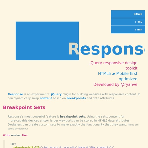
Blueberry - A simple, fluid, responsive jQuery image slider. What is Blueberry? Blueberry is an experimental opensource jQuery image slider plugin which has been written specifically to work with fluid/responsive web layouts. A brief history With the popularity of smart phones and tablet devices responsive/fluid web layouts have become an important part of modern web design. Working on a new project I decided to use the 1140px grid from cssgrid.net. jquery-iphone-ui - jQuery iPhone UI This is JavaScript library for prototype iPhone interface on web pages Download Download in archive | Source code (SVN) 30 Useful Responsive Web Design Tutorials So we’ve reached the end of our "Responsive Web Design week", tonight’s post will be the last of the series. We are going all out to help you hone your skills in manipulating those codes to respond at will when displayed on different devices. And to do this, we are featuring 30 Responsive Web Design Tutorials found online. This list is not meant to be an exhaustive one but it will get you started on understanding the basics of designing an adaptive website that will cater to all sorts of screen sizes.
Beamer [If you plan to use the development code, please read the entire text below carefully.] Official mailing list (Google Groups): beamer-class@googlegroups.com / News Code in repository is always in release candidate stage for next version. It's usable (because authors use it :-) ), but not all features have been extensively tested. scrolldeck.js Build a web page with each slide as a div. Pro-Tip: Use rem’s to make content scale (resize this window to see) Create section navigation by linking to slide id’s (optional) After linking all the required scripts (jQuery, Scrollorama, scrollTo, easing & scrolldeck), create the slide deck on document ready event.
jQuery Touchwipe (iPhone, iPad, iPod Touch Gesten Gestures Event Wischeffekt / Wipe Effect) The small 1 KB library allows you to obtain the wipe event on an iPhone, iPad or iPod Touch which can be used for example to scroll through an image gallery (see demo below). Should also work with Android touchscreens. Die 1 KB kleine Bibliothek ermöglicht das Abfangen des Wischevents auf einem iPhone, iPad oder iPod Touch um beispielsweise durch eine Bildergalerie zu scrollen (siehe Demo unten).
15 Nice Solutions for Free Contact Form Services There are many free options from which you can create a contact form for your website. The services usually offer both free service plans with less features and the paid ones which will remove the limitations and offer extra features. In this round-up, you’ll find the range of 15 free contact form services that allow you to create contact forms easily even without knowing much about PHP programming. Note that some of them may additionally have advanced premium options that actually require a monthly fee.
Elastislide - A Responsive jQuery Carousel Plugin Elastislide is a responsive image carousel that will adapt fluidly in a layout. It is a jQuery plugin that can be laid out horizontally or vertically with a pre-defined minimum number of shown images. View demo Download source With the responsive awakening in web design it becomes important to not only take care of the visual part of a website but also of the functionality. Elastislide is a responsive jQuery image carousel that will adapt its size and its behavior in order to work on any screen size. Inserting the carousel’s structure into a container with a fluid width will also make the carousel fluid.