
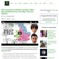
Why are British place names so hard to pronounce? OpenStreetMap. Why your mental map of the world is wrong. These are some of the most common geographic misconceptions that are both surprising and surprisingly hard to correct. PUBLISHED November 16, 2018. Why the Names of British Locations Often Sound Different From The Way They Are Spelled. In a tongue-twisting episode of Map Men, comedians Jay Foreman (previously) and Mark Cooper Jones spell out the history of British location names that don’t really sound their spelling might indicate.
As you can hear, no letter in the English alphabet is safe from being pronounced in dozens of different ways. Including, not at all. Thankfully, there are some general rules you can stick to, and because we’re nice, we’ll help the un-British amongst you through a couple of basics. …The only way to be absolutely sure of pronouncing British place names correctly is to live here long enough to learn every single one of them one at a time. Sorry. Maps - Portray Lesser Known Facts About America click 2x. 30 Maps might Change Your Perspective click 2x. For many of us, cartography day in geography or history class meant a quick nap.
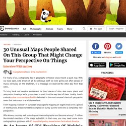
With our eyes open, we’d dream of all the delicious stuff we were gonna eat after school, of music we’d play on the Walkman, of a message we received the other day from that cutie… To bring back our long-lost excitement for hard pieces of data, aka maps, plans, and geographic drawings, we're gonna need to start from the very best of them. Luckily, there’s a whole online community on Reddit dedicated to the most unusual charts of geographic areas that took maps to a whole new level. From mapping "October" in European languages to mapping an eagle’s track over a period of twenty years, these incredible examples will surely put the world into a completely new perspective.
Ancient Maps that Changed the World: See World Maps from Ancient Greece, Babylon, Rome, and the Islamic World. One of the greatest challenges for writers and greatest joys for readers of fantasy and science fiction is what we call “world building,” the art of creating cities, countries, continents, planets, galaxies, and whole universes to people with warring factions and nomadic truth seekers.

Such writing is the natural offspring of the Medieval travelogue, a genre once taken not as fantasy but fact, when sailors, crusaders, pilgrims, merchants, and mercenaries set out to chart, trade for, and convert, and conquer the world, and returned home with outlandish tales of glittering empires and people with faces in their chests or hopping around on a single foot so big they could use it to shade themselves. The History of Cartography, “the Most Ambitious Overview of Map Making Ever Undertaken," Is Free Online.
“Cartography was not born full-fledged as a science or even an art,” wrote map historian Lloyd Brown in 1949.
“It evolved slowly and painfully from obscure origins.” Many ancient maps made no attempt to reproduce actual geography but served as abstract visual representations of political or theological concepts. Download 91,000 Historic Maps from the Massive David Rumsey Map Collection. Three years ago, we highlighted one of the most comprehensive map collections in existence, the David Rumsey Map Collection, then newly moved to Stanford University.

The Rumsey Collection, we wrote then, “contains a seemingly inexhaustible supply of cartographic images”—justifiable hyperbole, considering the amount of time it would take any one person to absorb the over 150,000 physical artifacts Rumsey has amassed in one place. By 2016, Rumsey had made almost half the collection—over 67,000 images—freely available in a digital archive that has been growing since 1996. Each entry features high-resolution scans for specialists (you can download them for free) and more manageable image sizes for enthusiasts; a wealth of data about provenance and historical context; and digital, user-friendly tools that use crowd-sourcing to measure the accuracy of antiquated maps against GPS renderings.
To make this document even more compelling, it contains its own bibliography. The Map of Physics. 30 Countries Compared To USA With A Real Scale Perspective click 2x. Map - AIDSVu. The octopuses of war: WW1 propaganda maps in pictures. In Its First Decades, The United States Nurtured Schoolgirl Mapmakers. Peters Map, An Area Accurate Map. Here’s How America Uses Its Land. Using surveys, satellite images and categorizations from various government agencies, the U.S. Department of Agriculture divides the U.S. into six major types of land. Did You Know the World Map You Grew Up With is Wrong? How Writers Map Their Imaginary Worlds. The Rulers of Europe: Every Year. Maps power to shape history - early native americans. German satellites sense Earth's lumps and bumps. Native cartography: a bold mapmaking project that challenges Western notions of place.
Aeon email newsletters are issued by the not-for-profit, registered charity Aeon Media Group Ltd (Australian Business Number 80 612 076 614).
This Email Newsletter Privacy Statement pertains to the personally identifying information you voluntarily submit in the form of your email address to receive our email newsletters More generally, when visiting the Aeon site you should refer to our site Privacy Policy here. This Email Newsletter Privacy Statement may change from time to time and was last revised 5 June, 2018.
By clicking ‘Subscribe’ you agree to the following: We will use the email address you provide to send you daily and/or weekly email (depending on your selection). Cowboy cartographer - pictorial maps Calif. Joseph Jacinto Mora knew all the dogs in Carmel-By-The-Sea, California.
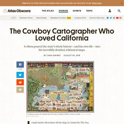
He knew Bess, a friendly brown mutt who hung out at the livery stables. He knew Bobby Durham, a pointy-eared rascal who, as Mora put it, “had a charge [account] and did his own shopping at the butcher’s.” He knew Captain Grizzly, an Irish terrier who went to town with his muzzle on and invariably came back carrying it, having charmed a kind stranger into taking it off. Three reasons to think twice about mapping the brain. The brain has a geography that matters.
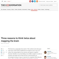
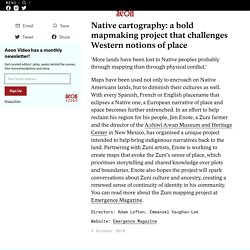
The cerebral cortex (the grey outer layer of the brain) is folded into our skulls in such a way as to reduce the wiring length of our neurons and improve cognitive function. Needless to say, this folding is incredibly complex. In order to examine and make sense of this structure, neuroscientists are increasingly turning to maps to represent its complexity. Much like the towns, cities, countries and continents represented on a typical geographic map, areas of the brain are similarly being spatially defined, labelled and understood through a process of mapping.
Mapping the brain is key to understanding how it works. Peters Projection Map, Widely used in educational and business circles. Maps not only represent the world, they shape the way we see it.
The Qing Empire and surrounds in 1910. Italy on the dawn of the French Revolution. - Maps on the Web. Non indigenous settlement click 2x. Science Infographics Breakdown STEM Subjects as Visual Maps. Click to enlarge It's often easy to get stuck into a narrow view of what a particular field of study entails, but as Dominic Walliman reveals in his impressive science infographics, there's much more than meets the eye when thinking of particular STEM subjects.
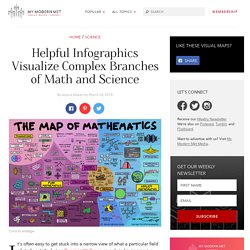
Walliman demonstrates the diversity and complexity of biology, chemistry, computer science, physics, and mathematics in visual maps that explore the breadth of each field. Walliman, who also created animated videos exploring his science infographics, manages to pack all the shades of each complex field on one page. For instance, the Map of Mathematics travels from the origins and foundations of the field to the differences between pure mathematics and applied mathematics. Likewise, chemistry is divided between rules and different sub-topics like biochemistry and inorganic chemistry, with fun illustrations to clearly show what falls underneath each area.
Dominic Walliman: YouTube | Flickr h/t: [Open Culture] Related Articles: Modern Pangea Map Showing Today's Countries on the Supercontinent. Map of most hated foods in America click 2x. Courtesy of Hater The INSIDER Summary: Dating app Hater used data from its users to create a map that shows the most hated food in each state.Some results make total sense; others are weirdly specific.For example, Missouri hates the last bite of a hot dog, New Jersey hates gas station wine, and Tennessee hates foraged food.
Country borders first defined. Conformal Projections. <br /><table class="warning" summary=""><tr><td><h2 class="warning">JavaScript Is Not Available</h2><table summary=""><tr><td><img src="../.. /StockImg/warning36.png" alt=""></td><td> </td><td><em>Since JavaScript is disabled or not supported in your browser, some or all maps in this page will not be displayed. </em></td></tr></table></td></tr></table><br /> Introduction.
3 Geology Maps that Explain the History of Earth - GIS Geography. EarthTime. Map Reveals How Long It Takes To Learn Different Languages. Interested in learning a foreign language, but need one that’s easy and time-efficient to pick up? The Foreign Service Institute has done the handy task of sorting major languages around the world into 5 categories of difficulty according to their differences from English, and Reddit user Fummy has translated that data into a color-coded map to make it all simpler. Show Full Text The Romance languages, based mainly on Latin, are among the most approachable, and include French, Spanish, and Italian. Tongues like Dutch, Danish, and Swedish share common roots with English, meaning half your work is done already if you choose to learn them. You’re looking at about 6 months of study to achieve proficiency in any of these ‘Category I’ languages.
Are you leaning further towards Japanese, Korean, or Arabic? Mapping & Cartography. If every U.S. state had the same population, what would the map of America look like. The Map is not the territory. A new kind of map: time & Points of interest click 2x. Maps. Ingeniously Redesigned World Map Looks Unusual, But Is Highly Accurate. One Interactive Map Reveals the Wi-Fi Passwords From Airports Around the World. Antipodes Map - Tunnel to the other side of the world. Cartography. Map: European colonialism conquered every country in the world but these five. Maps. Geografia. Map of the Viking World with placenames in the Old Norse language. 42 maps that explain World War II. By Timothy B. Lee on November 13, 2014 World War II was a great tragedy, claiming 60 million lives and throwing millions more into turmoil.
A Real Map of the Middle East. If the World were 100 PEOPLE. 50 would be female 50 would be male 26 would be children There would be 74 adults, 8 of whom would be 65 and olderThere would be: 60 Asians 15 Africans 14 people from the Americas 11 Europeans33 Christians 22 Muslims 14 Hindus 7 Buddhists 12 people who practice other religions 12 people who would not be aligned with a religion12 would speak Chinese 5 would speak Spanish 5 would speak English 3 would speak Arabic 3 would speak Hindi 3 would speak Bengali 3 would speak Portuguese 2 would speak Russian 2 would speak Japanese 62 would speak other languages83 would be able to read and write; 17 would not 7 would have a college degree 22 would own or share a computer77 people would have a place to shelter themfrom the wind and the rain, but 23 would not 1 would be dying of starvation 15 would be undernourished 21 would be overweight 87 would have access to safe drinking water 13 people would have no clean, safe water to drink.
Maps on the Web : Photo. Roman Roads – Sasha Trubetskoy. If you think this would make a cool poster, follow this link and send me a few bucks. I’ll email you a crisp PDF for printing! Global inequalities in population, wealth, and religious origin shown in six maps. This map of Canada shows the country's familiar vastness. This Map Shows the Hourly Wage You Need to Afford an Apartment in Your State. A new report shows that skyrocketing rent prices have put basic living arrangements out of reach in nearly every state for most low-income workers.
In order to afford a modest two-bedroom apartment in the U.S., workers on average need to earn at least $20.30 an hour, according to 2016 data from the National Low-Income Housing Coalition (NLIHC). That’s roughly $13 more per hour than the federal minimum wage, and roughly $5 per hour more than the average national $15.42 hourly wage earned by renters last year. 667 - Pop! Goes the World: 7.2 Billion and Counting. Animated interactive of the history of the Atlantic slave trade. Magnificent Maps: Cartography as Power, Propaganda, and Art. Six maps that will make you rethink the world. The Beauty of Maps: Seeing Art in Cartography. How to make infographics: a beginner’s guide to data visualisation. Animated map shows how religion spread around the world. MapCrunch - Random Google Street View.
Half the World's Population Lives in Just 1% of the Land [Map] Old Mexico Lives On. 40 Maps They Didn’t Teach You In School. 3 maps that explain America. 25 maps that explain the English language. 7 Maps to Help Make Sense of the Middle East - Metrocosm. World History Maps. Mongolia Adopts An Innovative System of 3-Word Locations. Animated map shows how humans migrated across the globe. Origin of crops. US States Renamed For Countries With Similar GDPs. MAPS OF THE WORLD. TimeMaps - World History TimeMap.
Mapping the Affordable Housing Deficit for Each State in the U.S. The 10 Best New York City Maps of 2015 - Metrocosm. City Map Archives. New York City, Oldest Footage In 1896. The Collection.