
http://www.youtube.com/watch?v=IpKqCu6RcdI
Related: Maps • TimelineNative cartography: a bold mapmaking project that challenges Western notions of place Aeon email newsletters are issued by the not-for-profit, registered charity Aeon Media Group Ltd (Australian Business Number 80 612 076 614). This Email Newsletter Privacy Statement pertains to the personally identifying information you voluntarily submit in the form of your email address to receive our email newsletters More generally, when visiting the Aeon site you should refer to our site Privacy Policy here. This Email Newsletter Privacy Statement may change from time to time and was last revised 5 June, 2018. By clicking ‘Subscribe’ you agree to the following: We will use the email address you provide to send you daily and/or weekly email (depending on your selection).
Watch as the world's cities appear one-by-one over 6,000 years Watch the rise of human cities, beginning with [arguably] the world’s first city in 3700 BC and continuing up to the present. Use the controls at the bottom to pause/resume the map and to move back and forth in time. The history of urbanization, 3700 BC – 2000 AD (full-screen version) full screen / videoFor each city, this map shows the date of the earliest recorded population figure, which is not necessarily the date when the city was founded. Here’s How America Uses Its Land Using surveys, satellite images and categorizations from various government agencies, the U.S. Department of Agriculture divides the U.S. into six major types of land. The data can’t be pinpointed to a city block—each square on the map represents 250,000 acres of land. But piecing the data together state-by-state can give a general sense of how U.S. land is used.
500 Year Old Map Was Discovered That Shatters The “Official” History Of The Planet The Facts:To bill to require the Secretary of Defense to establish an initiative on improving the capacity of military criminal investigative organizations to prevent child sexual exploitation does not have much of a chance to move on.Reflect On:How serious this problem is, especially in places of high power and 'elite' people. How does this behaviour by some of our 'leaders' reflect what their intentions for our world truly are? Why do we keep giving them power? Despite the fact that within the past couple of years alone millions of people around the world have become aware of the fact that the trafficking of both men, women, as well as children is a big problem. Just as we see with illegal arms sales, this type of activity seems to operate within the ‘black market’ and has sustained itself for years. The reason why it seems to continue to sustain itself year after year is simply the fact that many people in positions of power are involved.
Cowboy cartographer - pictorial maps Calif. Joseph Jacinto Mora knew all the dogs in Carmel-By-The-Sea, California. He knew Bess, a friendly brown mutt who hung out at the livery stables. He knew Bobby Durham, a pointy-eared rascal who, as Mora put it, “had a charge [account] and did his own shopping at the butcher’s.” He knew Captain Grizzly, an Irish terrier who went to town with his muzzle on and invariably came back carrying it, having charmed a kind stranger into taking it off. If you spend time with Mora’s map of the town—which was first printed in 1942—you’ll know the town dogs of that era, too. A Fascinating Map of Medieval Trade Routes Since their invention, automobiles have been a driving force of the global economy. Used by millions of people to get to work, transport goods, and travel, the modern automobile has become ubiquitous in our daily lives. So much so, that a whopping 92 million cars were produced in just 2019. To help us understand the might of the auto industry, this infographic from Parts Geek breaks down the earnings of 19 major car companies by an interesting metric—revenue per second. The Full List of Automakers Below are the earnings of the 19 automakers featured in the infographic.
Three reasons to think twice about mapping the brain The brain has a geography that matters. The cerebral cortex (the grey outer layer of the brain) is folded into our skulls in such a way as to reduce the wiring length of our neurons and improve cognitive function. Needless to say, this folding is incredibly complex. In order to examine and make sense of this structure, neuroscientists are increasingly turning to maps to represent its complexity. Much like the towns, cities, countries and continents represented on a typical geographic map, areas of the brain are similarly being spatially defined, labelled and understood through a process of mapping. Mapping the brain is key to understanding how it works.
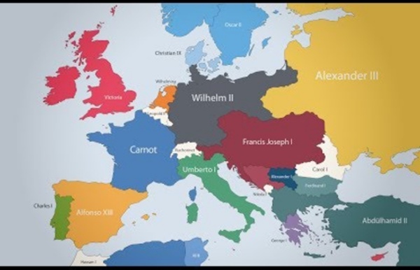
The History of Europe from 400 BC to the Present, Animated in 12 Minutes What does the future of Europe look like? Geopolitical times such as these do make one ponder such questions as, say, "In what shape (if any) will the European Union make it through this century?" But as any historian of Europe knows, that continent has seldom had an easy time of it: European history is a history of conquests, rebellions, alliances made and broken, and of course, wars aplenty — a major piece of the rationale behind the creation of organizations like the European Union in the first place. As a result, the division of Europe by the many groups and individuals who have laid claim to pieces of it has, over the past 2500 years, seldom held steady for long, as you can see on the animated map above. The Roman Empire did manage to paint the map red, literally, in the second and third centuries, but during all eras before and after it looks as multicolored as it was politically disunited.
Peters Projection Map, Widely used in educational and business circles Maps not only represent the world, they shape the way we see it. The revolutionary Peters Projection map presents countries in their true proportion to one another: it has been adopted by the UN, aid agencies, schools and businesses around the world. The Peters World Map is an Equal Area cylindrical projection with standard parallels at 45 degrees thus resulting in a distortion of shape which is stretched about the equator and squashed towards the poles, but having the great advantage that all countries are correct in size in relation to each other. Widely used in educational and business circles as an icon of the modern concept of world equality. Human evolution Evolutionary process leading up to the appearance of anatomically modern humans Human evolution is the evolutionary process that led to the emergence of anatomically modern humans, beginning with the evolutionary history of primates—in particular genus Homo—and leading to the emergence of Homo sapiens as a distinct species of the hominid family, the great apes. This process involved the gradual development of traits such as human bipedalism and language,[1] as well as interbreeding with other hominins, which indicate that human evolution was not linear but a web.[2][3][4][5]
Conformal Projections <br /><table class="warning" summary=""><tr><td><h2 class="warning">JavaScript Is Not Available</h2><table summary=""><tr><td><img src="../../StockImg/warning36.png" alt=""></td><td> </td><td><em>Since JavaScript is disabled or not supported in your browser, some or all maps in this page will not be displayed.</em></td></tr></table></td></tr></table><br /> Introduction
Oldest non-African modern human fossil revealed to be 195,000 years old The popular consensus in palaeoanthropology places the ancestors of our species exclusively in Africa before making a successful migration into Eurasia around 60,000 years ago. There has been some level of recognition that perhaps small numbers of early modern humans reached the Levant and the Middle East around 120,000 years ago. It was believed that these earlier populations represented a small-scale failed migration that barely managed to leave the continent before dying off.
Science Infographics Breakdown STEM Subjects as Visual Maps Click to enlarge It's often easy to get stuck into a narrow view of what a particular field of study entails, but as Dominic Walliman reveals in his impressive science infographics, there's much more than meets the eye when thinking of particular STEM subjects. Walliman demonstrates the diversity and complexity of biology, chemistry, computer science, physics, and mathematics in visual maps that explore the breadth of each field. Walliman, who also created animated videos exploring his science infographics, manages to pack all the shades of each complex field on one page. For instance, the Map of Mathematics travels from the origins and foundations of the field to the differences between pure mathematics and applied mathematics. Likewise, chemistry is divided between rules and different sub-topics like biochemistry and inorganic chemistry, with fun illustrations to clearly show what falls underneath each area.
MAP: Imperial Russia By the middle of the 19th century, the Russian Empire comprised more than 15 percent of the Earth’s land mass spanning parts of three continents, Europe, Asia, and North America. The population of the empire included not only Russians, but also Ukrainians, Belarusians, Finns, Poles, Armenians, Azerbaijanis, Tatars, Uzbeks, Kazakhs, Germans, and many other ethnic, linguistic, and religious groups. Russians were proud of the empire and used various means to celebrate its scale and diversity. Presented here are two sets of cards, circa 1800-33 and 1856, in which each card corresponds to a particular province or other administrative subdivision of the empire. Each card contains the map and coat of arms of the province and provides additional information about geographic features, cities, people, and local costumes.