
Avoiding a cartography catastrophe: Study recommends new tools to improve global mapping of infectious disease. Since the mid-nineteenth century, maps have helped elucidate the deadly mysteries of diseases like cholera and yellow fever.
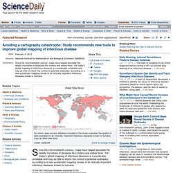
Yet today's global mapping of infectious diseases is considerably unreliable and may do little to inform the control of potential outbreaks, according to a new systematic mapping review of all clinically important infectious diseases known to humans. Of the 355 infectious diseases assessed in the review, 174 showed a strong rationale for mapping and less than 5 percent of those have been mapped reliably. Unreliable mapping makes it difficult to fully understand the geographic scope and threat of disease and therefore make informed policy recommendations for managing it, write the authors of the study, which appears as open access on Feb. 4 in the journal Philosophical Transactions of the Royal Society B. Princeton study: Nighttime images help track disease from the sky. Public release date: 8-Dec-2011 [ Print | E-mail Share ] [ Close Window ] Contact: Morgan Kellymgnkelly@princeton.edu 609-258-5729Princeton University Normally used to spot where people live, satellite images of nighttime lights can help keep tabs on the diseases festering among them, too, according to new research.
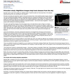
Princeton University-led researchers report in the journal Science Dec. 9 that nighttime-lights imagery presents a new tool for pinpointing disease hotspots in developing nations by revealing the population boom that typically coincides with seasonal epidemics. In urban areas with migratory populations, the images can indicate where people are clustering by capturing the expansion and increasing brightness of lighted areas. The team used nighttime images of the three largest cities in the West African nation of Niger to correlate seasonal population growth with the onset of measles epidemics during the country's dry season, roughly from September to May.
Establishing a web-based integrated surveillance system for early detection of infectious disease epidemic in rural China: a field experimental study. New mapping tools bring public health surveillance to the masses : The Pump Handle. By Kim Krisberg Many of us probably look into cyberspace and are overwhelmed with its unwieldy amounts of never-ending information.
John Brownstein, on the other hand, sees points on a map. Health-trend mapping technology grows in popularity. The healthcare industry increasingly sees geographic information system (GIS) software as a tool to improve the quality of care by tracking and analyzing area trends, according to an article published this week in The Atlantic Cities.
At Loma Linda (Calif.) University Medical Center, for example, providers are geo-coding patient addresses to determine just how much of a role environment--and in particular, pollution--plays in a patient's health status. Meanwhile, Estella Geraghty, an assistant professor of clinical internal medicine at the University of California, Davis, is using GIS to determine how other environmental factors--like access to healthy foods and recreational areas such as outdoor parks--relates to diabetes cases in different areas. She told The Atlantic Cities that, after years of ignorance, her provider colleagues are starting to warm up to the idea of the technology's impact on healthcare. Sign up for our FREE newsletter for more news like this sent to your inbox!
Healthcare visualisation maps disease prevalence across America. Regional differences in healthcare have been mapped time and again during the recent rise of online data-visualisation, but this effort, from the folks at AdAge, presents a new approach.
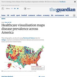
The infographic shows which disease is most prevalent within the population of each US county, and also highlights the socioeconomic status of each region, as defined by the Patchwork Nation project. If you would like to browse a larger, interactive version of the map, you can find the original here. The visualisation was produced by plotting data from 25,000 US household survey responses against Patchwork Nation's 'community types', showing both the geographical and and socioeconomic distribution of different diseases. Clear regional patterns are immediately visible, such as the prominence of muscular degeneration across the south-west and the emergence of Restless Legs Syndrome as the dominant affliction in the north-east.
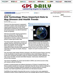
For more information on its methodology, click here. • Who made this graphic? Geographic Information Systems. GIS Technology Plays Important Role to Map Disease and Health Trends. Thanks to the advancements in geographic information systems (GIS) technologies and mapping applications like ArcGIS, health organizations worldwide are mapping disease and sickness trends in an effort to treat them locally and globally.
GIS tools and ArcGIS mapping applications play an important role in developing data-driven solutions that help health organizations visualize, analyze, interpret and present complex geo-location data. The World Health Organization maintains an updated influenza map that shows Asia and Africa are at greater risk the spread of flu. GIS Technology Plays Important Role to Map Disease and Health Trends. Geo-Medicine New Frontier In Medical Informatics. Healthcare researchers want to know if marrying geographic data on large patient populations to clinical databases can reveal hidden disease patterns. 9 Health IT Tools Patients Should Understand (click image for larger view and for slideshow) Health IT specialists will soon want to know more about a field called geo-medicine, which combines geographic information system (GIS) software with clinical databases to provide insights that might improve individual and population health.
While most of the activity is still confined to academic research, GIS firms have begun to explore its commercial potential as well. According to Esri, a Redlands, Calif. In healthcare, researchers could use this approach to find correlations between health conditions and the geographical areas where patients live. [Can wearable devices equipped with sensors and Web connections help consumers track health and fitness? SIGEPI - Home. SIGEpi forma parte de la línea de cooperación técnica "Aplicación y desarrollo de los Sistemas de Información Geográfica en Salud Pública" que tiene como objetivo fortalecer las capacidades analíticas de los Ministerios de Salud y otras Instituciones de salud de los países miembros de la Organización Panamericana de la Salud (OPS) y la Organización Mundial de la Salud (OMS).
En ese sentido, constituye una herramienta metodológica de la cooperación técnica que la OPS ofrece gratuitamente a los países de la Región de las Américas y de otras Regiones. Todos los interesados pueden obtener el software SIGEpi desde la sección de Soporte de este sitio en Internet. Al instalar el SIGEpi, los usuarios podrán usarlo por un período de 90 días bajo el término de una licencia demostrativa.
Visualizing Disease Data. MapAction.