
New Logo for Serpentine Galleries by Pentagram. About (Est. 1970) “The Serpentine Gallery is an art gallery in Kensington Gardens, Hyde Park, central London.
It focuses on modern and contemporary art. W FTW (for the Whitney) For full Access Subscription includes Full content.
Polls and comments. Full RSS functionality. New Theatre on Rotation. For full Access Subscription includes Full content.
Polls and comments. Full RSS functionality. 10 logos architecturaux. Janvier 4th, 2013 · by Lisa - Bedandy · No Comments C’est vendredi, nous vous présentons 11 logos illustrant graphiquement l’architecture des célèbres bâtiments qu’ils représentent.
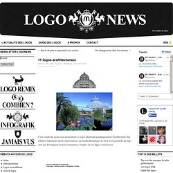
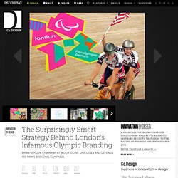
Le Jardin Botanique de New York possède un logo créé par Pentagram dont la conception s’inspire de ses lignes extérieures. Source : Logo Design Love Tags: C'est vendredi. The Surprisingly Smart Strategy Behind London’s Infamous Olympic Branding. Say what you will about London’s Olympic logo--and many people have said, and are still saying, many, many things--it is nothing if not memorable.
International branding consultancy Wolff Olins was no stranger to Olympic identities, having created the mark for the 2004 games in Athens. V Marks the Spot. Located in Central London, the Victoria district is a high traffic area thanks to Victoria Station, a complex that serves the Underground, railway, and buses, with more than 100 million passengers going through every year.
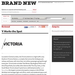
Victoria also includes Tate Britain, Buckingham Palace and three Royal Parks, but unlike other districts like The City, Soho, or the South Bank, Victoria doesn’t quite have a defined personality. Land Securities, the largest commercial property company in the UK that develops and manages high-end office, retail, and residential space and has many properties in Victoria is looking to establish an identity for the district, which has been designed by London-based SomeOne.
Promo video. A little long, but good to get a sense of the place. Identity elements. Shrewsbury's new brand campaign. Brand New Highlights. The Next Microsoft - journal - minimally minimal. A New Look for Canada. Just in time for Canada’s 145th birthday (July 1 is Canada Day, in case you forgot), Studio 360 gives our northern neighbor a brand makeover.
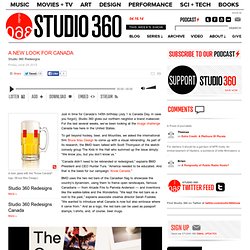
For the last several weeks, we’ve been looking at the image challenge Canada has here in the United States. A Deft Rebranding Of Canada Tackles Its Hazy Identity Abroad. For five seasons beginning in 1987, MTV produced a goofy but smart trivia game show called “Remote Control.”
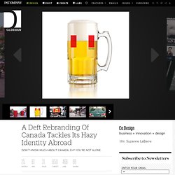
Three contestants sat in leather La-Z-Boys and answered questions under headers like “Bald Guys,” “Brady Physics,” and the trickiest of them all--“Dead or Canadian.” Rich Little: dead or Canadian? Madefire Makesawesome. Launched earlier this June, Madefire is a new digital publishing platform for comics and graphic novels through two main features: a desktop web tool where creators can produce their stories, and an iPad that delivers the content, or “Motion Books,” on steroids with animation, music, and sound effects.
Among notable artists contributing to the first wave of Motion Books is Watchmen creator Dave Gibbons with the comic “Treatment” and one of the founders of Madefire is Ben Wolstenholme, CEO of Moving Brands, who engaged his team to design the new publishing venture’s identity and user interface. The core Madefire identity assets — including fonts, colour palette and textures — pay homage to the vernacular of traditional comic visual language. Ollo logo. Ollo is currently being soft-launched as a new telecoms brand providing high-speed internet access to emerging markets.
“The logo is the first to exploit the new multi-touch hardware of smart phones and tablets. Custom software allows for interactive manipulation of the logo to become a creative tool in building the visual language. Playing with the interactive logo allows the designer to create an infinite number of brand-orientated digital assets that can be integrated into the brand.” Quoted from the Bibliothèque website. More images, info, and interaction on Bibliothèque. Via visuelle.co.uk. No Hugs and Kisses for XO from this Reviewer. Established in 1996, XO Communications is a “nationwide provider of advanced communications, managed network and IT infrastructure services for business, large enterprise and wholesale customers” providing internet service, networking, cloud computing, among other services.
Mohawk Connects the Dots. For full Access Subscription includes Full content. Polls and comments. Full RSS functionality. Qagoma. Established in 1895, The Queensland Art Gallery in Australia is one of the leading visual arts institutions in the country with more than 14,000 Australian and international paintings, sculptures, decorative art objects, multimedia installations, and works on paper. In 2006, the Gallery of Modern Art was opened as a sister institution to focus on contemporary work. For a quick distinction the Gallery offers that “the historical (pre-1970) collections are displayed at the Queensland Art Gallery, while the contemporary collections (1970 onwards) are displayed at the Gallery of Modern Art.” This month the “Queensland Art Gallery|Gallery of Modern Art”, a mouthful, has been rebranded as QAGOMA an abbreviated abbreviation of QAG and GOMA, with a new identity by Interbrand Australia.
The brand program was designed to bring the two galleries together. Les gros mots de Genève. C’est mon coup de cœur de ces dernières semaines. Une identité visuelle originale, qui ose faire tout haut ce que beaucoup ont refusé de faire tout bas. Boom Goes the Cloud. In Beta and Alpha versions last year, CX (formerly Cloud Experience), a “cloud storage and data file management system,” launched this month. Aiming to compete against Dropbox, CX allows users to sync their files, e-mail, and calendar on the magic place that is the cloud and they are trying to do it with more graphic and social media flair than Dropbox. Their new identity has been designed by Moving Brands. 20 Fabulous Websites for Logo Design Inspiration. As a precious commodity for your business, logo designing is a tough task. Whether you’re a logo designer or just interested in learning more about logo design, you’d like to see some excellent examples of other best logo designers around to get a bit of inspiration and to boost the creativity.
Do you need design inspiration now to achieve instantly recognizable logos? Just browse through logo collections online. Below I’ve put together a list of 20 incredibly useful logo Inspiration sites that offer tons of creative logos, helping you get some new and fresh ideas. 50 Excellent Text Orianted Logo Designs. It's Okay to be the King. 45 Incredible Logo Designs #5. Ben Eine. Tourist – a creative digital and print agency, London. Addition. J Fletcher Design – Graphic Design & Art Direction – Charleston, SC » Celadon.
Fruita Blanch. Accueil. A to S is the New A to Z. OCAD U, All New. Founded in 1876, OCAD University is Canada’s largest art and design institution, located in Toronto, Ontario. Formerly known as Ontario College of Art and Design, the school changed its name in 2007 to OCAD University when it received degree-granting status. Vanessa Lam. Click on image to launch website. There is no "i" in Thnk. Seriously, there isn't. Eurostar. MIT Media Lab Identity. Geek chic - the johnson banks thought for the week. Antarctic Voice. Animax Branding. The People’s Supermarket. Condom Campaign Highlights Dizzying Costs of Having a Kid. BE DANDY L'actualité des identités visuelles. Vintage Logos.
Typographic town logos in hiragana/katakana. Trade marks and symbols by Stefan Kanchev. LA CÁSCARA AMARGA. Les joyeux de la couronne. Pieces of Melbourne. Aol. Generation. Next. The Abu Dhabi Brand: Rich.