
Anamorphose : Voir le monde autrement - Richesse par habitant. Les anamorphoses proposées par la Cité de l’économie et de la monnaie montrent le monde comme vous ne l'avez peut-être jamais vu.
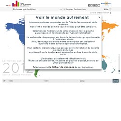
Sélectionnez l'indicateur de votre choix en haut à gauche puis cliquez en haut à droite sur 'Lancer l'animation'. La surface de chaque pays sur la carte devient alors proportionnelle à l'indicateur choisi. Ainsi, deux pays qui ont la même valeur pour cet indicateur auront la même surface après transformation. Pour certains indicateurs, vous pouvez suivre l'évolution de la carte au cours du temps en cliquant sur le bouton ►qui apparaitra en bas à gauche de la carte.
Population dataviz. Unemployment in graphics. 19 March 2014Last updated at 06:42 ET Continue reading the main story Latest news: The number of people out of work fell by 63,000 to 2.33 million in the three months to January, according to the Office for National Statistics.
The unemployment rate of the economically active population is 7.2%, and the number of people in work is 30.19 million. Census 2011: the results map of England and Wales. Four Ways to Slice Obama’s 2013 Budget Proposal - Interactive Feature. International Development Statistics online databases. Indicateurs internationaux de développement humain - PNUD. Infographic Of The Day: Cellphone Calls Reveal The United States's Invisible Ties. The lines between states and even countries are pretty arbitrary: The ties you have with people 50 miles away aren't going to be too-much affected by some imaginary line drawn up 200 years ago.

What if you could remap the United States -- not by geography, but rather social ties? MIT's Senseable City Lab has done just that, by analyzing mobile-phone calling patterns across the country. Rosling, Hans. Gapminder. Stata. Timeline of Major Events & Trends on Datavisualization. Peter von Stackelberg designed this complex timeline of social, technological, economic and political events and trends from 1750 to 2100.
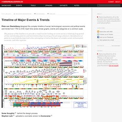
Each time series shows graphs, events and categories on a common scale. The purpose of the timeline is to provide a visual tool for looking at events across a relatively long period of time and identify patterns and interrelationships involving a broad range of factors. Identification of patterns is particularly important when attempting to look at the future of complex social, technological, economic, and other systems. Some thoughts behind the design process.Stephen Lark uploaded a zoomable version to Zoomorama. XML files. New Dream Mini-Views: Visualizing a Plenitude Economy.
United Kingdom Peace Index « Vision of Humanity. See the latest peace news and research Latest peace news,research and videos Contact us Vision of Humanity is an initiative of the Institute for Economics and Peace (IEP).

IEP have offices in New York and Sydney. For more specific inquiries related to the peace indexes and research, please contact IEP directly. Media: media@economicsandpeace.org Education: educators@economicsandpeace.org Data request: info@economicsandpeace.org Sydney office PO Box 42, St Leonards, NSW 1590, Sydney Australia Tel: +61 2 9901 8500 New York office. Daily chart: Green and pleasant. The 2012 Legatum Prosperity Index. OECD Better Life Initiative. Average personal index for Germany, men, 15–24 How’s life?
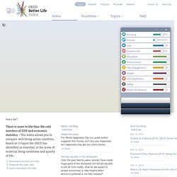
There is more to life than the cold numbers of GDP and economic statistics – This Index allows you to compare well-being across countries, based on 11 topics the OECD has identified as essential, in the areas of material living conditions and quality of life. Download executive summary Download the index data Learn more about the index. How’s life? Mapping Happiness. Where is the happiest place in New York? By Hans Pul Where is the happiest place in New York? The above diagram maps “happiness” in the city based on the content of geotagged tweets.
The diagram is structured according Manhattan’s grid, where red blocks represent “happy tweets”, while blueish blocks indicate a lower grade of happiness. Global Adaptation Index. World's Best Countries. SHOW®/WORLD - A New Way To Look At The World. DataVisualizer from worldbank.org - StumbleUpon. McDonalds in USA jpg. Walmart Dwarfs Entire Industries And Nations. Walmart is always good for destroying your faith in humanity on Black Friday, and this year was no exception: By day’s end, reports emerged from stores across the country of biblical struggles over waffle makers, pepper-spraying, and even at least one shooting.

Maybe if shoppers took a closer look at Walmart’s business doings they wouldn’t be so willing to whip out legal airborne torture for a bargain Xbox. Or maybe they would, I don’t know. Still, what Frugal Dad has strung together in Weight of Walmart above, has to give even the most hardened Black Friday criminals pause. It takes what are by now well-worn statistics about Walmart--it’s America’s largest grocery store, and the world’s largest retailer, employer, and earner of corporate revenue--and puts them into context, comparing the company to other businesses, industries, and even countries, to demonstrate the astounding reach of a corporation that looks more like a superpower every day. University of Bradford : Web of Hiram. This website began when Dr Robert Lomas of the University's School of Management, decided to create an electronic database of the Masonic material held in many of the University's Special Collections as part of his on-going research into the cultural origin of scientific ideas.
As other material has been donated to this work it has been added to the archive. None of the rituals and statutes recorded in the data are currently in use. It is in effect a scrap heap of discarded ritual and belief. But just as an archaeologist can search through ancient midden heaps and in doing so discover a lot of information about the people who dumped the rubbish, so this archive gives valuable insight into the cultural contributions of Freemasonry. Mapping technologies.