

The Scourge of Arial – Notebook. Arial is everywhere.
If you don’t know what it is, you don’t use a modern personal computer. Arial is a font that is familiar to anyone who uses Microsoft products, whether on a PC or a Mac. It has spread like a virus through the typographic landscape and illustrates the pervasiveness of Microsoft’s influence in the world. Arial’s ubiquity is not due to its beauty. It’s actually rather homely. Throughout the latter half of the twentieth century, one of the most popular typefaces in the western world was Helvetica.
An icon of the Swiss school of typography, Helvetica swept through the design world in the ’60s and became synonymous with modern, progressive, cosmopolitan attitudes. As it spread into the mainstream in the ’70s, many designers tired of it and moved on to other typographic fashions, but by then it had become a staple of everyday design and printing. By the late eighties, the desktop publishing phenomenon was in full swing. Arial vs. Helvetica. By Ilene Strizver We’ve all heard of the Arial® and Helvetica® typefaces, and have most likely used them both.
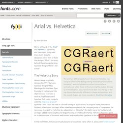
Graphic designers either love or hate the designs. What’s the story behind these two polarizing typeface designs? Here’s the scoop! The Helvetica Story Helvetica was originally designed in 1957 by Swiss typeface designer Max Miedinger for the Haas Type Foundry in Switzerland. In the mid 1980s, Helvetica virtually became a household name when it, along with Times Roman® and Courier, were made core fonts in Apple® Computer’s operating system and laser printers – ushering in desktop publishing.
Arial’s Tale At about the same time that Adobe was developing PostScript, Monotype won the contract to provide fonts for IBM’s first big laser-xerographic printers. Arial, una tipografía que está en todas partes. Me ha gustado mucho el artículo Font Series: Arial is everywhere!

, de designworkplan. En donde dan un repaso a la historia del tipo de letra Arial, y nos deja un buen muestrario gráfico de lugares donde se emplea y los comenta. La historia abreviada es como sigue: Erase una vez que había un tipo de letra llamado Helvética. Era extremadamente popular. Más tarde llegó una compañía de software llamada Microsoft y se saco de la manga un clon con otro nombre, Arial. Pero la historia un poco más larga para los que tengan tiempo, es la siguiente: Arial versus Helvetica. How to tell them apart. Is Arial just a poor copy?
Seconds Out, Round One Every typeface, like every one of us, has its distinguishing features.
You might be forgiven for thinking that some fonts are clones, or identical twins. However, closer inspection reveals subtle differences and nuances that simply escape casual perusal. Something that can really help heighten our sensitivity to those differences is getting out our magnifying glasses and really taking a closer look. If you’ve forgotten to bring your magnifying glass, then don’t fear for the Fontometer is here (we’ll get to that in a moment). Today we’re going to de-robe two popular typefaces, namely Arial and Helvetica — faces that are often confused, and often the subjects of mistaken identity. Designworkplan » wayfinding design. Arial, a contemporary sans serif typeface by Robin Nicholas and Patricia Saunders designed for Monotype in 1982.
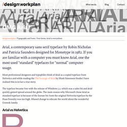
If you are familiar with a computer you must know Arial, one the most used “standard” typefaces for “normal” computer usage. Most professional designers and typophiles think of Arial as a copied typeface from Helvetica and while reading the The Scourge of Arial by Mark Simonson Studio I have realized this is in fact a true story. The typeface became free with the release of Windows 3.1, which was a sales hit and Arial quickly gained spread around the globe. The main reason why Microsoft chose Arial as standard typeface is because of the license fee from the original Helvectia typeface by the Haas Foundry was too high. Missed change to educate the world about the wonderful Grotesk family. Arial vs Helvetica There are several glyps of the typefaces similar and some of them are different.
Arial. Robin Nicholas y Patricia Saunders. Robin Nicholas. For instance, Cambridge University Press and Oxford University Press had been early adopters of the Lasercomp, and they were using typefaces that weren’t as popular with mainstream customers so they may have prompted us to look at some new typefaces.
I got caught up more in that rather than thinking ‘I want to design another typeface.’ It still seemed there was a lot to do with the existing library. Some of those typefaces take on a cult status – things like Fournier. So when you learn more about their history it would seem criminal to just let them drift away and not be made for modern technology. We revived some things with varying degrees of success. Eye: What would be top of your revisit list? RN: I think that most of our typefaces could do with a redesign! Eye: So the most popular ones get done quickly, because there’s a market for them, but the later, less popular ones get more attention because technology has improved. Robin Nicholas - letrag.