
Font Management in macOS. This section examines each of the various macOS releases (High Sierra 10.13.x through Big Sur 11.x) and provides the recommended minimum list of the fonts to be stored in the System folder for that particular release of the operating system in order for it and most third party applications to run properly.
These lists also include the fonts most needed for the web, iLife and iWork. The fonts listed should always be active on your Macintosh for macOS and should not be removed. Note that this first part of Section 1 covers only fonts required in the /System/Library/Fonts/ folder. There is also a root /Library/Fonts/ folder with its own set of required fonts, which will be addressed in the second half of Section 1. From the font lists below, the San Francisco font set is used throughout the system font display purposes.
All other fonts in the /System/Library/Fonts/ folder (that are not included in the lists below by release level) can be removed. Home — 36 Days of Type.
Letterpress Print Workshop at the NCAD. Cheapest Mugs, Prints, iPhone Cases and T-shirts. Top 10 typography We found 10 amazing web design tools to discover beautiful fonts for your next project.
Typewolf Typewolf is a curated design showcase that identifies the fonts used in the design. Our goal is to serve as a one-stop resource for designers seeking typographic inspiration for the modern web. Google Fonts Making the web more beautiful, fast, and open through great typography. Type Nugget an online typesetting tool that gives you fine control over a robust base for hella fine web type — all via a pleasant user interface. WhatTheFont Seen a font in use and want to know what it is? Type Anything Type Anything is a free and awesome typography tool to create and test font combinations for your projects. Font Flame Tinder for font pairing. Fontface Ninja Explore fonts within a website, try and buy them ! FontReach FontReach scans the top million sites to show font usage across the web.
Fontic Scan your PSD file for fonts then include them on the web! Gridlover ← Older Post Newer Post → Typography Resources. Typography Resources A continuously updated collection of the best typography resources from around the web Learning Resources The Elements of Typographic Style Applied to the Web → A summary of Robert Bringhurst’s typography-bible The Elements of Typographic Style and how it applies to the web.
Fontology → A complete curriculum on the typographic arts structured as a workbook. Best Practices of Combining Typefaces. Advertisement Creating great typeface combinations is an art, not a science.
Indeed, the beauty of typography has no borders. While there are no absolute rules to follow, it is crucial that you understand and apply some best practices when combining fonts in a design. When used with diligence and attention, these principles will always yield suitable results. Today we will take a close look at some the best practices for combining typefaces — as well as some blunders to avoid.
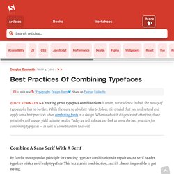
Combine a Sans Serif with a Serif By far the most popular principle for creating typeface combinations is to pair a sans serif header typeface with a serif body typeface. In the example below — a typical article layout — we have Trade Gothic Bold No.2 paired with Bell Gothic on the left side. Putting these two together creates an unwanted conflict in the design. Now let’s look at the example on the right. Avoid Similar Classifications. Typo_tips.pdf. Tiff - a visual typeface diff tool.
The History of Typography - Animated Short. Typographer's Glossary. Serif: Serif's are semi-structural details on the ends of some of the strokes that make up letters and symbols.

A typeface that has serifs is called a serif typeface (or seriffed typeface). Some of the main classifications of Serif type are: Blackletter, Venetian, Garalde, Modern, Slab Serif, Transitional, and Informal. Fonts in each classfication share certain similiar characteristics including the shape or appearance of their serifs. Serif fonts are widely used in traditional printed material such as books and newspapers. Show all Serif Didone is a typeface classification characterized by slab-like serifs without brackets; vertical orientation of weight axes. History of Western Typography. Etymology[edit] Typography (from the Greek roots τύπος typos = "impression" and -γραφία -graphia = "writing").
Medieval design roots[edit] Typography, type-founding and typeface design began as closely related crafts in mid-15th-century Europe with the introduction of movable type printing at the junction of the medieval era and the Renaissance. Handwritten letterforms of the mid-15th century embodied 3000 years of evolved letter design, and were the natural models for letterforms in systematized typography.
Hellbox. The American Heritage Dictionary of the English Language, Fourth Edition, 2000.
Houghton Mifflin Company. [1]Fleischman, J (1977). "A Linotypist's Notes: Being an Account of a Brief Apprenticeship in an Obsolete Trade". [2] Typography for Lawyers. Kern Type, the kerning game.
Blogs & Magazines. Experimental. Twenty Essential Text Faces. What The Font! Identifont.