
Visualising Whitehall: the Guardian map of the senior civil service. Turn autoplay off.
Journalisme graphique. La technologie améliore continuellement la productivité. Visualisation de l'information. Faites parler les donn?es. Best Infographics of 2010 - VisualEconomics.com. Share this infographic on your website, simply copy and paste the source code in the box below to your website.
The average American consumes a LOT of food and beverage over the course of a year. Just how much, you ask? In the United States, we take light switches and electrical sockets for granted. 40 Useful and Creative Infographics. Six Revisions Menu Main Categories CSS HTML JavaScript Web Design WordPress Web Development.
BestInfographics.info. Les 50 meilleures infographics et data visualization. We Love Datavis. Infographics. Information aesthetics - Information Visualization & Visual Communication. Mashable. Social Media Marketing Made Simple / Flowtown. The Conversation Prism by Brian Solis and JESS3. 35 Great Social Media Infographics. 35 Great Social Media Infographics [Note: I recently updated this compilation to include some more recent visualizations... you can see it here.]
Here’s a collection of terrific social media infographics that might come in handy. As you probably know, infographics are visual representations of information, data, or knowledge. They illustrate information that would be unwieldy in text form and they act as a kind of visual shorthand, making information easy to understand and consume. They are driven by the same information as charts, but they’re often a better form of communication because of their pleasant aesthetics — charts and graphs can communicate data, but infographics turn data into information. It’s very helpful to use infographics in presentations, reports, articles, etc., to convey concepts.
Most of these have been scaled down or cropped. If you know of any good ones that I’ve missed, please leave a comment and let me know! 1. 2. 10 Levels of Intimacy in Today’s Communication 3. 50 Informative and Well-Designed Infographics. It’s impossible to comprehend complex data or analyze large amounts of information, if we only use words or texts.
Information graphics or better known as infographics are visual explanation of data, information or knowledge. These graphics are excellent visual tools for explaining huge amounts of information where complex data needs to be explained immediately and clearly. Let me show you how Rick Mans explain how infographics ease the process of communicating conceptual information Image credit. Infographic is one of the most challenging types of graphic design because the creation process alone is pretty intensive. We are truly delighted to show you these brilliant and informative infographics created by various talented individuals. Recommended Reading: More Infographic related posts. 55 Interesting Social Media Infographics.
19 of the Best Infographics from 2010. Research can sometimes be a bit of a chore, but when knowledge is wrapped up in charts, cartoons, or even some heart-holding robots, suddenly "information" isn't such a scary word.
What do Facebook's 500 million users look like? Who's suing whom in the mobile world? How does FarmVille stack up against actual farms? These questions and more are answered in the infographics below. Have a look through the list and let us know which graphics you liked best (or learned the most from) in the comments below. Survey Shows the Internet Would Have Passed Prop 19Prop 19, California’s controversial bid to legalize marijuana, lost at the polls on Tuesday, but if that vote had been up to the wider web of Internetusers, Prop 19 would have passed.Social Media’s Impact on the Midterm Elections [INFOGRAPHICS]Social media, especially Facebook, had a huge impact on how the U.S. midterm elections were perceived and decided.
Twitterverseinfographic.jpg (JPEG Image, 1052x1460 pixels) - Scaled (44%) The Interest Graph on Twitter is Alive: Studying Starbucks Top Followers « Brian Solis Brian Solis. InShare1,306 Social media is maturing as are the people embracing its most engaging tools and networks. Perhaps most notably, is the maturation of relationships and how we are expanding our horizons when it comes to connecting to one another. What started as the social graph, the network of people we knew and connected to in social networks, is now spawning new branches that resemble how we interact in real life. This is the era of the interest graph – the expansion and contraction of social networks around common interests and events. Interest graphs represent a potential goldmine for brands seeking insight and inspiration to design more meaningful products and services as well as new marketing campaigns that better target potential stakeholders.
While many companies are learning to listen to the conversations related to their brands and competitors, many are simply documenting activity and mentions as a reporting function and in some cases, as part of conversational workflow. 1. 1. 1. Obama’s 2012 Budget Proposal: How It’s Spent. Internet cut off in Libya - another amazing graph from Arbor Networks - rorycellan's posterous.
Qui sont les blogueurs ? La psychologie de la couleur. Infographie : Facebook vs Twitter. Twitter et Facebook font partis des réseaux sociaux les plus utilisés au monde.
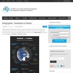
Leurs croissances sont indiscutables et plus de 600 millions d’utilisateurs (les 2 confondus) se retrouvent sur ces plateformes. Pour vous montrer comment sont départagées toutes ces personnes, le site Digital Surgeons c’est amusé à créer une magnifique infographie : Facebook vs Twitter… Quelques faits intéressants sont à noter : Ht. Comment fonctionne la recherche Google ? Four_stages_of_getting_twitter.
Design Language News. Infographie – Les marques sur Facebook. Landing Pages for PPC: How to achieve higher conversions and a lower CPC [Infographic] Successful PPC campaigns are about more than simply choosing ad words that attract the attention of your target audience.
![Landing Pages for PPC: How to achieve higher conversions and a lower CPC [Infographic]](http://cdn.pearltrees.com/s/pic/th/landing-unbounce-publish-6295681)
Many marketers falter in the “what happens next” post-click phase, and a big reason for this is sending paid traffic to the wrong type of page. Roughly 80% of paid search traffic is sent to one of the following page types: The company homepage (most common)A sign-up or registration pageA shopping cart pageA product detail page If you fall into this category then your highest converting call to action is likely to be the back button on your browser – which means you are wasting money. This stat also means that only about 20% of traffic is being sent to promotion specific landing pages, which is crazy. Simply put, you should send PPC traffic to landing pages whenever possible. L’impressionnante taille d’Internet. Internet nuit-il à l’environnement ? [Infographie] Facebook et Twitter dominent les plans marketing sur Internet pour 2011 - Web-Interviews.com - From Web News to Interviews.
Infographie : l’histoire des ordinateurs. Depuis les prémices de l’informatique, nos bécanes ont pas mal évolué.
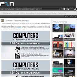
Et je pense que si les gars qui ont travaillé sur les premiers ordinateurs devaient voir ce que sont devenus leurs rêves, ils seraient sans doute très très surpris. Enquête sur la blogosphère francophone, infographie des résultats. Stagueve du blog nowhereelse a mis en ligne les résultats de son enquête 2010 sur la blogosphère francophone.
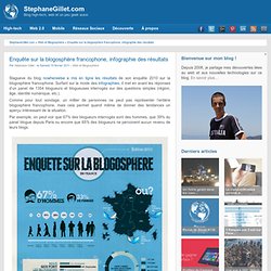
Surfant sur la mode des infographies, il met en avant les réponses d’un panel de 1354 blogueurs et blogueuses interrogés sur des questions simples (région, âge, identité numérique, etc.). Comme pour tout sondage, un millier de personnes ne peut pas représenter l’entière blogosphère francophone, mais cela permet quand même de donner des tendances un aperçu intéressant de la situation. Par exemple, on peut voir que 67% des blogueurs interrogés sont des hommes, que 39% du panel blogue depuis Paris ou encore que 65% des blogueurs ne percoivent aucun revenu de leurs blogs.
Stéphane Gillet est l'auteur de cet article. Amoureux des nouvelles technologies et du web, Stéphane Gillet a créé ce blog qui porte son nom afin d'exprimer ses passions et ses découvertes. ENQUETE BLOGOSPHERE FRANCOPHONE 2010. Un monde sans Apple. Un monde sans Apple est-ce possible ? L’infographie ci-dessous réalisée par Infographic Labs montre l’étendue de l’empire Appel ainsi que les différentes étapes de la marque – lancements de produits, présence de Steve Jobs ainsi que l’évolution du cours de l’action. iMac, iPhone, iPad… La marque à la pomme, créée en 1975, accumule les succès depuis une dizaine d’années.
Enuneseuleimage.tumblr. Infographie. La maquette de votre site Internet est enfin terminée ?! Etape suivante, on passe au SEO (référencement naturel), c’est à dire à l’optimisation des mots clés pour chacune des pages web. Le but de cette tâche : améliorer sa visibilité pour mieux apparaitre dans les pages de résultats de Google. En France, Google détient le monopole de la recherche avec plus de 95% et c’est pourquoi nous nous sommes focalisés sur ce moteur de recherche. Les meilleures infographies du web. En une seule minute, une quantité monstrueuse de données est échangée sur le web. 15 New Extremely Creative Infographics. With the help of evolution and progress, people’s lives become easier day by day.
Today everything is simpler than it used to be in the past. Let’s take information for example. Information is displayed everywhere we go and to make it easier to read it, people have created special graphics that help us get is faster. The way information is displayed is very important; because this is how someone would interpret something you wanted to say. Infographics are graphic visual representations of data and information and it is the best way to visualize an idea or a thought. But don’t be discouraged – with some practice and yet some practice again, anyone willing to achieve something will definitely achieve it.