

CSS Image Styles & Effects. CSS Backgrounds. CSS Gradients. CSS Vertical Methods: Height, Centering, Lining up Columns. CSS Beveled Corners & Edges. CSS Box Shadows. CSS Font & Typography Methods. CSS Breadcrumb Triangles. CSS Shapes. Pure CSS3 accordion – Red Team Design. A while ago, I wrote about the CSS3 :target pseudo-class and how can that help you achieve cool results.
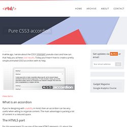
Today you'll learn how to create a pretty simple animated CSS3 accordion with its help. View demo What is an accordion If you're designing with usability in mind, then an accordion can be very useful when willing to organize content. The main advantage is packing a lot of content in a reduced space. The HTML5 part For this experiment I'll use one of the new HTML5 elements, it's about the section element.
<script>document.createElement('section');</script> John Resig HTML5 Shiv To simplify things here, I just used the de facto script for enabling HTML5 elements in Internet Explorer. CSS3 Responsive Slider / Carousel Using Radio Buttons. Select catcher Created by Ian Hansson (@teapoted) Art from Brendan Zabarauskas (@bjzaba_).

Icons from the iconSweets set. Browser Support: Best In Test: Firefox (transition performance) Full Support: Chrome, Firefox, Opera, Safari (latest versions of all browsers) Partial Support: IE9 (Functional, but does not support transitions) *No JavaScript Functionality (1 compatability fix though) iOS devices don't handle labels properly. You can view this page without the js iOS fix here. How Does It Work? The actual slider is much like any JavaScript slider. To save our input we are using radio buttons. We put the radio buttons at the top so when they are :checked we can use a general sibling selectors (~) to change our slider. That is all the essential CSS, the other gaff is just styling and animation.
CSS transitions & media queries. Posted on 31 May 2011 • 14 comments While coding up the site for our Insites Tour, I happened across an accidental feature: a smooth transition on growing / shrinking type and image sizes when I resized the browser window.
This isn’t particularly groundbreaking and has probably been put into use by others, but as I personally haven’t seen it used elsewhere on the web, I thought it’d be good to make a note of this happy accident. The basic premise is this: you use media queries to design responsive websites that adapt their layout according to browser width, and you constantly resize your browser to see how the site performs, but each time a query kicks in, there’s a harsh jump between the old styles and the new ones. Why not use some simple CSS transitions to smooth that jump by animating the resize? A note about relative sizing In our example code above, the media queries kick in at 800px (reducing the type down to 0.8em) and at 400px (reducing the type even further to 0.7em). Glossary and Table format for Definition Lists. Today I ran into an old post from Bruce Lawson (via @necolas).
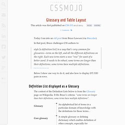
In that post, Bruce challenges CSS authors to: style [a definition list] in a way that’s very common for glossaries—term on the left, and all the different definitions on the right. Each new term starts a new “row” for want of a better word. It needs to be robust; some terms are longer than their definitions; some terms have multiple definitions.
Below I show one way to do it, and also how to display DT/DD pairs in rows. Definition List displayed as a Glossary The content of the Definition Lists below is from the Glossary page on Wikipedia. Control image aspect ratios with CSS3. Rotating color cube box with CSS3 animation, transforms and gradients. 3D FishBirds « jonahgoldstein.com. You aren’t seeing the magic above because your browser doesn’t yet support 3D transforms. Try using Chrome or Safari. Katrina recently was part of a panel on mixed-race identity at the Brooklyn Historical Society where she spoke about her project, FishBird . While discussing ways to remount the piece and additionally create a rich, digital component to accompany it, I began tossing around visuals.
I couldn’t really get the idea of the wooden blocks out of my head. A basic rubix cube of sorts with various of animals that would rotate to create fishbirds, cowmonkeys, and beariguanas. After looking over a few tutorials on 3D CSS3 transforms (currently webkit only), I began on the test shown above. 25 CSS Snippets for Some of the Most Common and Frustrating Tasks. In this post we have 25 CSS snippets and hacks that will solve many of the most frequently used and, at times, frustrating CSS development tasks.
Why reinvent the wheel when there are already plenty of time-saving pre-written CSS code snippets? As well as some classic and timeless CSS hacks you will also find many CSS3 snippets, like box-shadow, border-radius,linear-gradient and many more. Adding shadow to text – text-shadow Helps make your text stand out from the rest. Source Adding an image-based border – border-image You can create any kind of border you want for any object(s) on your website using this. Adding shadow to borders and images – box-shadow Helps make your borders and images “pop” from the background more, giving a subtle 3D-like visual cue that it’s something separate, in the foreground, and the thing that visitors should be looking at.