CSS Box Alignment Module Level 3
Conformance requirements are expressed with a combination of descriptive assertions and RFC 2119 terminology. The key words “MUST”, “MUST NOT”, “REQUIRED”, “SHALL”, “SHALL NOT”, “SHOULD”, “SHOULD NOT”, “RECOMMENDED”, “MAY”, and “OPTIONAL” in the normative parts of this document are to be interpreted as described in RFC 2119. However, for readability, these words do not appear in all uppercase letters in this specification.
Designing Websites for All Screen Resolutions
Tutorial on Designing for 800 x 600, 1024 x 768, 1280 x 1024 and higher Designing web sites to fit all resolutions is a very important web design principle. Try out the Entheos site in all resolutions higher than 800 x 600 and you will find that it is designed to fit the page exactly. Therefore, visitors who have higher resolution can see more content in one page which reduces scrolling.
Less Framework 4
I called Less Framework "a CSS grid system for designing adaptive websites". It was basically a fixed-width grid that adapted to a couple of then popular screen widths by shedding some of its columns. It also had matching typographic presets to go with it, built with a modular scale based on the golden ratio. The resources it was originally published with are still available on GitHub. Contrary to how most CSS frameworks work, Less Framework simply provided a set of code comments and visual templates, instead of having predefined classes to control the layout with.
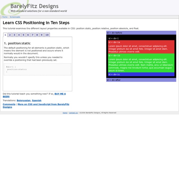
Top 10 CSS Table Designs - Smashing Magazine
Advertisement Many companies try to create a great experience for customers. But few are willing to make the changes required to deliver on that promise. In fact most don’t even realize just how bad their experience can be. This is why we made a new book called “User Experience Revolution,” a practical battle plan for placing the user at the heart of your company.
How to Build a Fully Functional CSS3-Only Content Slider
Content sliders are a great way to make a website more dynamic. They add flair, and if used correctly, could be the difference between a purchase and a back button. Normally, they would be built with jQuery or some other Javascript library. However, with the advent of CSS3, I will show you how to build one using only CSS.
Progressively Enhancing CSS Layout: From Floats To Flexbox To Grid
Advertisement Many companies try to create a great experience for customers. But few are willing to make the changes required to deliver on that promise. In fact most don’t even realize just how bad their experience can be. This is why we made a new book called “User Experience Revolution,” a practical battle plan for placing the user at the heart of your company. Get the book now!
A Handful Of CSS Trends And How To Use Them
There are a handful of CSS and CSS3 trends that are making their way across the web. Find out how to use them on your site… As I make my daily web travels, I’m constantly keeping an eye out for any trends or cool effects that other blogs are taking advantage of. I finally rounded up a handful of them that really stood out and wanted to share with my readers how to execute the same effects on your site. A few of these I’ve adopted here on Bluefaqs and you may have noticed that I have introduced them to the site over the last couple of months. Some of the examples below are taking advantage of CSS3 and may not work in all browsers.
HOW TO: Get Started with Less Framework
The Web Development Series is supported by Rackspace, the better way to do hosting. Learn more about Rackspace's hosting solutions here. For the past few years, CSS grid systems have become increasingly popular with web designers. Thanks to efforts like Nathan Smith's 960.gs, designing with a grid is less complicated, and better looking sites can be crafted with ease.
