

Learn CSS Layout The Pedantic Way. Bureaucrat Conrad, you are technically correct - the best kind of correct.
I hereby promote you to grade 37. - Number 1.0 (Futurama, S2E15)I won't lie to you, Neo. Every single man or woman who has fought an agent has died. But where they have failed, you will succeed.Why? I've seen an agent punch through a concrete wall; men have emptied entire clips at them and hit nothing but air; yet, their strength, and their speed, are still based in a world that is built on rules. Because of that, they will never be as strong, or as fast, as you can be.What are you trying to tell me? CSS, like the Matrix, is a system based on rules. I wrote this set of chapters to describe those rules. Pedantic: adjective. (2): overly concerned with minute details or formalisms, especially in teaching. I mean it in a good way, though obviously the word has a negative connotation.
You may have heard that there are inline and block elements in CSS normal flow. You may have heard about the box model. Apprendre les mises en page CSS. Layout in CSS. Learn how to structure your CSS layout… Website Design: Creating the Layout in HTML. Relearn CSS layout: Every Layout. How Well Do You Know CSS Layout? Share this: Ship custom analytics today with Keen.io.
The difference between a CSS good experience and a long frustrating one is oftentimes a matter of a few small details. CSS is indeed nuanced. One of the most common areas where I see struggles is layout. Personally, I like to study patterns. #Just for fun, let’s start with a test We’ll use a platform that I happen to have made called Questionable.io and I’ve used it to create a test that we’ll get to below. The purpose of the test is to see if you can recognize specific CSS behaviors and problems in context without first being presented with the material. The test is 10 questions and should take 10 minutes or less. Category "Layouts" Learn CSS Layout The Pedantic Way. Centering in CSS: A Complete Guide. Centering things in CSS is the poster child of CSS complaining. Why does it have to be so hard? They jeer. I think the issue isn't that it's difficult to do, but in that there so many different ways of doing it, depending on the situation, it's hard to know which to reach for.
So let's make it a decision tree and hopefully make it easier. I need to center... The Different Kinds of CSS Layout - CSS-Tricks. Sticky CSS Footer. Sticky Footer, Five Ways. By Chris Coyier On flexbox, footer, grid, sticky footer A brief history, if you will. The purpose of a sticky footer is that it "sticks" to the bottom of the browser window. But not always, if there is enough content on the page to push the footer lower, it still does that.
But if the content on the page is short, a sticky footer will still hang to the bottom of the browser window. #There is negative bottom margins on wrappers There was a wrapping element that held everything except the footer. Salvattore — A jQuery Masonry alternative with CSS-driven configuration. Fluid Grids. Early last year, I worked on the redesign of a rather content-heavy website.
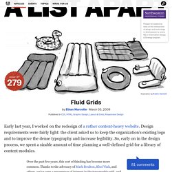
Design requirements were fairly light: the client asked us to keep the organization’s existing logo and to improve the dense typography and increase legibility. So, early on in the design process, we spent a sizable amount of time planning a well-defined grid for a library of content modules. Article Continues Below Over the past few years, this sort of thinking has become more common.
Thanks to the advocacy of Mark Boulton, Khoi Vinh, and others, we’ve seen a resurgence of interest in the typographic grid, and how to use it on the web. However, our client had one last, heart-stopping requirement: the design had to be fluid and resize with the browser window. Progressively Enhancing CSS Layout: From Floats To Flexbox To Grid. Advertisement Many companies try to create a great experience for customers.
But few are willing to make the changes required to deliver on that promise. In fact most don’t even realize just how bad their experience can be. This is why we made a new book called “User Experience Revolution,” a practical battle plan for placing the user at the heart of your company. Get the book now! Earlier this year, support for CSS grid layout1 landed in most major desktop browsers. Statements And Questions I’ve Heard In The Last Few Weeks Link. The New Layout Standard For The Web: CSS Grid, Flexbox And Box Alignment. CSS Box Alignment Module Level 3. Conformance requirements are expressed with a combination of descriptive assertions and RFC 2119 terminology.
The key words “MUST”, “MUST NOT”, “REQUIRED”, “SHALL”, “SHALL NOT”, “SHOULD”, “SHOULD NOT”, “RECOMMENDED”, “MAY”, and “OPTIONAL” in the normative parts of this document are to be interpreted as described in RFC 2119. However, for readability, these words do not appear in all uppercase letters in this specification. All of the text of this specification is normative except sections explicitly marked as non-normative, examples, and notes. [RFC2119] Learn CSS Positioning in Ten Steps: position static relative absolute float. 1. position:static The default positioning for all elements is position:static, which means the element is not positioned and occurs where it normally would in the document.
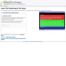
Normally you wouldn't specify this unless you needed to override a positioning that had been previously set. 2. position:relative If you specify position:relative, then you can use top or bottom, and left or right to move the element relative to where it would normally occur in the document. Comprendre le Viewport dans le Web mobile. Mydevice.io know your mobile device (pixel-ratio, CSS width, features) An event for CSS position:sticky Here's a secret: You may not need scroll events in your next app.
Using an IntersectionObserver, I show how you can fire a custom event when position:sticky elements become fixed or when they stop sticking. All without the use of scroll listeners. CSS Layout News. /* Position Is Everything */ — Modern browser bugs explained in detail! Remove Whitespace Between Inline-Block Elements. I remember being a young developer during the Internet Explorer 6 days and desperately wanting IE to adopt display: inline-block.
The inline-block value is incredibly useful when wanting to control margin and padding on "inline" elements without the need to `block and float` them. One problem that arrises when you use inline-block is that whitespace in HTML becomes visual space on screen. Gross. There are a few ways to remove that space; some of them are just as gross, one is reasonably nicer. Comprendre z-index et les contextes d'empilement - Vincent De Oliveira. Apprendre les mises en page CSS. Structures et sections d'un document HTML5 - HTML (HyperText Markup Language) La spécification HTML5 apporte plusieurs éléments nouveaux aux développeurs web leur permettant de décrire la structure d'un document Web avec une sémantique standard.
Progressively Enhancing CSS Layout: From Floats To Flexbox To Grid. Block Formatting Context. Le contexte de formatage block en CSS - Alsacreations. Certaines spécifications CSS sont plus obscures que d'autres.
Mais il est du devoir d'un intégrateur de les connaître pour être plus efficace dans son métier. Le modèle tabulaire en CSS - Alsacreations. Display: inline-block et les espaces indésirables - Alsacreations. La valeur inline-block de la propriété display est à la mode, même si elle demeure encore trop peu connue et mal utilisée. Elle offre de multiples avantages dont le principal est de pouvoir disposer des éléments les uns à côté des autres, tout en étant dimensionnés et sans les retirer du flux.
L'un de ses inconvénients majeurs est l'apparition d'un espace indésirable et incompressible de prime abord entre les blocs. S'il n'est pas gênant, tant-mieux; sinon, de multiples techniques plus biscornues les unes que les autres existent. Design a responsive site with em-based sizing. You've probably heard that you should use relative units for font size. This is a good rule for accessible web design; if the user changes their browser's default font size, this enables your page's text to resize accordingly.
You may have taken this advice and made the switch. Perhaps you got out your calculator and converted your site's font sizes from absolute px units to ems or, more likely, rems. But if that's where you stopped, you are missing out on a lot of the flexibility and power that ems bring to the browser. The em unit is not simply a replacement for the familiar px; you can use it for more properties than just font-size. By consistently using ems, you can design components on the page that respond automatically should the font size change. Learn CSS Layout - floats, positioning, flexbox, grids. Learn CSS Positioning in Ten Steps: position static relative absolute float. Guide de survie du positionnement CSS. Initiation au positionnement CSS (partie 2) Sandbox. 1. A very wide image contained in a paragraph with no styles applied Dunstan kindly lent me this charming image. Pellentesque in felis quis tortor consectetuer condimentum.
Phasellus nibh nibh, interdum sit amet, sagittis nec, cursus sit amet, dolor. Duis scelerisque tortor. Ce bon vieux tableau HTML – La Tête dans le Flux. Hier, sur Twitter, j’ai conseillé d’utiliser des tableaux HTML pour de la mise en forme. Et je n’ai même pas honte. En 2011 déjà, lors d’un atelier Paris-Web, je vantais les mérites des tableaux HTML pour de l’habillage graphique. Le point sur les grilles en CSS – La Tête dans le Flux. Width: 100%, tu es le Mal ! – La Tête dans le Flux. La propriété CSS width est certainement celle qui porte le plus mal son nom. En effet, elle représente la taille de la composante de contenu uniquement, pas largeur de l’élément.
A vrai dire, l’appellation content-width lui conviendrait parfaitement et serait bien moins source de problèmes, mais voilà, elle s’appelle bel et bien width, et c’est ça le drame.
FLEXBOX. Multiple Columns. FLOAT. Grilles de mise en page. Longueurs, Unités etc. The New Clearfix Method. Clearfix Reloaded + overflow:hidden Demystified. Clearfix and overflow:hidden may be the two most popular techniques to clear floats without structural markup. This short article is about enhancing the first method and shedding some light on the real meaning of the second. clearfix In everything you know about clearfix is wrong I explain the issues this method creates across browsers and I suggest to only use clearfix on elements that are not next to floats (e.g. a modal window), although as authors we still have to deal with collapsing margins.
This demo page demonstrates the issue. Margin-collapse behavior in the first two boxes shows that it is the generated (non-empty) content that keeps the bottom margin inside the box (which makes perfect sense according to spec). Force Element To Self-Clear its Children. Share this: Ship custom analytics today with Keen.io. This will do you fine these days (IE 8 and up): Apply it to any parent element in which you need to clear the floats. Treehouse Community. A new micro clearfix hack. HasLayout et bugs de rendu dans Internet Explorer 6-7. Introduction - In search of the One True Layout. CSS Positioning 101.
Line-height, cette propriété méconnue. ZONE CSS - Propriétés CSS et leurs relations avec les balises (X)HTML (Définition CSS V5.0) Jonikorpi. Responsive Design Knowledge Hub. Le modèle des boîtes. Vertical-Align: All You Need To Know - Christopher Aue. Tutoriel Vidéo HTML-CSS Présentation de Susy. Susy. Création de motifs qui rebouclent. <length> Margin. Tous les gabarits — Gabarits HTML-CSS. Inline-block est-il un substitut aux floats ? Centrer en CSS, un guide complet. Les bases du positionnement en CSS. Centering in CSS: A Complete Guide.