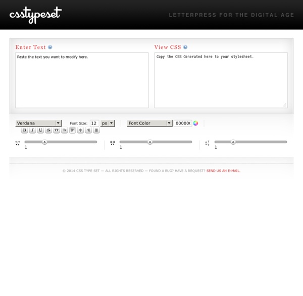


Designing Websites for All Screen Resolutions Tutorial on Designing for 800 x 600, 1024 x 768, 1280 x 1024 and higher Designing web sites to fit all resolutions is a very important web design principle. Try out the Entheos site in all resolutions higher than 800 x 600 and you will find that it is designed to fit the page exactly. Therefore, visitors who have higher resolution can see more content in one page which reduces scrolling. Top 10 Typography Tools for Web Designers Typography happens to be the key factor for web designing these days. It can be quite challenging and fascinating to work with typography. A plethora of tools have come up to let you build your own fonts and insert them into your designs, with ease. In this post, I`m going to introduce you some great typography tools, which will be very useful and quite time saving.
Browse Web Type, Grab CSS. font-family: Helvetica, Arial, sans-serif; font-size: 28px; font-style: normal; font-weight: bold; text-transform: normal; letter-spacing: -1px; line-height: 1.2em; Close font-family: Helvetica, Arial, sans-serif; font-size: 24px; font-style: normal; font-weight: bold; text-transform: normal; letter-spacing: -1px; line-height: 1.2em; font-family: Helvetica, Arial, sans-serif; font-size: 24px; font-style: normal; font-weight: normal; text-transform: normal; letter-spacing: -0.1; line-height: 1.4em; font-family: Helvetica, Arial, sans-serif; font-size: 18px; font-style: italic; font-weight: normal; text-transform: normal; letter-spacing: normal; line-height: 1.4em;
CSS Frame Generator v. 1.00 What is it? Ok, here's the deal. CSS Get the lowdown on the key pieces of Bootstrap's infrastructure, including our approach to better, faster, stronger web development. HTML5 doctype Bootstrap makes use of certain HTML elements and CSS properties that require the use of the HTML5 doctype. Include it at the beginning of all your projects. Learn CSS Positioning in Ten Steps: position static relative absolute float 1. position:static The default positioning for all elements is position:static, which means the element is not positioned and occurs where it normally would in the document. Normally you wouldn't specify this unless you needed to override a positioning that had been previously set. 2. position:relative If you specify position:relative, then you can use top or bottom, and left or right to move the element relative to where it would normally occur in the document. Let's move div-1 down 20 pixels, and to the left 40 pixels:
Basic Tips On Typography For Web Design Sometimes even the smallest details can have a big impact on the way a website looks. Typography is a perfect example of one of those small details. It is also one of the most overlooked design elements on the majority of websites. Even if the rest of the layout and graphics are well-designed, the end result can be unattractive or difficult to read with the wrong typography. 11 Free jQuery CSS3 Navigation Menu Plugins These days, jQuery Navigation menus are more than plain texts with links on it. With the command of jQuery, it can transform the menu of a web site into a dynamic menu. Despite the fact that CSS3 can now be utilized to make dynamic menu, still, the query includes more functionality to the menus.