Comic Sans Has an Uncanny Ability to Make Us Hate It
Perhaps it goes without saying: Comic Sans is the number-one most hated typeface on this planet. That is quite the honor to hold. When it comes to design and aesthetic preference, can you think of many other design choices that are so widely and collectively viewed as just plain bad, in any context, as using Comic Sans? Comic Sans has acquired such a high status of hatred in our society that it has become unacceptable to use anywhere, at any time, for any reason whatsoever. I can’t help but ask how a typeface can get to that point.
Amazing Collection of Typography
Here is a slice of some spectacular typography projects done by African digital artists. More Typography You might also like Comments
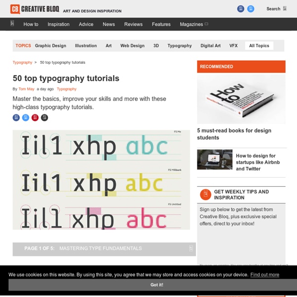
Typography tutorials and best practices
Typography forms a large part of any designer’s learning curve. Thanks to the internet all available information is at your fingertips. There are a lot of tutorials available that are easy to follow and relevant to learning typography skills.
The freelancer's guide to cash flow management
An ex-freelance writer, I appreciate how infuriating the financial side of freelancing can be. At times your flush, at others you’re crushed, forced to turn over settees and flail around for cash. A lack of marketing, a loss of a client, mere bone idleness on your part - there’s a number of things that can fuel a famine in your finances, but, more often than not, poor cash flow management will shoulder most of the blame. In-house at an accountancy firm for just over a year now, I’ve seen how integral good cash flow management is to a freelancer’s success. So, drawing upon my own experiences and some of the office expertise, here’s a brief course in cash flow management for any of you freelancers being crippled by a lack of cash... Read all our career-related posts here
Typography
The 15 Punctuation Marks in Order of Difficulty Ever wonder why you can’t figure out when and where to stick a comma? It’s probably because commas, by far, have more rules and applications than any other punctuation mark. But why do so many people use the semicolon incorrectly? Comparatively, it should be one of the easiest punctuation marks to master.
Type Worship
Colourful messages transform the winding favela streets Earlier this year Boa Mistura, an urban art collective formed in Madrid, worked on a vibrant community project near São Paulo, Brazil The collective worked with the children and other residents of Brasilândia Vila, a poor suburb on the outskirts of São Paulo, to fill the narrow streets with colour and words: beleza, amor, doçura, firmeza and orgulho (beauty, love, sweetness, firmness and pride). These one-point perspective messages are carefully painted to reveal themselves to passers-by as they reach a certain part of the the street. The smiles of the participants clearly say it all. I Like It.
A Crash Course in Typography: The Basics of Type
Typography could be considered the most important part of any design. It’s definitely among the most important elements of any design project. And yet it’s often the part of a design that’s left for last, or barely considered at all. Designers are often intimidated by typography, which can result in bland typographical design or a designer always using one or two “reliable” typefaces in their designs.
How to create mood boards: 40 pro tips and tools
When trying to convey a design idea to win pitches and get an early sign-off, moods, feelings and visions can be difficult to communicate verbally. So designers will often use mood boards: a collection of textures, images and text related to a design theme as a reference point. Mood boards help others to 'get inside our heads' as they show what you're thinking and feeling about a creative idea and your intended vision for a piece of work. Get Adobe Creative Cloud now
Trends: Going Bigger with Typography
I like big type and I cannot lie … OK, that’s not exactly how 1990s rap anthem by Sir Mix-a-Lot goes, but you get the idea. Big typography is trending in a major way. And that’s a good thing. The point of text in your design is to be read.
25 New Fonts for Graphic & Web Designers - Download Now
Russell Brown: Tips and Techniques for Using Tilt Shift, Iris Blur, and Field Blur in Photoshop CS6 Robots of Brixton Origins - A Beautiful 3D Animated Short Film
My Favorite Illustrator Trace Settings to Vectorize Lettering - Every-Tuesday
If you love lettering – whether it’s on paper or an iPad, you’re probably familiar with how powerful your lettering becomes when it’s vectorized. Vectorization allows your lettering to be infinitely rescaled without losing quality. This means it can be put on anything, at any size and look as great as the day it was drawn.