A history and some revival fonts < The Fell Types
The Fell Types took their name from John Fell, a Bishop of Oxford in the seventeenth-century. Not only he created an unique collection of printing types but he started one of the most important adventures in the history of typography. You will find here a non-exhaustive history and a modern digitization of some of them.
Edward Tufte’s “Slopegraphs”
After you read this post, you’ll probably want to check out the follow-up, A Slopegraph Update. Back in 2004, Edward Tufte defined and developed the concept of a “sparkline”. Odds are good that — if you’re reading this — you’re familiar with them and how popular they’ve become.
Branding, graphic design, typography and web design
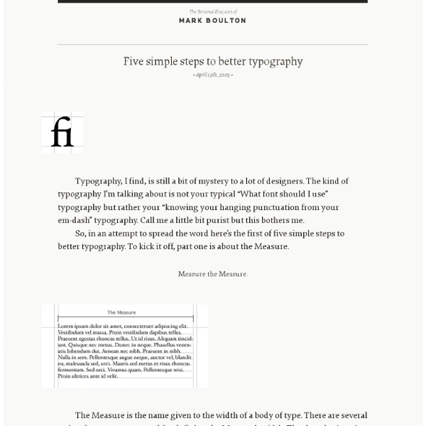
I put the call out on Facebook and Twitter recently to see which typographers and calligraphers were inspiring people at the moment. The results were interesting, because very few of them were “typographers” in the true sense of the word, in that, they don’t “arrange typefaces for print”. What they do, is actually use typographic forms in an artistic, or “illustrative” way. In fact, I was interested to see there are very few recognisable typefaces amongst the works of these artists at all, most of them preferring to hand draw their own letterforms from scratch. I want to thank everybody for their suggestions. I’m flattered to say I was among the suggestions, as well as a few people I love and admire, and quite a few I had never heard of, so sit back and enjoy.
Superheroes and villains recreated with typography
We've seen plenty of design tributes to our favourite superheroes and villains of late. From making stunning use of negative space to postcard portraits, it's clear that comic book icons are providing a ton of inspiration for new design concepts. Here, Moldova-based artist Midu1995 has illustrated various superheroes and villains with typography. Showcasing the likes of Batman, Iron Man and Bane, he uses words that are often attributed to the character, arranging them until it forms the silhouette.
The Walden Font Co. - Purveyors of old and historic fonts and clip-art
Welcome! We resurrect old typefaces of historical importance and make them available to you. Each font package includes typefaces unique to their period, plus printer's ornaments, borders, and symbols. It's everything you need to create period pieces for advertising, business use, book design, educational, and recreational purposes. You've seen our fonts featured in National Geographic Books, ESPN Magazine, book covers, in-store ads, concert posters and many other places. Browse our selection below and see for yourself why for over 10 years Walden Font Co. is the premier source for historical fonts!
Vox-ATypI classification
In typography, the Vox-ATypI classification makes it possible to classify typefaces in eleven general classes. Devised by Maximilien Vox in 1954, it was adopted in 1962 by the Association Typographique Internationale (ATypI) and in 1967 as a British Standard, as British Standards Classification of Typefaces (BS 2961:1967), which is a very basic interpretation of the earlier Vox-ATypI classification. Originally a ten-part classification, Vox revised his original proposal within months to a more compact nine-part scheme.
Rare Type Specimens at the Open Library (2012 update)
Collecting rare specimen books from type foundries can be a really expensive hobby. Luckily there is a growing number of digitized type specimen books available online. The Open Library project offers a free and enjoyable way to browse in those books. The magnifying glass isn’t working yet, but you can download most of these type specimen as PDFs with a sufficient resolution.
Periodic Table of Typefaces on the Behance Network
Large original English version HERESpanish version HEREPortuguese version HERE PRINTS, SOURCE FILES, and other Periodic Table of Typeface related goodies are available HERE The Periodic Table of Typefaces is obviously in the style of all the thousands of over-sized Periodic Table of Elements posters hanging in schools and homes around the world. This particular table lists 100 of the most popular, influential and notorious typefaces today. As with traditional periodic tables, this table presents the subject matter grouped categorically.
Fonts : Type topics: Glossary
This section provides a small glossary of terms frequently used in the type world. alignment The positioning of text within the page margins.
Free fonts!
Font squirrel is a site dedicated to finding only the best commercial-use free fonts... "Free fonts have met their match. We know how hard it is to find quality freeware that is licensed for commercial work. We've done the hard work, hand-selecting these typefaces and presenting them in an easy-to-use format."
Magazine columns and their layout options
Columns are essential tools to standardize your layout. They will help you in getting order and structure of your magazine, but do resist to imprison your thinking into standard format because rigidity dulls the creativity. To avoid that trap you can play with column width and shapes.
Worthe Numerals
Worthe Numerals come out of a time-tested development cycle where House Industries employees ask “What if this could be just a little more...”. After pushing traditional didot forms to the limit, these digits were originally applied to a set of wood blocks. But, who says replenishable Michigan-grown basswood should have all the fun?