background preloader

Beginner-web-design-tutorials
Beginner-web-design-tutorials
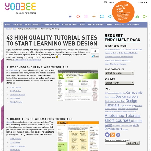
If you want to start learning web design and development any time soon, you can start from these high quality resources. Most of the sites have been around for a while, have accumulated numerous tutorials on various topics on HTML/CSS, Photoshop, PHP/MySQL, Javascript/jQuery/AJAX and Flash. Start learning or polishing off your design skills now Add This Post to Your Delicious 1. At W3Schools, you can study everything you need to learn, in an accessible and handy format. 2. Yoobee Online now offer their introduction to HTML & CSS short course online. Introduction to HTML5 & CSS3 3. Quackit teaches beginners how to create websites. 7. HTMLlite will show you how to easily create web pages with your favorite text editor. 9. Tutorials on EchoEcho are structured into three sections. 10. Sergey Gribov‘s website offers a quick start on web technologies. 11. Jessett covers such topics as usability, graphic design, html, css, dhtml and more. 19. 20. 22. 25. HTML Tutorial 27. CSS Tutorial 28. 34. 41.

Why Users Fill Out Forms Faster with Top Aligned Labels | UX Movement by anthony on 09/01/10 at 3:48 pm Imagine a user who is really excited about your product or service. They’re ready to sign up, so they go to your form page and start filling out their information. The way you align your labels with your form fields can affect how easy it is for users to fill out the form. Do you want to give users a quick, easy and painless experience or do you want to give them a hassle? If you want to make their experience quick, easy and painless, consider using top aligned labels for your form fields. Top aligned labels are faster and easier to fill out than left or right aligned labels. The only drawback with top aligned labels is that they can make the form long. The difference is clear.

Design A Fresh Blog Theme On The 960 Grid CSS Frameworks Up until a couple of weeks ago I never really understood the fascination with using CSS frameworks in web design. They just seemed very limiting and boring. Then I used one. If you have been hesitant to give CSS frameworks a try for similar reasons, I suggest you at least give them a fair shake before you write them off completely. Introduction In this tutorial I’ll show you how to mock up a fresh looking blog theme in Photoshop that is designed to be used within the 960 framework. The Files In order to help you follow along and learn the techniques in more depth, below is the PSD file and a full size preview. Step 1 In some of my past Photoshop mockups and noticeably so for this project, Photoshop has a tendency to fade out colors like they’ve been through the wash too many times. We are going to use the 960 photoshop template that is provided in the download. Step 2 Step 3 Grab the logo you are going to use. Step 4 Step 5 Drop in some text into your search box. Step 6 Step 7

Gimp-tutorials.net - Gimp , tutorials , brushes , downloads, forum. the mystery of css float property Advertisement Years ago, when developers first started to make the transition to HTML layouts without tables, one CSS property that suddenly took on a very important role was the float property. The reason that the float property became so common was that, by default, block-level elements will not line up beside one another in a column-based format. The CSS float property allows a developer to incorporate table-like columns in an HTML layout without the use of tables. In this article, we’ll discuss exactly what the float property is and how it affects elements in particular contexts. Definition and Syntax The purpose of the CSS float property is, generally speaking, to push a block-level element to the left or right, taking it out of the flow in relation to other block elements. Flickr photo by presentday The effectiveness of using floats in multi-columned layouts was explained by Douglas Bowman in 2004 in his classic presentation No More Tables: No More Tables Syntax Float in Practice

Web Developers Handbook | CSS, Web Development, Color Tools, SEO, Usability etc. Vitaly Friedman's The Web Developer's Handbook creativity | css galleries & showcases | color tools | color schemes, palettes | color patterns | fashion: colors selection | color theory | royalty free photos | css daily reading | web design daily reading | css layouts | css navigation menus | css techniques | css: software & Firefox Extensions | css-web-tools & services | html-web-tools & services | accessibility checkers | miscellaneous tools | ajax | javascript | DOM | fonts | typography | RSS | CMS | blogging | specifications | usability & accessibility | add a link (free) | seo tools | seo references | howtogetthingsdone | freelancers resources | web2.0 | 2read Advertise here! creativity css: selected showcases css galleries & showcases color tools color schemes, palettes color patterns fashion: colors selection color theory royalty free photos specifications usability & accessibility add a link (free) seo tools seo references howtogetthingsdone freelancers web 2.0 2read: this week

10 Rock Solid Website Layout Examples Keeping It Simple Page layout is equal parts art and science. Creating something that’s visually attractive and unique takes an artist’s eye. However, there are several very easy to follow guidelines that you can use to create solid layouts that work for any number of cases. Designers often stress out far too much about the layout process. In this article we’re going to take a look at ten very common layouts that you can find on countless sites across the web. If you’re a web designer, bookmark this page and come back the next time you get stuck laying out a page. Three Boxes This is probably the most simple layout on the list. The three boxes layout features one main graphic area followed by two smaller boxes underneath. The silhouetted shapes along the top are areas that can be used for logos, company names, navigation, search bars and any other informational and functional content typically on a website. In the Wild Simple, effective and attractive. 3D Screenshots Advanced Grid Five Boxes

Photoshop Text Effects Tutorials on Tutorial Outpost - Photoshop Tutorials, Flash Tutorials, and more! Using Adobe Photoshop software learn how you can design cool 3 dimensonal floral text effects. This effect is great for a number of different applications such as logo design for a florist or any plant/gardening related business. Summary of tutorial steps: Step 1: Create the 3D text Step 2: Create a new Document Step 3: Bring the 3D text to Photoshop Step 4: Adding Color to the text Step 5: Adding Contrast to the Image Step 6: Making the Color Little Bit Dull Step 7: Adding Filter Effects Step 8: Making Selection of Same Color on Top of the Text Step 9: Filling the Selection Step 10: Adding Drop Shadow Step 11: Clear Finishing for Drop Shadow Step 12: Shadow Adjustment Step 13: Finished Image Step 14: Installing Brush in Photoshop In this tutorial, you will learn how to create a brick text with some simple effects. It is very suitable for beginner. Click here to view the full tutorial. Create an impressive magma text effect with just a few simple steps. Click here to view the full tutorial.

Texting before bed can make teens even moodier By Daniel Bates Updated: 12:06 GMT, 8 November 2010 Children who text and email late at night may be damaging their health. Teenagers and children who send electronic messages after they have been sent to bed may have poorer quality sleep and become moody, a study found. Those who were unable to put their phones or laptops to one side were also more likely to be anxious and depressed or suffer learning difficulties. Distraction: Across both sexes, emails and texts woke them up once a night on average and a worrying 77 per cent had persistent trouble getting to sleep The U.S. researchers said that unlike watching TV, which is a largely passive activity, sending emails and texts involved more interaction so kept the brain busy at the time when it should be shutting down. The pilot research team from the JFK Sleep Centre in Edison, New Jersey, gave questionnaires to 40 people aged between eight and 22, asking about their sleep habits and use of texts and emails.

How to create a colorful business web layout | Ultimate Designer Toolkit How to Create a Colorful Business Layout – Tutorial Already a member? This step by step tutorial will teach you how to create a colorful business layout. If you’re a member, you can download the PSD Layout for this tutorial at the bottom of the page. Before I begin this tutorial, I want to tell you about our 60,000+ premium design items package, which you will be able to download instantly and use in your own or client designs. Become a member of Ultimate Designer Toolkit before you proceed to get instant access to all of them and design like a pro. Now to begin this tutorial, we will need to create a new document. I will select Rectangle Tool, and i will make a big gray shape. Then for this shape i will add the following layer styles. In the middle of the previous shape i will add another one but this time i will use Rounded Rectangle Tool. Also for this image i will add some layer styles. Under the big image with this nice colorful layout i will create 4 different shapes.

50 Totally Free Lessons in Graphic Design Theory | Psdtuts+ - StumbleUpon 1,200+ courses and ebooks Design, code, video editing, business, and much more. Adobe Photoshop, Illustrator and InDesignGraphic, Logo and Print DesignSketch, Adobe XD & FigmaWordPressJavascript, PHP & PythonAdobe After Effects & Premiere ProMuch More Millions of creative assets Design templates, stock videos, photos & audio, and much more. Graphic TemplatesStock PhotosMusic TracksVideo TemplatesWeb TemplatesDesign AssetsWordpress Themes & PluginsMuch More 1,200+ courses and ebooks Design, code, video editing, business, and much more. Adobe Photoshop, Illustrator and InDesignGraphic, Logo and Print DesignSketch, Adobe XD & FigmaWordPressJavascript, PHP & PythonAdobe After Effects & Premiere ProMuch More Millions of creative assets Design templates, stock videos, photos & audio, and much more. Graphic TemplatesStock PhotosMusic TracksVideo TemplatesWeb TemplatesDesign AssetsWordpress Themes & PluginsMuch More

PDFs Become Contextually Amazing With Scribd's Apture Integration The Portable Document Format, or .PDF, sometimes feels silly these days - doesn't it? Sure, they are often pretty - but they feel so static and inflexible. No more! With the new integration of contextual search tool Apture, HTML5-powered PDF viewing and sharing community Scribd now offers a radically new way to read PDFs. Above, you can see an image of my screen while reading a PDF titled The Internet of things: Networked objects and smart devices. "Reading has been a flat experience for thousands of years," Scribd CEO Trip Adler said about the partnership. Those are strong words, but really - the user experience is there and remarkable. Apture Highlights on Scribd from Tristan Harris on Vimeo. ReadWriteWeb uses Apture as well - try it out here by highlighting any word or phrase on any page. Most of the time right now I read PDFs on my iPad.

How to Design a Clean Business Website with Photoshop The focus of this template is on a design agency that offers a range of web-based services. The primary aim of the page we’re designing, therefore, is to promote what the business does and what services they provide. This is the first part of a tutorial on building a clean business website. This first part will focus on creating the design in Photoshop, and in the second part, will focus on converting the PSD outcome to a working XHTML template. "Clean Business Website" Series Final Result Here’s a screenshot of the design we’ll be creating. Overview In this tutorial, I’m going to assume that you have a basic understanding of Photoshop and know how to do basic tasks such as adding text, drawing shapes, and resizing/rotating objects. My goal in this walkthrough is to show that you don’t always need lots of fancy effects in a design to make a nice-looking template. The design we’re going to build has a header that contains the name of the company and the navigation area. Create the Document

These PowerPoint Experts Can Make You a Star & The Rapid eLearning Blog Sometimes we get so busy that we lose sight of the great resources available to us. It’s not until you pull your head up from your desk and look around that you realize what’s available. That’s why it’s important to be connected to other people who have similar interests or do similar work. You’ll learn from them and have access to all sorts of information. If you think about it, there’s really not much that you know (if anything) that you didn’t learn from someone else or because of someone else. Last week I was at PowerPoint Live 2009 in Atlanta where I spent some time with people in the PowerPoint community. Today, I’d like to share a little of what I learned from the PowerPoint community and provide some great resources and tools that will help you do a better job building your elearning courses. The Community Inspires New Ideas PowerPoint MVP Glen Millar shared quite a few animation tips. Free Software PowerPoint MVPs Microsoft PowerPoint Help & Resources The Rapid E-Learning Blog

20 Free Social Media Icon Sets For a More Shareable Website If your blog needs a face lift, the creative types who power the web are here to help. Sometimes a few well-designed, tastefully placed icons can add a little class or creativity to an otherwise neutral theme. Social media links, which we'd argue are a priority for any blog, are a great opportunity to add some texture. You could always roll with the standard-issue glossy, rounded-edge fare, but for those who want to distinguish themselves, there are more creative options out there. To help, we've rounded up some of the most impressive works of social icon art circulating the web lately. If you use a fun icon set that didn't make our list, be sure to share the wealth in the comments section. 1. You don't need a "science" blog to take advantage of these lovely beakers. 2. These are just too cute to pass up. 3. These ice cubes are less practical, but they're so nicely rendered we had to include them. 4. 5. 6. There's something about the texture of these swatches that draws the eye. 7. 8. 9.

Related: