
Native Responsive Images. How It All Began Our story starts in ancient times, when WURFLs roamed the wilderness, and mobile-only websites were a thing.

In these times, a developer that wanted to provide access to his website to mobile users created a simpler, dumbed down version of the “real” website, and served that based on UA detection. As you surely know, the proliferation of devices with numerous viewport dimensions and many different capabilities called out for a better way to target mobile (and not-so-mobile) users. Responsive Web Design combined new browser capabilities and CSS techniques to create websites that adapt to the device displaying them, and look ideal everywhere. That enabled developers to stop worrying about unreliable device detection and think of their websites in terms of viewport dimensions.
But, even though RWD sites looked different on each device, underneath, most of them continued to download the same resources for all devices. But, hold on a minute. Responsive Images: Use Cases and Documented Code Snippets to Get You Started. Introduction Finally, true responsive images are becoming a reality on the web — in pure HTML, without convoluted hacks.
The <picture> element and a couple of new attributes for the <img> element are behind a flag in Chromium 37 and shipping in Chromium 38 (so coming soon in Opera), in Firefox Nightly and are being implemented in WebKit (although it remains to be seen if Apple will ship it in the next version of Safari). The new <picture> element can be verbose and confusing, because it solves a range of use cases. To help you match your requirements to the responsive image syntax, we’ve prepared this article full of examples. Four questions. Picturefill. ResponsiveImages.org. Ronan Levesque – Responsive design : adoptez un process intelligent ! Tutoriels et Articles sur le Design Responsive. ReSmush.it > the 3 Billion (and still free) Image optimization API.
Smush.it! Responsive Images: If you're just changing resolutions, use srcset. By Chris Coyier On September 30, 2014 responsive images If you're implementing responsive images (different images in HTML for different situations) and all you are doing is switching between different versions of the same image (the vast majority of usage), all you need is the srcset attribute on the <img>.
Gaze upon this easy syntax: It's not just the syntax that is easy, it does a better job than <picture> with <source>s with explicit media attributes (we'll cover why in a moment). Plus it has the opportunity to be much better in the future with browser settings and browser improvements. I've screencasted about this before, but it clicked better watching Mat Marquis's talk at An Event Apart Austin and with Jason Grigsby's post. #With srcset, the browser does the work of figuring out which image is best In the simple example above, all we're doing is telling the browser about some images that we have available and what size they are. The browser goes: Now another browser visits the site.
Ajouter des images responsive à une page web - Apprendre le Web. Dans cet article, nous allons préciser le concept d'images adaptatives — images qui s'adaptent aux appareils selon les différentes tailles d'écran, résolutions et autres caractéristiques de ce type — et examiner les outils fournis par HTML pour faciliter leur mise en œuvre.
Responsive Images 101, Part 1: Definitions. Over the last few years, we’ve written a quite a few articles about responsive images.
Now that responsive images have landed in browsers, it seemed like a good time to step back and cover the basics for those who are just starting to tackle responsive images. Ergo, a new series of articles called Responsive Images 101 that will cover everything from why we need responsive images to how to pick the right responsive images solution. Let’s dig in! Picturefill. FlexNav - A jQuery Plugin for Responsive Menus. A Device-Agnostic Approach to Complex Site Navigation The mock navigation you see above is a mobile-first example of using media queries and javascript to make a decent site menu with drop downs.
Special attention is paid to touch screens using touch events with tap targets (the key feature of FlexNav). This is something I use to test different navigation techniques and may change as I iterate over different solutions to the problem. Basically I want a simple model to build upon when working on sites from scratch. Sidr - Berriart. You will be able to create multiple sidrs on both sides of your web to make responsives menus (or not, it works perfectly on desktop too).
It uses CSS3 transitions (and fallbacks to $.animate with older browsers) and it supports multiple source types. Get started Like any other plugin, you must include it after the jQuery script. For a better performance load them at the bottom of your page or in an asynchronous way. You have to include a Sidr Theme stylesheet too, choose between the dark or the light one, or if you prefer create one by your own. Responsive Nav — Responsive Navigation Plugin. Liquidapsive (Liqui-dap-sive) Patterns and Resources for Responsive Web Design. Responsive Design. I don't think that word means what you think it means. ON 25 MAY 2010, when Ethan Marcotte coined the phrase “responsive web design,” he defined it as using fluid grids, flexible images, and media queries to deliver elegant visual experiences (e.g. layouts and type treatments) that accommodate the reality of our post-iPhone, post-Android, post-iPad digital landscape: Rather than tailoring disconnected designs to each of an ever-increasing number of web devices, we can treat them as facets of the same experience.
We can design for an optimal viewing experience, but embed standards-based technologies into our designs to make them not only more flexible, but more adaptive to the media that renders them. Ethan expanded his vision in Responsive Web Design, a book I consider so important I published it. I and many others think it is a landmark book, an evolutionary milestone in the development of web and interaction design as a practice and as an industry. I understand well why Ethan favors his fluid grid/flexible image approach. Taille des écrans, responsive design, et point de rupture. Prévoir un site pour toutes les résolutions (design fluide)
La question des dimensions idéales d'un site est souvent posée.

Responsive Web Design Online Testing - isResponsive. Responsive Image Breakpoints Generator by Cloudinary. The Responsive Image Breakpoints Generator. By Robin Rendle On responsive images Direct Link → Nadav Soferman has written a great post about the common mistakes that can be made when developers attempt to make images responsive: Whichever responsive design solution or framework you choose, you still need to generate and deliver multiple versions of each image.
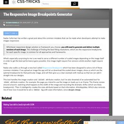
The challenge of finding the best fitting resolutions, which are the responsive breakpoints for each specific image, is common for all approaches and frameworks. What’s especially surprising to me is we need to serve a different number of scaled images depending on the image itself in order to get the best performance gains possible. Responsive Images in CSS. The term "responsive images" has come to mean "responsive images in HTML", in other words, the srcset and sizes attribute for <img> and the <picture> element. But how do the capabilities that these things provide map to CSS? CSS generally wasn't really involved in the responsive images journey of the last few years. That's for good reason: CSS already has the tools. Responsive images was, in a sense, just catching up to what CSS could already do.
Let's take a look. Responsive Images 101, Part 1: Definitions. Picturefill. Responsive design : le viewport. Comme nous l’avions évoqué précédemment lors de l’introduction des Media Queries, ces dernières ne font pas tout dans le responsive design et ainsi, on peut constater que sur pas mal de smartphones (par exemple), les Media Queries ne semblent avoir aucun effet… Ce qui peut paraître étrange et surtout extrêmement gênant : si on fait tout ça, c’est surtout pour les mobinautes, après tout ! Responsive Web Design just got Easier with the Responsive Grid System.
6 outils gratuits pour tester un site web responsive - Blog Tuto.com. Aujourd’hui, tout site se doit d’être responsive. Comprendre le Viewport dans le Web mobile. Le Viewport désigne schématiquement la surface de la fenêtre du navigateur. Cependant, la notion de viewport sur un appareil mobile est différente de celle sur un écran de bureau: sur mobile, le navigateur ne dispose pas de "fenêtre" réelle, ni de barres de défilement car tout est prévu pour naviguer de manière tactile. Know your mobile device (pixel-ratio, CSS width, features) ResponsiveImages.org. Responsive Web Design · An A List Apart Article. Responsive Images 101, Part 1: Definitions - Cloud Four. Responsive Data Table Roundup. By Chris Coyier On responsive tables There has been a bunch of takes on responsive data tables since I first published about it.
The idea of the original was to abandon the grid layout of the table and make each cell its own line. Each of those lines is labeled with a pseudo element. This creates a much taller table, requiring more vertical scrolling, but does not require horizontal scrolling. It's easier to browse the data without losing context of what's what. Mobifreaks published a very similar idea, which uses the same layout change and pseudo element labeling.
Derek Pennycuff took the original and applied the "mobile first" concept. Drew Dyksterhouse made a demo that calculates where the table should break by measuring if the table has become wider than the screen, then saving that breakpoint for efficiency. Scott Jehl cooked up two clever ideas. Pretty cool, but clearly all tables can't be converted into charts. Responsive Images Done Right: A Guide To And srcset. Advertisement Many companies try to create a great experience for customers. But few are willing to make the changes required to deliver on that promise. In fact most don’t even realize just how bad their experience can be. This is why we made a new book called “User Experience Revolution,” a practical battle plan for placing the user at the heart of your company. Get the book now! Images are some of the most important pieces of information on the web, but over the web’s 25-year history, they haven’t been very adaptable at all.
“Everything I’ve said so far could be summarized as: make pages which are adaptable.… Designing adaptable pages is designing accessible pages. HTML authors began to really feel these limitations when high-resolution screens and responsive layouts hit the web like a one-two punch. Responsive Web Design · An A List Apart Article. The English architect Christopher Wren once quipped that his chosen field “aims for Eternity,” and there’s something appealing about that formula: Unlike the web, which often feels like aiming for next week, architecture is a discipline very much defined by its permanence. Article Continues Below A building’s foundation defines its footprint, which defines its frame, which shapes the facade.
Responsive Web Design. Responsive Grid System. Picturefill. Responsive Image Breakpoints Generator by Cloudinary. Responsive design & mobile first. Responsive Images 101, Part 1: Definitions - Cloud Four. Patterns and Resources for Responsive Web Design. OOCSS/Atomic CSS are Responsive Web Design ‘anti-patterns’ – Ben Frain. 655Days 655 days since this post was last revised. Specific details are likely out of date. For many months now, in response to many failed attempts to find a suitable approach to scaling the CSS on the projects I work on, I have been using ‘ECSS’, my own Frankenstein approach to large-scale CSS architecture. It’s detailed more fully in the post, Enduring CSS: writing style sheets for rapidly changing, long-lived projects. Subsequently, in this post, I’m about to argue that an OOCSS architectural approach to a large scale, rapidly changing responsive web site or application is an ‘anti-pattern’.
This isn’t an attack on OOCSS, Atomic CSS or any related single responsibility principle (SRP) approaches. Writing CSS is easy. It’s therefore important to consider the problems that you have. For me, the two biggest problems with an OOCSS approach are: Ultra simple Responsive navigation snippets. Les fondations du responsive design - Applications. Dans cet article, nous allons discuter des principales composantes essentielles de la conception adaptée, avec des liens vers des informations suppléméntaires si nécessaire. Pour les développeurs web, il est maintenant assez commun d'être appelé pour créer un site web ou une application qui change son interface utilisateur en fonction du navigateur ou du dispositif accédant au site, pour fournir une expérience optimisée. Responsive Design Knowledge Hub. Top 10 Responsive Web Design Tutorials.
The use of mobile devices such as iPad, iPhone and other smart phones has increased a lot in the last few years and this represents the main reason why responsive web design started to gain more importance in web design. A responsive website is one that can easily adapt its layout and design to fit in any device resolution. In this post I share with you 10 useful responsive web design tutorials which I’m sure will help you better understand this concept and design more complex websites. If you’d like to get some responsive web design inspiration, read the following articles: 10 Incredible Examples of Responsive Web Design , 10 Amazing Responsive Image Galleries and 10 Amazing Responsive WordPress Themes .
Responsive Web Design for Beginners. Mobile vs. Responsive Websites - Which One Is Better? When you visit websites on different devices, you often get confused that some sites have mobile design and others have responsive design. 20 Really Helpful Responsive Web Design Tutorials. 20 Responsive Menu Tutorials with Free Scripts. Responsive designs are more and more frequently used today. Many people started using mobile devices, like smartphones or tablets, to browse the internet, and thus, having a fully responsive website is a must! 10 Amazing Responsive Image Galleries. CSS3 Multiple Columns and Responsive Design. Advanced Responsive Design Techniques. Ish. yet another viewport resizer. Am I Responsive? Responsive Design Knowledge Hub.