
Fluid Width Video. IN A WORLD of responsive and fluid layouts on the web ONE MEDIA TYPE stands in the way of perfect harmony: video.
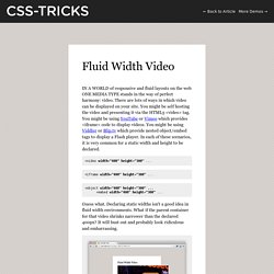
There are lots of ways in which video can be displayed on your site. You might be self hosting the video and presenting it via the HTML5 <video> tag. You might be using YouTube or Vimeo which provides <iframe> code to display videos. You might be using Viddler or Blip.tv which provide nested object/embed tags to display a Flash player. In each of these scenarios, it is very common for a static width and height to be declared. <video width="400" height="300" ... <iframe width="400" height="300" ... <object width="400" height="300" ... Guess what. So can't we just do this? <video width="100%" ... Well, yep, you can. <iframe> Video (YouTube, Vimeo, etc.) Our little 100% width trick isn't going to help us when dealing with video that is delivered via iframe. Fortunately there are a couple of possible solutions here. But, but... aspect ratios, legacy content, non-tech users, etc.
Display resolution. This chart shows the most common display resolutions, with the color of each resolution type indicating the display ratio (e.g. red indicates a 4:3 ratio).
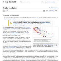
The display resolution or display modes of a digital television, computer monitor or display device is the number of distinct pixels in each dimension that can be displayed. It can be an ambiguous term especially as the displayed resolution is controlled by different factors in cathode ray tube (CRT) displays, flat-panel displays (including liquid-crystal displays) and projection displays using fixed picture-element (pixel) arrays. It is usually quoted as width × height, with the units in pixels: for example, "1024 × 768" means the width is 1024 pixels and the height is 768 pixels. This example would normally be spoken as "ten twenty-four by seven sixty-eight" or "ten twenty-four by seven six eight". Considerations[edit] 1080p progressive scan HDTV, which uses a 16:9 ratio Interlacing versus progressive scan[edit] Current standards[edit] Responsive Web Design - partie 3 : Taille d'écran, résolution et media-queries.
Nous allons voir ici comment mettre en oeuvre le Responsive Web Design en fonction de la taille et de la résolution l'écran des principaux appareils du marché.

Le module CSS3 Media Queries permet d'adapter le rendu des pages en se basant sur des conditions comme la résolution d'écran. Les Media Queries constituent donc la brique essentielle à la mise en oeuvre du Responsive Web Design (RWD). Vocabulaire La définition : Le nombre de pixels en largeur x le nombre de pixels en hauteur. Exemple : 1920 x 1080La résolution : Le nombre de pixels par unité de longueur, exprimé en PPI (Pixels Per Inch) ou en DPI (Dot Per Inch). Définition des écrans courants On trouvera ici : une liste d'appareils avec leur définition et leur résolution. Un graphique qui résume pas mal de choses ... Compatibilité des Media Queries Les Media Queries sont une recommandation du W3C depuis Juin 2012. Le principe général Prendre de bonnes résolutions Contexte : Télévision connectée. Responsive Boilerplate Framework. The difference between responsive and adaptive web design - Marketing Cloud Blog. When working with customers and developing scopes for projects, we often present two options for web design: responsive design and adaptive design.
The two are commonly confused, and some may refer to responsive as a subset of adaptive technologies. Therefore, it’s helpful to make sure all parties involved are using the same terminology when talking about site implementation. Understanding the key differences between responsive and adaptive design will keep everyone on the same page and help you select the best approach for your project. Responsive vs. adaptive True responsive design is fluid, using CSS3 media queries to respond to any screen sizes. Adjust the browser size of this responsive website to see how the page contents responds. A Flexible Grid With responsive design, the use of media queries also opens up a range of options that allow for layouts (along with colors, images, fonts and text styles) to change based on screen size.
Adaptive Layout Deciding on the proper approach. [Traduction] Adaptive VS Responsive Design : quelle est la différence ? La différence entre le “Responsive Webdesign” et ce qu’on appelle “Adaptive Design” ou “Design Adaptatif” n’est pas forcément facile à saisir.
![[Traduction] Adaptive VS Responsive Design : quelle est la différence ?](http://cdn.pearltrees.com/s/pic/th/traduction-responsive-71301170)
Viljami Salminen dans son article Adaptive vs. Responsive, what’s the difference? Donne une explication assez claire, dont je vous propose la traduction aujourd’hui avec son autorisation. Il semble y avoir confusion entre ces deux termes et leur signification. Je vous propose donc mon avis sur le sujet ainsi que quelques liens annexes pour continuer vos lectures. SlickNav - Responsive Mobile Menu Plugin for jQuery.