
Picturefill. The picture element and associated features are W3C standard HTML features that allow web developers to deliver an appropriate image to every user depending on a variety of conditions like screen size, viewport size, screen resolution, and more.
Picturefill is a JavaScript file (or a polyfill to be more specific) that enables support for the picture element and associated features in browsers that do not yet support them, so you can start using them today! Picturefill is developed and maintained by , with help from the members of the Responsive Issues Community Group and the developer community at large. For Picturefill version 2, a special thanks goes to Shawn Jansepar for all his work on polyfilling the new spec. Contributing, Bug Reports, and More information. Website design - Best practices for full width browser images? There are several things to keep in mind when serving images to viewers.

Keep the image ratio the same as the original dimensions We do this to prevent the image from getting skewed and to prevent images from being blurry. Simple Responsive Images With CSS Background Images – Smashing Magazine. Editor’s Note: This article features just one of the many, suboptimal solutions for responsive images.
We suggest that you review different approaches before choosing a particular responsive image solution, including these two: How To Avoid Duplicate Downloads In Responsive Images1 and Choosing A Responsive Image Solution2. With all the talk of new HTML5 standards such as the srcset3 attribute and <picture>4 element, as well as server-side techniques such as Responsive Web Design + Server Side Components5 (RESS), you'd be forgiven for concluding that simple, static websites can’t support responsive images today. That conclusion might be premature, however. In fact, there’s an easy, straightforward way to deliver responsive images that’s supported by all of today’s Web browsers: CSS background images. Responsive Image CDN with 75% smaller file sizes. Choosing A Responsive Image Solution. If you code websites, it’s a good bet that at least one of your clients has asked about or requested a mobile-friendly website.
If you go the responsive design route (whereby your website is flexible enough to adjust visually from mobile to desktop widths), then you’ll need a strategy to make images flexible, too — a responsive image solution. The basics are fairly simple to learn, but once you’ve mastered them, you’ll find that scaling images is only the beginning — you might also have performance and art direction conundrums to solve. You’ll be faced with a wide field of responsive image solutions to choose from, each with its own strengths and weaknesses — and none of them is perfect! This article leads you through the basics, and then arms you with the information you’ll need to pick the best responsive image solution for your situation.
The Basics. Full screen responsive images mark up. iPhone 6 Screen Size and Mobile Design Tips. February 4th, 2015 by Kyle Larson Apple updated its iPhone a bit ago making the form factor much bigger.
The new iPhone 6 screen size is both wider and taller and the iPhone 6 Plus also has a higher pixel density. This is an update to my previous post about designing websites for the iPhone 5. It’ll cover these new screen sizes and try to clarify how this all works. Responsive Images: If you're just changing resolutions, use srcset. By Chris Coyier On September 30, 2014 responsive images If you're implementing responsive images (different images in HTML for different situations) and all you are doing is switching between different versions of the same image (the vast majority of usage), all you need is the srcset attribute on the <img>.
Gaze upon this easy syntax: Responsive Images Done Right: A Guide To <picture> And srcset. Advertisement Many companies try to create a great experience for customers. But few are willing to make the changes required to deliver on that promise. In fact most don’t even realize just how bad their experience can be. Design - Preparing the images for retina-ready (web) 5 Things I learned designing for high-resolution retina displays. I was lucky enough to receive a 13" MacBook Pro with Retina display for work a few months back.
It's a beautiful device. At first I didn't think it would make a big difference but after using for a day it's hard to go back to other displays. It's like the transition from VHS to DVD or SD to HD. The first website I designed while having the Retina display was Runnable.com and of course I was now more inclined to design for high-resolution screens as I notice the results on a daily basis. Below are just a few techniques I learned while designing for high-res devices. A guide for creating a better retina web - Ivo Mynttinen / User Interface Designer. Preparing the web for a new era of displays.
It’s been almost one year since Apple released the Retina MacBook Pro, the first device produced for the masses that is not a mobile phone or tablet and offers a screen with an incredibly high pixel density. While almost all major apps for OSX have been updated already to appear in a super crisp look, the web still isn’t retina ready at all. Most web designers and developers out there still produce low-resolution content for the web – which is a bad thing, because retina actually matters. Untitled. Mightybytes developer Stephanie Daniels offers a concise explanation of what Retina is, how to make images for it, and why it’s all so darn confusing.
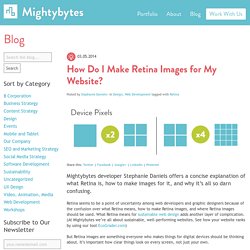
Retina seems to be a point of uncertainty among web developers and graphic designers because of the confusion over what Retina means, how to make Retina images, and where Retina images should be used. What Retina means for sustainable web design adds another layer of complication. (At Mightybytes we’re all about sustainable, well-performing websites. See how your website ranks by using our tool EcoGrader.com) But Retina images are something everyone who makes things for digital devices should be thinking about.