
Adapting To A Responsive Design (Case Study) This is the story of what we learned during a redesign for our most demanding client — ourselves!
In this article, I will explain, from our own experience of refreshing our agency website, why we abandoned a separate mobile website and will review our process of creating a new responsive design. At Cyber-Duck1, we have been designing both responsive websites and adaptive mobile websites for several years now. Both options, of course, have their pros and cons. With a separate mobile website, you have the opportunity to tailor content and even interactions to the context of your users, whereas a responsive website means better content parity2 for users and a single website to maintain.
Main column with sidebar. Patterns and Resources for Responsive Web Design. Media queries — Responsive Web Design. Is responsive design going to work every time?
Is there any chance that it won't be supported in some of the currently used browsers? What an excellent question! Go straight to the head of the class. The support for media queries is like the force. It is strong. Moving forward every new browser release will support media queries in some way, shape, or form however we unfortunately are still in the position where we need to support older browsers. Retina display & pixel density — Responsive Web Design. Retina display and more than single pixel density allows the web to finally surpass the print world and produce content that is even more detailed than high definition television.

Foundation, one of our favourite responsive design frameworks, has an almost unintended side effect for retina displays. Because Foundation won't allow images to be larger than their container (it scales them down to fit the grid) many images are already being scaled down. On a standard display that detail is lost when we scale — on newer iPads and now the new MBP that detail will no longer be lost, meaning we could embed very large images and get all the detail from them (at a huge cost in file size, natch). Likewise, background images can be sized using the background-size property, and you could use very large images that are scaled to 50% size on newer devices and browsers.
Media Queries for Standard Devices. If you think responsive's simple, I feel bad for you son.
We got 99 viewports, but the iPhone's just one. —Josh Brewer, March 10, 2010 A major component of responsive design is creating the right experience for the right device. With a gazillion different devices on the market, this can be a tall task. RWD 1. Making your existing website images responsive — Responsive Web Design. Generally, this works splendidly.
But if you're "reponsifying" an old site, you might find that the authors included the images' heights and widths as attributes in the HTML. You may also find that you need to review every page with in your site and remove the inline widths because in a lot of browsers these values override the CSS. In this case you also have the option of including some jQuery to help get you by until all of the site images are fixed. $('img').removeAttr('width&').removeAttr('height'); Project Lifecycle Process — Responsive Web Design. It takes a lot of time and a lot of planning.
The technique of responsive design is brand new and the implementation is totally different to the way we usually will implement websites. By that definition we need to change the way our internal processes work as well as the client journey through the project. Navigation — Responsive Web Design. Navigation is key for your websites users to be able to find their way around your website.
Navigation within responsive design is unique though because although you need to provide the same navigation options across multiple viewports you have a changing canvas size upon which to do so. In this section we look at the specific requirements on one level, two level, and multiple level navigation options and the kind of navigation that you will be working on depends on your current information architecture. Establishing Design Direction. Design is hard.
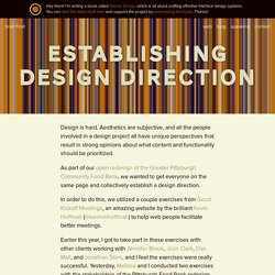
Aesthetics are subjective, and all the people involved in a design project all have unique perspectives that result in strong opinions about what content and functionality should be prioritized. As part of our open redesign of the Greater Pittsburgh Community Food Bank, we wanted to get everyone on the same page and collectively establish a design direction. In order to do this, we utilized a couple exercises from Good Kickoff Meetings, an amazing website by the brilliant Kevin Hoffman (@kevinmhoffman) to help web people facilitate better meetings. Earlier this year, I got to take part in these exercises with other clients working with Jennifer Brook, Josh Clark, Dan Mall, and Jonathan Stark, and I feel the exercises were really successful.
Yesterday, Melissa and I conducted two exercises with the stakeholders of the Pittsburgh Food Bank redesign project. 20 Second Gut Test Exercise The first exercise we conducted is called the 20 second gut test. Mobile First — Responsive Web Design. Mobile first is touted by some really big names in our industry.
Jeremy Keith, Brad Frost, and Mr Mobile First himself Luke Wroblewski has all repeatedly pushed for a mobile first website approach. Strategically it is the way to go. Linear Content By starting mobile first with your responsive website you are able to make the tough decisions about the content. 9 GIFs That Explain Responsive Design Brilliantly. What is responsive design?
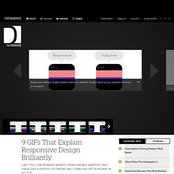
9 GIFs That Explain Responsive Design Brilliantly. What is responsive design? Most people vaguely understand that it refers to websites that work just as well on desktops as they do on smartphones, but there's a lot more to it than that, leading to widespread confusion (heck, I'll admit, I've even been known to misuse it myself, even after fellow Co.Design writer John Pavlus called me a dummy for it). But the principles of responsive design aren't that hard to understand, thanks to this amazing collection of animated GIFs put together by the guys Froont, a San Francisco-based company specializing in making tools for designers to create responsive websites. Spend just a few minutes with these GIFs, and you'll never be hoightily corrected by a design pedant about "responsive websites" versus "adaptive websites" ever again. In fact, you can be that hoighty pedant! The GIFs below show many of the basic principles of responsive designs, with explaining quotes by Froont co-founder Sandijs Ruluks.
The Difference Between Responsive and Adaptive Design. This is a question that comes up more regularly than you might expect. We see it pop up in the CSS-Tricks forums from time-to-time. Responsive design. Helping People Make Mobile Web Experiences. Responsive design. Responsive and Mobile-Friendly Tooltip · Osvaldas Valutis. Responsive Web Design (RWD) – "A new paradigm for rich user experience(UX)" Overview of Traditional web design Web designing is a core part of user interface development. It is a way by which end user interacts with the system in an interactive way. Traditional user interfaces is built using old web design approaches where user experience or usability was not a big concern.
End user was comfortable with UI navigation flow as long as user is able to execute business workflows. JSP, JSF, ASP.net, PHP, HTML’s were the top languages and specifications for UI development. Responsive Data Tables: A Comprehensive List of Solutions. Tables are an important part of HTML. Although they were often used in the past for layout, today they’re mainly used for marking up data. Since the adoption of responsive web design, various approaches have been developed for establishing tables that can scale well in different viewport sizes. In this article, I’ll go over and analyze many of these approaches. Keep in mind that I’ll be focused mostly on the JavaScript-based ones, as I think they offer more options and features compared to the pure CSS solutions.
To make things easier and clearer, this article is full of helpful images and demos. The Basic Markup for Our Table Before diving into the core methods, let’s have a look at the example table that will be used throughout this article to demonstrate the different methods for achieving responsive tables: Note that with the exception of the Foundation example, the styling of this table will be based on Bootstrap’s table styles. Responsive Email Templates.