
Best practices for responsive typography - Degordian Education hub. Start with pixels Every designer and front-end developer is familiar with the one and only px units.
Pixels are fixed-size units used in screen media. One pixel is equal to one dot on the computer screen (the smallest division of your screen’s resolution). The biggest problem with pixel units is that it does not scale upward for visually-impaired readers or downward to fit mobile devices. When you are starting to write your CSS/SCSS, your code might look like this: You could replace existing values with SCSS variables. Placehold.it - Quick and simple image placeholders. Adapter vos sites pour les écrans Retina. De la même manière que le Responsive Webdesign était une tendance débutée en 2011, les écrans à haute définition seront probablement le nouveau challenge de 2012.
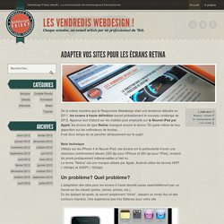
Apparus tout d’abord sur les mobiles puis employés sur le Nouvel iPad par Apple, les écrans de type Retina changent encore la donne. On parle même de leur apparition sur les ordinateurs de bureau. Il est donc temps de se pencher sérieusement sur le sujet! Note technique Utilisés sur les iPhone 4 et Nouvel iPad, ces écrans ont la particularité d’avoir une résolution extrêmement élevée (320 dpi pour l’iPhone et 264 dpi pour l’iPad), rendant les pixels pratiquement indiscernables à l’œil nu. Le terme “Retina” est une marque utilisée par Apple, Android utilise les termes HDPI (~240dpi) et XHDPI (~320dpi). Un problème? L’adaptation des sites pour les écrans à haute densité passe essentiellement par un travail sur les visuels (pictos, icônes, photos, etc.). Voyons maintenant quelques techniques pour gérer au mieux ce type d’écrans. A non-responsive approach to building cross-device webapps. Media queries are great, but...
Media queries are awesome, a godsend for website developers that want to make small tweaks to their stylesheets to give a better experience for users on devices of various sizes. Media queries essentially let you customize the CSS of your site depending on screen size. Before you dive into this article, learn more about responsive design and check out some fine examples of media queries usage here: mediaqueri.es. As Brad Frost points out in an earlier article, changing the look is only one of many things to consider when building for the mobile web. Configurer la fenêtre d'affichage - PageSpeed Insights. Cette règle se déclenche lorsque les analyses PageSpeed Insights indiquent que votre page ne spécifie pas de fenêtre d'affichage, ou spécifie une fenêtre d'affichage qui ne s'adapte pas à des appareils différents.
Présentation L'affichage d'une page Web sur un appareil mobile est contrôlé par une fenêtre d'affichage. Sans fenêtre d'affichage, les appareils mobiles affichent la page comme sur un écran d'ordinateur, en la mettant à l'échelle pour qu'elle s'adapte à l'écran. Comprendre le Viewport dans le Web mobile. Le Viewport désigne schématiquement la surface de la fenêtre du navigateur.
Screen Sizes. Common smartphones and tablets devices values. Meta tag customization (iOS + android) Common smartphones and tablets devices values.
UX Design & Wireframing Tools As Beautiful As Your Work. The 2014 Guide to Responsive Web Design. How to build a responsive HTML5 website - a step by step tutorial. Rating: 8.6/10 (1247 votes cast) Required knowledge level: intermediate In this responsive web design tutorial we will create an awesome responsive HTML5 website starting from scratch.
I tried to include as many different features as possible, so we will be dealing with a jQuery slider, CSS3 transitions and animations, CSS Media Queries and so on. This part of the tutorial will show you the HTML structure and the required scripts in a step by step tutorial. The second part will then show you how to style it using CSS3 features to create this stunning HTML5 cross-browser responsive website. Preview HTML5 responsive website. Browser compatibility list · joshuaclayton/blueprint-css Wiki. Responsive CSS Framework Comparison: Bootstrap, Foundation, Skeleton.
Bootstrap 4.0.0-alpha is a fairly large update to the framework.
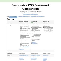
It has dropped Less support in favor of Sass, converted from px-based to rem-based sizing, improved its grid system, and dropped IE8 support. Also, all its JS plugins were re-written in ES6, it now uses a customized reset CSS file called Reboot, and offers flexbox support via a Sass boolean variable. In addition to this update, Bootstrap now offers themes at themes.getbootstrap.com. Also, Bootstrap will continue supporting version 3, unlike the dropping of version 2 support after the release of version 3. You can read more here. Foundation 6 is a fairly major update which includes more grid flexibility, custom breakpoints, optional flexbox, and more. Like Bootstrap 4, Flexbox is now toggleable via Sass in Foundation 6. The Sass/CSS has been reworked and consolidated, and there are fewer default styles to override on common elements. Skeleton 2 was updated in December 2014 after remaining mostly unchanged for about three years. The Top 25 Responsive Design Tools.
Note: this piece was originally published on Net Magazine, who recently nuked about 10,000 articles when they moved over to Creative Bloq.
In an effort to preserve the writing I did for them, I’m republishing those articles here on my blog. This article is still alive over at Creative Bloq, so you can also read it there. As responsive web design evolves, Brad Frost looks at some of the best tools, resources and thinking for crafting exceptional responsive experiences This article first appeared in issue 241 of .net magazine – the world’s best-selling magazine for web designers and developers. Over the past few years we’ve seen an explosion of web-enabled devices with varying resolutions, capabilities, form factors, pixel densities, interaction methods and more. It’s futile to create a dedicated web experience for every single device class out there, and the need to create a smart, flexible, adaptable web experiences is becoming more apparent every day.
Cross domain - Respond.js on Subdomain using Tumblr. Awesome Media Queries in JavaScript - enquire.js. The Lowdown What is it?
Enquire.js is a lightweight, pure JavaScript library for responding to CSS media queries. JavaScript callbacks for media queries matching and unmatching.