
Tutoriel Gephi #01 : Visualiser son réseau Facebook. News. New Release 2.38 (13 April 2014) The dot program now supports packing of connected components the same way of the other layout tools. (7 March 2014) The edgepaint filter has been added to Graphviz. Given a graph that has been laid out, edgepaint colors the edges in a manner to make it easier for the viewer to distinguish edges that intersect in an almost parallel fashion. New Release 2.36 (11 January 2014) Public webdot server now available (20 August 2013) A public webdot server is available for use at . New Release 2.34 (6 September 2013) This release includes a new (1.5) version of the xdot format supporting inline text characteristics such as <b> and version-specific output based on xdotversion. New Release 2.32 (1 August 2013) This release includes the features noted below, plus there is a new (1.3) version of the xdot format that encodes linear and radial gradient as color values.
New features (July 2013) Graphviz now supports the star node shape New Release 2.30 (January-February 2013)
Mentionmapp. Data Visualization Framework. Framework Expressive Axiis gives developers the ability to expressively define their data visualizations through concise and intuitive markup.
Axiis has been designed with a specific focus on elegant code, where your code can be just as beautiful as your visual output. Concise By leveraging {inline} Flex Binding and the Axiis markup syntax you don't need to write volumes of code to produce amazing results. Modular Axiis was designed to be a granular framework, allowing developers to mix and match components and build complex output by compositing together basic building blocks. Open Source Axiis is an open source project, under an MIT license. Want to Contribute? If you are interested in helping us with Axiis we would love to talk to you. (Hint, blog links, and/or references to prior work or studies would be warmly received.) Team Background In February of 2009, Tom joined forces with Michael to conceptualize and develop what has now become Axiis.
Tom Gonzalez Michael VanDaniker Special Thanks. Powerful Open Source Data Visualization plugins – Part 1. Analyzing data online can be a tedious task & when you have tons of data to share online – it could be challenging to make it readable & at the same time interesting for the user to understand the data.
In such scenarios data visualization plugins can come in handy to visually represent your data to the user than just presenting it as plain numbers. The main goal of data visualization is to communicate information clearly and effectively through graphical means. There are numerous Javascript plugins on the web which can help in presenting your data in multiple formats & at the same time make it interactive for the user to digest the info being shared easily. Find below are few hand picked data visualization plugins build using javascript frameworks which can make your life easier by presenting the data much more visually. #1. JavaScript InfoVis Toolkit - Data Visualization Plugin The JavaScript InfoVis Toolkit provides tools for creating Interactive Data Visualizations for the Web.
Weave (Web-based Analysis and Visualization Environment) ViSta - The Visual Statistics System. Xebece Demonstration Applet. Gephi, an open source graph visualization and manipulation software. Dynamic network graphs. On Twitter, @GiftedPhoenix asked about similar applications to TouchGraph recently, and this seemed like a good time to gather together information on the variety of applications in the special niche of network graphs.
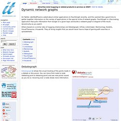
TouchGraph is a fascinating application that pulls information from Google on a given topic and builds a network graph or diagram of the result, dynamically as you watch. Others based on a similar idea of mapping relationships are Debategraph, InFlow, LinksViewer, Mentionmap, NodeXL, VisualThesaurus, Visuwords. They all bring insights that you would never have a hope of gaining with searches or spreadsheets. Debategraph Debategraph allows the visual tracking of the points made in a debate or discussion. InFlow InFlow is a professional network analysis tool and their website cites these as uses: LinksViewer Linksviewer is a professional tool for those wishing to understand the relationships between investors and capital projects (startups and the like) in Silicon Valley.
DebateGraph. DebateGraph is an award-winning, web-platform for visualizing and sharing networks of thought – and opening reasoning and action to collaborative learning and iterative improvement.Create your own maps and explore and contribute to maps created by amongst others: CNN, the White House, the UK Prime Minister's Office, The Independent, and the Foreign Office.
DebateGraph is being used in over 100 countries and helping people reason and learn together more effectively in many different fields, including: education, health, governance, media, publishing, environment, conflict resolution, conferences, group facilitation, and public consultation and planning.There's no limit to the number of people who can collaborate on maps, and you are welcome to start building and sharing public and private maps on any topic now. Copyright © 2014 Thoughtgraph Ltd. All Rights Reserved. Registration No: 0584316 VAT No: 994672852. Terms & Privacy (including our Cookie Policy).