
Topographic profile - Wikipedia. Example of topographic profile.
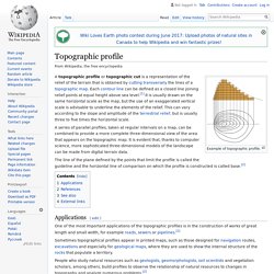
A series of parallel profiles, taken at regular intervals on a map, can be combined to provide a more complete three-dimensional view of the area that appears on the topographic map. Basemaps Defined ~ GIS Lounge. What is a basemap?
The term basemap is see often in GIS and refers to a collection of GIS data and/or orthorectified imagery that form the background setting for a map. The function of the basemap is to provide background detail necessary to orient the location of the map. Basemaps also add to the aesthetic appeal of a map. Typical GIS data and imagery that make up the layers for a basemap: streets, parcels, boundaries (country, county, city boundaries), shaded relief of a digital elevation model, waterways, and aerial or satellite imagery. Contour line - Wikipedia. The bottom part of the diagram shows some contour lines with a straight line running through the location of the maximum value.
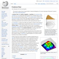
The curve at the top represents the values along that straight line. A three-dimensional surface, whose contour graph is below. A two-dimensional contour graph of the three-dimensional surface in the above picture. The Art of Data Visualization. EVBAL : The Joy of Stats. JSCharting Chart Types Gallery. 50 most stunning examples of data visualization and infographics. 50 Great Examples of Data Visualization. Wrapping your brain around data online can be challenging, especially when dealing with huge volumes of information.

And trying to find related content can also be difficult, depending on what data you’re looking for. But data visualizations can make all of that much easier, allowing you to see the concepts that you’re learning about in a more interesting, and often more useful manner. Below are 50 of the best data visualizations and tools for creating your own visualizations out there, covering everything from Digg activity to network connectivity to what’s currently happening on Twitter. Music, Movies and Other Media Narratives 2.0 visualizes music. Liveplasma is a music and movie visualization app that aims to help you discover other musicians or movies you might enjoy. Tuneglue is another music visualization service. MusicMap is similar to TuneGlue in its interface, but seems slightly more intuitive.
Digg, Twitter, Delicious, and Flickr Internet Visualizations. Trees vs Networks — The Higher Education Revolution. Chart Porn. InfoGraphic Designs: Overview, Examples and Best Practices. Information graphics or infographics are visual representations of information, data or knowledge.
These graphics are used where complex information needs to be explained quickly and clearly, such as in signs, maps, journalism, technical writing, and education. Is HTML or PDF Better for Technical Documentation? Is HTML or PDF Better for Technical Documentation?
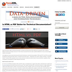
Does format really matter for technical documents? As long as you have access to the content you’re looking for, does it make any difference what kind of wrapper it arrives in? In fact it does. Document format can make a significant difference in how you find and digest content. 40 Maps That Will Help You Make Sense of the World. If you’re a visual learner like myself, then you know maps, charts and infographics can really help bring data and information to life. Maps can make a point resonate with readers and this collection aims to do just that.
Hopefully some of these maps will surprise you and you’ll learn something new. A few are important to know, some interpret and display data in a beautiful or creative way, and a few may even make you chuckle or shake your head. If you enjoy this collection of maps, the Sifter highly recommends the r/MapPorn sub reddit. InfoGraphic Designs: Overview, Examples and Best Practices. The art of data visualization. Interactive Infographics. d3. Word Mosaic. TagCrowd: make your own tag cloud from any text. Tagxedo.
Data Presentation - 5 PowerPoint Tips. Home > Presenting Data Main > 5 Data Presentation Tips Most data presentations are confusing and boring.
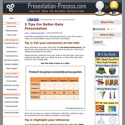
Learn the 5 tips to make your presentation clearer and more memorable. Tip 1: Put your conclusion on the title Most presenters use vague slide titles like Our Sales Performance. This doesn’t give the audience any clue about what to look for in the sea of numbers presented on the slide. Infographic: Useful Frameworks. Infographic: Useful Frameworks Today’s collection of infographic will be equally useful for beginners web developers and advanced developers.
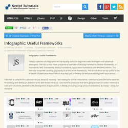
The fact is that I have prepared an overview of existing frameworks: Mobile frameworks, UI frameworks, MVC frameworks, WebGL frameworks, Application frameworks and WYSIWYG editors. This overview shows the resulting popularity of all the above frameworks. This information will be useful to you in search of alternative means which may help you to develop (or enhance existing) web applications.I decided to compile this collection for you because, recently, I was looking for similar information.
I wanted to find alternative libraries for working with WebGL (in addition to the well-known three.js). Original source: Mobile Frameworks Original source: UI Frameworks. Charts. 30 Simple Tools For Data Visualization. There have never been more technologies available to collect, examine, and render data.
Here are 30 different notable pieces of data visualization software good for any designer's repertoire. They're not just powerful; they're easy to use. In fact, most of these tools feature simple, point-and-click interfaces, and don’t require that you possess any particular coding knowledge or invest in any significant training. Let the software do the hard work for you.
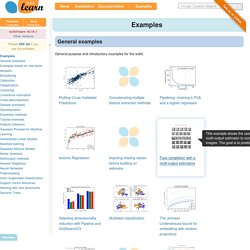
Examples. Examples concerning the sklearn.feature_extraction.text module.
Visualising information. Visualisation Ontology (VISO) Introduction The Visualisation Ontology (VISO) defines concepts and relations from the field of graphics and visualisation. The ontology is split into seven main modules, each being concerned with a specific field of visualisation. These modules include the graphic module, the data module and the facts module and other modules such as activities and system context modules*. At the bottom of each resource you will find a link to the discuss it in the VISO Question and Answers forum. Please also note our Blog on VISO. A Periodic Table of Visualization Methods. Visualising topography. Here is the topography slideshow, otherwise read on.. Over the past few years I’ve been looking at lots of relief maps – i.e. those showing geographical topography, specifically land elevation, and I’m generally struck by two things.
Firstly how the colour schemes commonly used seem too dominant, which seems to reduce the brain’s capacity for interpreting the geographical features being depicted. 30 Simple Tools For Data Visualization. Chart Porn. Infographics.