
http://www.idiagram.com/index.html
50 Great Examples of Data Visualization Wrapping your brain around data online can be challenging, especially when dealing with huge volumes of information. And trying to find related content can also be difficult, depending on what data you’re looking for. But data visualizations can make all of that much easier, allowing you to see the concepts that you’re learning about in a more interesting, and often more useful manner. Below are 50 of the best data visualizations and tools for creating your own visualizations out there, covering everything from Digg activity to network connectivity to what’s currently happening on Twitter.
22 free tools for data visualization and analysis You may not think you've got much in common with an investigative journalist or an academic medical researcher. But if you're trying to extract useful information from an ever-increasing inflow of data, you'll likely find visualization useful -- whether it's to show patterns or trends with graphics instead of mountains of numbers, or to try to explain complex issues to a nontechnical audience. There are many tools around to help turn data into graphics, but they can carry hefty price tags. The cost can make sense for professionals whose primary job is to find meaning in mountains of information, but you might not be able to justify such an expense if you or your users only need a graphics application from time to time, or if your budget for new tools is somewhat limited.
Clive Thompson on the Power of Visual Thinking Illustration: Posttypography When I went online to shop for a laptop this summer, I faced a blizzard of choices. Was an ultralight worth the price, or would a heavier model do? Did I need a big screen, or would it make the computer a pain to lug around? Infographics 2015 YFCY Infographic 2015 DLE Infographic 2015 CSS Infographic 2014 TFS Infographic 2014 HERI Faculty 2014 CSS Infographic 2014 YFCY Infographic 2013 TFS Infographic 2012 YFCY Infographic 2012 DLE Infographic 2010 FAC Infographic Customizable Infographics - Compare your own survey results 2012 YFCY Infographic
Top 10 Ways to Make Yourself Look (and Be) Smarter How terribly obnoxious of you. Thanks for sharing. Well, it is probably not the smartest move ever to call monolingual people dumb. But here in Europe (or at least in most countries) learning a second language is compulsory in secondary school. Therefore not speaking a second language often goes along with a lack of general education, probably leading roelroelroel to this bovine conclusion. People in Europe need only travel a few hours to encounter another language, and bi- and tri-linguality is essential to business and communication there.
Great Visualizers: Always With Honor Design duo Tyler Lang and Elsa Chaves are Always With Honor, an Portland-based design team with a specialty in beautifully simple information displays and iconography. I first got turned on to / by their work when I spotted this awesome poster. It visualizes the many domains within design. Gallery · mbostock/d3 Wiki Wiki ▸ Gallery Welcome to the D3 gallery! More examples are available for forking on Observable; see D3’s profile and the visualization collection. Please share your work on Observable, or tweet us a link! Visual Index
Whistleblower Magazine April 2014 – THE WAR FOR THE GOP: How conservatives plan to take over the Republican Party and stop the Obama juggernaut Get special discounts on quantity purchases of your favorite Whistleblower issues. For more information or to order at quantity discounts, please call WND Customer Service toll-free at 1-800-496-3266 (1-800-4WND-COM) or email support@wnd.com. It’s a crazy situation: Conservative-minded Americans – people who a generation ago were part of the “Reagan Revolution,” and today might identify with the “tea party” – are caught up in not just one, but two civil wars. The first conflict everyone knows about: America is more polarized today than at any time in the last century.
Visual thinking guides - Wikit This presents nine sources of visual thinking guides: Exploratree, Gamestorming, LexIcon, Education Oasis, TeacherVision, Freeology, Education Place and Writing Fun. Exploratree hosts a set of interactive thinking guides. This is a free web resource where you can use the guides, print them, edit them or make your own. You can share them and work on them in groups. It is aimed at schools and students, but has ideas for thinkers of all ages. Frontiers of Innovation Launched in May 2011, Frontiers of Innovation (FOI) focuses on the work of a community of researchers, practitioners, policymakers, philanthropists, and experts in systems change from across North America. The goal of FOI is to bring about substantially improved outcomes for vulnerable young children whose needs (or whose caregivers' needs) are not being fully met by existing policies and programs. To do that, FOI seeks to spur change in the field by forging cross-sector collaborations that prompt creativity, support experimentation, and foster learning from experience. FOI’s work draws on science, including advances in the biological, behavioral, and social sciences, to: identify reasons why children’s development stays on track or goes off course;devise theories of change about how to produce better outcomes; anddesign and test new intervention approaches and measure their effectiveness in reducing barriers to learning and strengthening lifelong physical and mental health.
The Mystery Woman Behind the Murdoch Mess Rebekah Wade was 20 years old in 1988 when she showed up at the Warrington office of The Post, a now defunct national tabloid. As Graham Ball, then the features editor, recalled to the BBC, she approached him and said, “I am going to come and work with you on the features desk as the features secretary or administrator.” He told her that would be impossible, as he was moving the next week to work in the paper’s London office. Graphical visualization of text similarities in essays in a book The problem A collection of essays is collated for readers with visualizing graphics. The graphics should both serve as a thematic and structural overview of each text, and pose the essay in question in relation to the other essays in the book. They should be both an abbreviation of the text and the key to decoding the complex issues under discussion. The difficulty in developing appropriate graphics arises from the level of discussion of the key themes.
Life Path - Sarah Berchild 2 Flares Twitter 2 Facebook 0 Google+ 0 Pin It Share 0 1 2 Flares × Life Path – Sarah Berchild
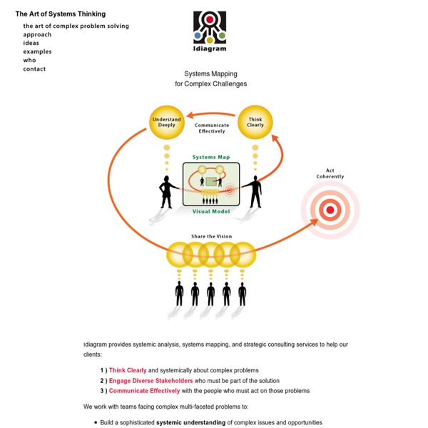
the art of complex problem solving? by coolucka Dec 5