
Gephi, an open source graph visualization and manipulation software. Free Data Visualization Software. 22 free tools for data visualization and analysis. Review April 20, 2011 06:00 AM ET Text/word clouds Some data visualization geeks think word clouds are either not very serious or not very original.
You can think of them as the tiramisu of visualizations -- once trendy, now overused. But I still enjoy these graphics that display each word from a text file once, with the size of the words varying depending on how often each one appears in the source. IBM Word-Cloud Generator What it does: Several tools mentioned previously can create word clouds, including Many Eyes and the Google Visualization API, as well as the website Wordle (which is a handy tool for making word clouds from websites instead of text files). Fast Analytics and Rapid-fire Business Intelligence from Tableau Software. Isee systems - The World Leader in Systems Thinking Software. Systemdenken und Simulation mit HERAKLIT - KHSweb.de Bildungssoftware GmbH. Data fusion for the management of multimedia documents. JESS3. W. Bradford Paley; W. B. Paley. The Open University : KMi : Compendium.
SoNIA Examples. Examples & Gallery We've included here a few examples of animations created by various researchers in different domains.
Several of them include the .son file so you can regenerate the same movie. Please contact us if you have something for us to include. NOTE: most of these are .MOV files and will reqiure the QuickTime viewer, and are all from 1 to 20 MB in size, so don't look at them over a dialup connection! In some cases an .AVI file is also included Basic Examples Some trivial examples for testing and demonstrating concepts. Dan McFarland's Classroom Networks Dan (one of SoNIA's authors) uses SoNIA to visualize the streaming data he has collected on classroom interactions. James Moody Jim is one of the original collaborators on the SoNIA project, and has created a number of interesting visualizations, including the output from a simulation of social balance process. Eye plorer. Visone. TimeFlow Analytical TimelineVisual timelines for investigation - GitHub. VOSviewer. The Best Tools for Visualization.
Visualization is a technique to graphically represent sets of data.
When data is large or abstract, visualization can help make the data easier to read or understand. There are visualization tools for search, music, networks, online communities, and almost anything else you can think of. Whether you want a desktop application or a web-based tool, there are many specific tools are available on the web that let you visualize all kinds of data. Walrus - Graph Visualization Tool. Source Code Available The source code to Walrus is now available under the GNU GPL.

You may download the source code below. Description Walrus is a tool for interactively visualizing large directed graphs in three-dimensional space. It is technically possible to display graphs containing a million nodes or more, but visual clutter, occlusion, and other factors can diminish the effectiveness of Walrus as the number of nodes, or the degree of their connectivity, increases.
Walrus computes its layout based on a user-supplied spanning tree. Walrus uses 3D hyperbolic geometry to display graphs under a fisheye-like distortion. Walrus is being developed by Young Hyun at CAIDA. Applicability Please note that Walrus currently has the following requirements, restrictions, or limitations which may render it unsuitable for a given problem domain or dataset:
Infographics. Gisteren even een tour genomen door Infographic land.
Newsilike: Latest & Archived Infographics Blog. Graphic World: 3D Infographics Projected in NY Grand Central Terminal. We are crossing the next frontier: putting animated infographics within the public, physical space.
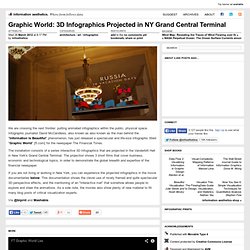
Infographic journalist David McCandless, also known as also known as the man behind the "Information Is Beautiful" phenomenon, has just released a spectacular and life-size infographic titled "Graphic World" [ft.com] for the newspaper The Financial Times. The installation consists of a series interactive 3D infographics that are projected in the Vanderbilt Hall in New York's Grand Central Terminal. The projection shows 3 short films that cover business, economic and technological topics, in order to demonstrate the global breadth and expertise of the financial newspaper. If you are not living or working in New York, you can experience the projected infographics in the movie documentaries below.
Via @blprnt and Mashable. Column Five Media: Infographics, Content Strategy, Interactive Design. Over 100 Incredible Infographic Tools and Resources (Categorized) This post is #6 in DailyTekk’s famous Top 100 series which explores the best startups, gadgets, apps, websites and services in a given category.

Total items listed: 112. Time to compile: 8+ hours. Follow @DailyTekk on Twitter to make sure you don’t miss a week! Cool Infographics - Blog. Cool Infographics - Cool Links. Randy's infographic design consultancy to Visualize Business Intelligence Jacob O'Neal's site focused on designing animated GIF infographics Company that helps visualize business data Rose Zgodzinski's site to help client find visual solutions Consulting, Design and Social + PR Brian Cragin is an infographic designer in San Diego A masterfully constructed infographic campaign can work wonders for your business Dashboard Design: Data Driven helps your clients better understand and act upon your information Dejure Design provides interactive and visual design services to social justice organizations seeking to make their legal work more accessible and engaging.
One of the UK’s leading providers of infographics and data visualisation for bloggers and businesses of all sizes An interactive design industry We make important data beautiful and easy to understand We specialize in transmitting messages in a clear, simple and attractive way.