
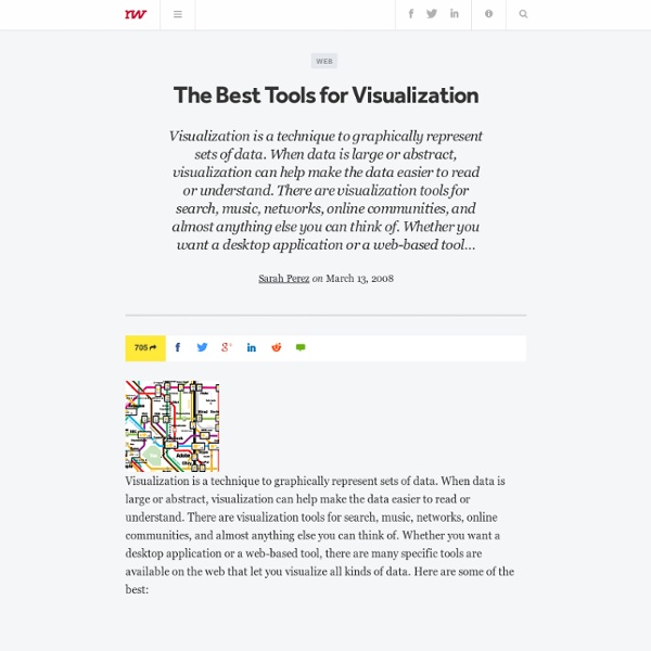
http://readwrite.com/2008/03/13/the_best_tools_for_visualization#awesm=~oByMHeGDzFx2bg
About ChartsBin.com What is ChartsBin? ChartsBin is a web-based data visualization tool that will allow everyone to quickly and easily create rich interactive visualizations with their own data. You can then share your interactive visualizations with others by embedding them in websites, blogs or sharing via Facebook or Twitter. We're focused on building the most exciting and engaging destination for statisticians, and computer scientists in the world. Who is ChartsBin for? This site would find love among those who like stats and graphs; for anyone who wishes to see the boring research data in a refreshing way.
Google Operating System Last year's predictions weren't that great (the predictions for 2010 were better), but predicting the future is an addictive game, so I'll try again. Here are my predictions for 2012: 1. Oflline Google stores that will sell Chromebooks, Android phones, Google TV boxes, Google-branded shirts and more. [ update: not true yet ] 2.
Gamers Get Girls Most guys aren’t grinding away at their Level 45 Battle Mage in order to meet the ladies. But online gaming across the board is becoming more mainstream, and lots of people spend lots of time in virtual worlds — men and women alike. Show More Boxing Clever: What Law Firms Can Learn From Effective Business Intelligence (Edge Int'l) By Tony Bash, Edge International, UK Managing for success May 2012 10 PRACTICE MANAGEMENT: BUSINESS INTELLIGENCE Ihave been working with law firms for longer than I care to remember, and, over those years, one of the more common terms bandied about has been business intelligence (BI). Sadly, however, time and again, that intelligence has provided very little real insight. This is because effective BI isn’t what often masquerades as it in law firms – a pack of Excel spreadsheets about the firm’s performance that goes out in a hardcopy monthly management report. And no, it isn’t any better if the reports are emailed as PDFs or put on the intranet! BI isn’t anything to do with data that looks at the past, since, as we hear so often, the past is no guide to the future.
Website Analyzer, Metatag Analyzer, mozRank Checker, Google PageRank Checker, Bing Indexed Pages Checker. The Website Analyzer helps you optimize your site for best performance and high rankings. Check your page structure, pageranks, traffic rankings, backlinks, authority links, indexed pages in the most popular search engines, links from social networks, mozRank, domain authority, domain age and many other metrics. Analyze your Keywords performance in various databases, check website's reputation and see if site is safe for browsing. Over 100 Incredible Infographic Tools and Resources (Categorized) This post is #6 in DailyTekk’s famous Top 100 series which explores the best startups, gadgets, apps, websites and services in a given category. Total items listed: 112. Time to compile: 8+ hours.
Nightingale’s Rose January 9, 2008, 4:06 pm By Henry Woodbury Two ways of reading the word area — its general vs. its mathematical meaning — leads to confusion in this otherwise superb article on Charts in the Economist. The chart in question is Florence Nightingale’s “Diagram of the Causes of Mortality in the Army of the East.” The data is plotted by month in 30-degree wedges. Rhetological Fallacies A brain-blending categorisation and visualisation of errors and manipulations of rhetoric and logical thinking. How many do you use? The word ‘rhetological’ is made up. Just so I can munge two types of entity: rhetorical techniques and logical fallacies. Both are used heavily by institutional powers – governments, religions, political parties, across the entire spectrum to sway opinion, confuse and obfuscate. And, unfortunately, we internalise them, like bad habits, into our own decision-making and mental processes.
Subversive Cartographies What are subversive cartographies? This issue is addressed a series of presentations organized by Chris Perkins (University of Manchester) and Jörn Seemann (Louisiana State University) for the upcoming 2008 Association of American Geographers meeting (Boston, April 15-19 2008). “To be subversive, is to wish to overthrow, destroy or undermine the principles of established orders. As such subversive cartographies offer alternative representations to established social and political norms.
Information is beautiful: war games Amid confusion over the rise in defence cuts, I was surprised to learn that the UK has one of the biggest military budgets in the world - nearly £40bn ($60 bn) in 2008. But I was less surprised to see who had the biggest. Yep, the United States spent a staggering $607bn (£402 bn) on defence in 2008. Currently engaged in what will likely be the longest ground war in US history in Afghanistan. Harbourer of thousands of nuclear weapons. 1.5m soldiers. Fleets of aircrafts, bombs and seemingly endless amounts of military technology. Data visualisation DIY: our top tools What data visualisation tools are out there on the web that are easy to use - and free? Here on the Datablog and Datastore we try to do as much as possible using the internet's powerful free options. That may sound a little disingenuous, in that we obviously have access to the Guardian's amazing Graphics and interactive teams for those pieces where we have a little more time - such as this map of public spending (created using Adobe Illustrator) or this Twitter riots interactive. But for our day-to-day work, we often use tools that anyone can - and create graphics that anyone else can too.
Crisis narrows China-UK gap About this Video 200 years ago, United Kingdom was a leading nation of the world – both in regard to health and economy. In this video, Hans Rosling details UK’s 200-year journey, to present time, and also shows that China, in the coming five years, will narrow the gap to UK faster than ever. Related content Livehoods – Use-based urban analytics In conceptualizing and exploring the city we rely a range of smaller areas—neighbourhoods, boroughs, wards and districts—in order to make urban space intelligible. While we can readily discuss how neighbourhoods are shaped by physical geography (topography, adjacency to lakes or rivers, etc.), ordinance (zoning, access to public transit) and economics (real estate prices, average resident income), machine learning does not really spring to mind when we are considering how we might define ‘a neighbourhood’. Livehoods is a new project hatched within the School of Computer Science at Carnegie Mellon University that leverages 18 million Foursquare check-ins to draft up new urban ‘activity zones’ based on the patterns of frequent visitors.
OpenSourceFeatures – FalconView This page contains a summary of the features of FalconView Open Source along with some screen captures that illustrate those features. FalconView includes a plugin architecture that makes it easy to add new features as well. Base Map Types Supported 