
Tricks and Hacks. A Beginner's Guide to Perceived Performance: 4 Ways to Make Your Mobile Site Feel Like a Native App. Editor's note: This post is ≈3,000 words.
It covers many different aspects of perceived performance of mobile websites as well as practical solutions to speeding up your site. TL;DR: it's not about how fast your site is; it's about how fast your users think it is. Building well-designed websites on mobile devices is slowly becoming easier and easier. Whatever the method (responsive, adaptive, etc.), if you know what you're doing, crafting a good-looking site is not a problem. But your clients, just like ours, may still be asking for that app-like experience. Most of the time, when people say something is ‘app-like’ or that it feels ‘native’, they’re not talking about the way a site looks. Native apps are fast. Sliding Horizontal Layout. A slider-like layout where the neighboring sections are positioned horizontally next to each other.
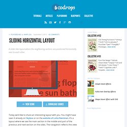
View demo Download source Today we’d like to share an interesting layout with you. You might have seen it already on Skybox or on the website of Lotta Nieminen. It’s a layout where we see the main section in the middle and part of the previous and next section on the sides. The navigation reflects this view by showing the three items currently visible. We use CSS 3D Transforms for moving the lateral sections. The main structure for the layout is the following: What we do is to first check if 3D Transforms are supported.
The idea is to position the sections absolutely on top of each other and then position them with the right left value. Basiliq by Cloud Castle. Responsive Multi-Level Menu. A responsive multi-level menu that shows its submenus in their own context, allowing for a space-saving presentation and usage.
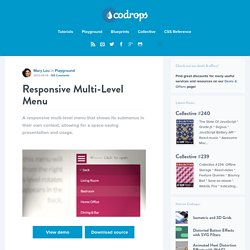
View demo Download source Today we want to share an experimental drop-down menu with you. The main idea is to save space for menus that have a lot of content and sub-levels. Each sub-level in this menu will be shown in its own context, making the “parent” level disappear. This is done with subtle animations that are defined in separate animation classes. Please note: this only works as intended in browsers that support the respective CSS properties. The structure of the menu contains an unordered list that can have an arbitrary number of sub-lists: Sidr - A jQuery plugin for creating side menus. Responsive WebDesign. » The EMs have it: Proportional Media Queries FTW! Cloud Four Blog. Hay, I wrote this in 2012!
I still like the notion of the metaphorical connection between content-based sizing units (e.g. ems) and layout definitions (e.g. breakpoints). And the zooming behavior cited here was always meant more as a sidelong example than a core argument. Nonetheless! You should note that the zooming behavior has long since been made consistent in browsers (i.e. fixed). Keep that in mind if you cite or otherwise put stock in this post. –Lyza, March 11, 2015. Gridpak Revisited: A Closer Look at the Responsive Grid Generator. One of the most interesting and useful responsive grid generators around is a tool called Gridpak, which allows you to use a simple and fun UI to create fluid, media-query driven grids.
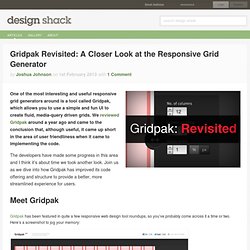
We reviewed Gridpak around a year ago and came to the conclusion that, although useful, it came up short in the area of user friendliness when it came to implementing the code. FitText - A plugin for inflating web type. FlexNav - Flexible, Device Agnostic Navigation. A Device-Agnostic Approach to Complex Site Navigation FlexNav is a mobile-first example of using media queries and javascript to make a decent multi-level menu with support for touch, hover reveal, and keyboard tab input accessibility.
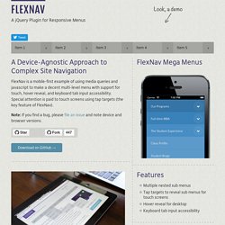
Special attention is paid to touch screens using tap targets (the key feature of FlexNav). Transitions & Animations - An Advanced Guide to HTML. One evolution with CSS3 was the ability to write behaviors for transitions and animations.
Front end developers have been asking for the ability to design these interactions within HTML and CSS, without the use of JavaScript or Flash, for years. Now their wish has come true. With CSS3 transitions you have the potential to alter the appearance and behavior of an element whenever a state change occurs, such as when it is hovered over, focused on, active, or targeted. Animations within CSS3 allow the appearance and behavior of an element to be altered in multiple keyframes. Transitions provide a change from one state to another, while animations can set multiple points of transition upon different keyframes.
Transitions As mentioned, for a transition to take place, an element must have a change in state, and different styles must be identified for each state. In the example below the box will change its background color over the course of 1 second in a linear fashion. Vendor Prefixes Box.
Retina et svg. Implementing Off-Canvas Navigation For A Responsive Website. Advertisement Today, too many websites are still inaccessible.
In our new book Inclusive Design Patterns, we explore how to craft flexible front-end design patterns and make future-proof and accessible interfaces without extra effort. Hardcover, 312 pages. Get the book now!