
TechStars. Products. D3.js - Data-Driven Documents. Tributary. D3 Tutorial: Making a scatterplot. Last updated 2012 December 30 So far, we’ve drawn only bar charts with simple data — just one-dimensional sets of numbers.
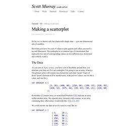
But when you have two sets of values to plot against each other, you need a second dimension. The scatterplot is a common type of visualization that represents two sets of corresponding values on two different axes: horizontal and vertical, x and y. The Data As you saw in Types of data, you have a lot of flexibility around how you structure your data set. Var dataset = [ [5, 20], [480, 90], [250, 50], [100, 33], [330, 95], [410, 12], [475, 44], [25, 67], [85, 21], [220, 88] ]; Remember, [] means array, so nested hard brackets [[]] indicate an array within another array. We could rewrite our data set so it’s easier to read, like so: var dataset = [ [ 5, 20 ], [ 480, 90 ], [ 250, 50 ], [ 100, 33 ], [ 330, 95 ], [ 410, 12 ], [ 475, 44 ], [ 25, 67 ], [ 85, 21 ], [ 220, 88 ] ]; Now you can see that each of these 10 rows will correspond to one point in our visualization. Size.
Re-usable charts for d3.js. Rickshaw: A JavaScript toolkit for creating interactive time-series graphs. Graphing Toolkit Rickshaw provides the elements you need to create interactive graphs: renderers, legends, hovers, range selectors, etc.
You put the pieces together. See Demo → Built on d3.js It's all based on d3 underneath, so graphs are drawn with standard SVG and styled with CSS. Open Source Rickshaw is free and open source, available under the MIT license. Getting Started Here's a minimal but complete working example. Area Graphs Lines Bars Scatterplot Interactive Legend Add a basic legend: Cubism.js. Time Series Visualization foo7.6 bar−6.2 foo + bar1.4 foo - bar14 Cubism.js is a D3 plugin for visualizing time series.
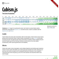
Scalable Cubism fetches time series data incrementally: after the initial display, Cubism reduces server load by polling only the most recent values. Effective Cubism also scales in terms of perception: small multiples aligned by time facilitate rapid comparison. Area (120px)7.6 Area (30px)7.6 In contrast, horizon charts reduce vertical space without losing resolution. Horizon, 1-band (120px)7.6 Horizon, 2-band (60px)7.6 Horizon, 3-band (40px)7.6 Horizon, 4-band (30px)7.6 By combining position and color, horizon charts improve perception: position is highly effective at discriminating small changes, while color differentiates large changes. Flexible Cubism is data-source agnostic. Want to learn more? Humble finance - html5 visualization. HumbleFinance is an HTML5 data visualization tool written as a demonstration of interactive graphing in HTML5.
It is similar to the Flash tool on The tool itself is written entirely in JavaScript, using the Prototype and Flotr libraries. It can be used to display any two 2-D data sets of real numerical data which share an axis. Demo: This demo displays historical stock data for Google from their IPO to March 5th, 2010. This data was acquired through the Google Finance website. You can mouse over the chart for additional data, as well as zoom and pan the charts using the grey bottons. August 19, 2004 - January 11, 2005 HTML: (hide) demo.js: (hide) Dygraphs JavaScript Visualization Library. The R Project for Statistical Computing. Shiny. Nutonian Inc.