
Worldwide Airport Coverage Map. Ventusky - Wind, Rain and Temperature Maps. Free AIS Ship Tracking of Marine Traffic - VesselFinder. Old Maps Online. Maps And Mapping. Pursued - Street view game. GeoSettr - Create your own GeoGuessr challenge. GeoGuessr - Let's explore the world! A global map of wind, weather, and ocean conditions. Tájékozódás az égen - ICSIP - ELTE, Csillagászati Tanszék.
IMAGINARY. Visual History of War, Religion, and Government. Térképek - 1. oldal. Mekkora a Naprendszer? Medium Resolution Globes. 70 maps that explain America. By Max Fisher and Dylan Matthews on July 1, 2015 The United States of America is many things.
It is the world's most powerful country, and one of the largest. It has a history of political revolution and social progress, as well as a legacy of slavery and genocide. In one sense, mapping the United States should be a simple matter of displaying borders and geography. But America is a complex nation with a long and fascinating history that could never be captured in a single frame. The original Americans.
40 Maps That Will Help You Make Sense of the World. If you’re a visual learner like myself, then you know maps, charts and infographics can really help bring data and information to life. Maps can make a point resonate with readers and this collection aims to do just that. Hopefully some of these maps will surprise you and you’ll learn something new. A few are important to know, some interpret and display data in a beautiful or creative way, and a few may even make you chuckle or shake your head. 32 Maps That Will Teach You Something New About the World.
Our world is a complex network of people, places and things.
Maps are a great tool and can help us understand how we are all connected. Below you will find a collection of informative maps that will hopefully teach you something new and give you a fresh perspective of our amazing planet and those that inhabit it. 1. If It Were My Home. Fentrol.hu. Build Your Own Earth (BYOE) 27 hilariously bad maps that explain nothing. By Max Fisher on May 21, 2015 Maps can illuminate our world; they can enlighten us and make us see things differently; they can show how demographics, history, or countless other factors interact with human and physical geography.
But sometimes, maps can be utter disasters, because they're either wrong or simply very dumb. Here is a collection of maps so hilariously bad that you may never trust the form again. Tellingly, the bulk of the collection comes from cable TV news. Maps so bad they're great The Wall Street Journal's election mapIn 2012, President Obama won reelection, and the famously conservative Wall Street Journal opinion page was outraged. Hilariously wrong maps. Green: Vegetation on Our Planet (Tour of Earth) Your insight into science. Infotainment - Entertainment with Knowledge. 11 Stunning Wonders of the World Ice In polar and other cold regions there is so beautiful, unusual and you may say, a unique education from ice, snow and water, that the mere sight of them is breathtaking.
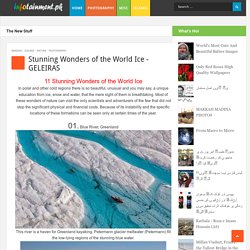
Most of these wonders of nature can visit the only scientists and adventurers of the few that did not stop the significant physical and financial costs. Because of its instability and the specific locations of these formations can be seen only at certain times of the year. 01. Blue River, Greenland This river is a haven for Greenland kayaking.
The river changes its shape every season, depending on changes in the flow of melt water. 02. Title Svalbard (also known as Svalbard), Norwegian translates as "cold coast". Svalbard Islands occupy a total area of ?? Zombie-Based Learning. 5 Ways to Create Mapped Stories. Creating mapped stories is one of my favorite activities to help history students see the significance of location in historical events.

Most of the time I have students include dated placemarks on the mapped stories that they build. Here are five free tools that students can use to create mapped stories. The Google Earth Tour Builder allows students to create Google Earth tours in their web browsers. The Tour Builder uses a slide-like format for creating tours. Science Experiments You Can Do At Home or School.
OneGeology Europe - Client. Within the GMES (Global Monitoring for Environment and Security) Service Element (GSE) programme of the European Space Agency, the Terrafirma project is delivering satellite EO based Geohazard Land Motion Services.
Its aim is to provide essential support in the process of risk assessment and mitigation by using the latest technology to measure terrain motion from satellite radar data. The ESA GMES project provides this support to a wide range of entities including: civil protection agencies, disaster management organisations and costal, rail and motorway authorities. Using data acquired 800km above the Earth's surface which is interpreted and analysed by expert national geoscience organisations, the project provides a pan-European ground motion hazard information service in each of the 27 states.
Prezi Collaboration Map. Demonocracy.info - Economic Infographics. Geománia - magyarországi ásványlelőhelyek. The Best Map Ever Made of America's Racial Segregation. Last year, a pair of researchers from Duke University published a report with a bold title: “The End of the Segregated Century.”
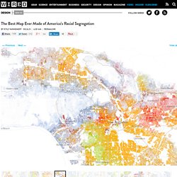
U.S. cities, the authors concluded, were less segregated in 2012 than they had been at any point since 1910. But less segregated does not necessarily mean integrated–something this incredible map makes clear in vivd color. The map, created by Dustin Cable at University of Virginia’s Weldon Cooper Center for Public Service, is stunningly comprehensive. Drawing on data from the 2010 U.S. Census, it shows one dot per person, color-coded by race. This is the most comprehensive map of race in America ever created. White people are shown with blue dots; African-Americans with green; Asians with red; and Latinos with orange, with all other race categories from the Census represented by brown. Looking at the map, every city tells a different story. The Internet map. Pulitzer Center. Age of Internet Empires: One Map With Each Country's Favorite Website - Robinson Meyer.
Two researchers, Mark Graham and Stefano De Stabbata, at the Oxford Internet Institute have depicted the world’s “Internet empires” in a map, below.
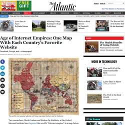
The map shows each nation’s most popular website, with the size of nations altered to reflect the number of Internet users there. The map makes for a brief, informative look at how geographic—and universal—certain web tastes and habits are. Facebook, the world’s most popular site, is most popular in North Africa, parts of the Middle East, and the Pacific coast of South America. A Real-Time Map of Births and Deaths - James Hamblin. In 1950, there were 2.5 billion humans.

Today there are just over 7 billion. In another 30 years, according to U.S. Census Bureau projections, there will be more than 9 billion. Brad Lyon has a doctoral degree in mathematics and does software development. He wanted to make those numbers visual. Worldmapgenerator + HOME. BibliOdyssey: Victorian Infographics. A time table indicating the difference in time between the principal cities of the World and also showing their air-line distance from Washington.
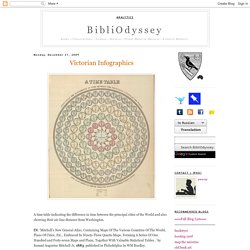
IN: 'Mitchell's New General Atlas, Containing Maps Of The Various Countries Of The World, Plans Of Cities, Etc., Embraced In Ninety-Three Quarto Maps, Forming A Series Of One Hundred and Forty-seven Maps and Plans, Together With Valuable Statistical Tables..' by Samuel Augustus Mitchell Jr, 1883; published in Philadelphia by WM Bradley. Tableau d'Astronomie et de Sphère IN: 'Atlas Universel d'Histoire et de Geographie Anciennes et Modernes, de Mythologie, des Religions, d'Astronomie, de Physique, de Geologie, de Histoire Naturelle, de Grammaire, de Rhetorique..' by Henri Duval, 1834; published in Paris by L Houbloup.
Tableau d'Astronomie et de Sphère [detail] The Solar System. How much money do the top technology companies make per second? 40 more maps that explain the world. Maps seemed to be everywhere in 2013, a trend I like to think we encouraged along with August's 40 maps that explain the world. Maps can be a remarkably powerful tool for understanding the world and how it works, but they show only what you ask them to. You might consider this, then, a collection of maps meant to inspire your inner map nerd. I've searched far and wide for maps that can reveal and surprise and inform in ways that the daily headlines might not, with a careful eye for sourcing and detail. I've included a link for more information on just about every one. Historical Metropolitan Populations of the United States - Peakbagger.com. The graph and tables on this page attempt to show how the urban hierarchy of the United States has developed over time.
The statistic used here is the population of the metropolitan area (contiguous urbanized area surrounding a central city), not the population of an individual city. Metropolitan area population is much more useful than city population as an indicator of the size and importance of a city, since the official boundaries of a city are usually arbitrary and often do not include vast suburban areas.
European word translator: an interactive map. Enter one or two lower-case English words to see translations from Google Translate. This site is an old side-project that I'm planning to shut down around the end of 2017. It's been a fun project and I'm grateful for the encouraging and helpful feedback I've received.
Drop me an email at james dot trimble at yahoo dot co dot uk if you really need the site to continue working after the end of 2017. J Examples: banana the cat she runs Random words: awareness risk. Submarine Cable Map. World Geography Games - Let's play and learn about the world. World Food Clock. Where everyone in the world is migrating—in one gorgeous chart. It’s no secret that the world’s population is on the move, but it’s rare to get a glimpse of where that flow is happening. In a study released in Science, a team of geographers used data snapshots to create a broad analysis of global migrations over 20 years. The study was conducted by three geographic researchers from the Wittgenstein Centre for Demography and Global Human Capital in Vienna. The researchers presented their data in five-year increments, from 1990 to 2010.
A supercell near Booker, Texas. Page. Land of Maps. Down2Earth. GeoRisk * Földrengés Mérnöki Iroda * Earthquake Engineering. An animated map of global wind, weather, and ocean conditions. Tervrajz- és térképpornó az ideális városokról. Planet Earth in 4K. A Year in the Life of Earth's CO2. 38 maps that explain Europe. European Geosciences Union. Natural Sciences. IUGS - Home. Beautiful Maps. 38 maps that explain the global economy. Mesmerizing Aurora in Dramatic Landscapes of Fire, Ice, and Shadow. A Social Atlas of Europe. MapAList - Create and Manage Maps of Address Lists. The Second Languages In Every Part Of The World. The website MoveHub.com, experts in international moving, is a resource for people looking to move abroad. It has released this eye-opening infographic that shows the second language of every region across the globe. Some are rather predictable, like Canada's knowledge of French.
But others are very telling about the histories of certain regions and how our global story has played out over hundreds of years. Galerie de Aerial Photography.