Replacing Respond JS with Sass
So you’re building some really cutting/bleeding edge web sites. You’re using HTML5, CSS3, and media quieries to serve your users some fast, repsonsive, and beautiful code/websites. Your life is great, and you love the work you’re producing… Then you have to make sure your code is working in legacy browsers like IE7 and 8… So you throw some polyfils like Modernizr at these legacy browsers… and now they understand HTML5. You used progressive enhancement from the beginning, so the CSS3 you’re using looks fine in browsers that don’t understand it.
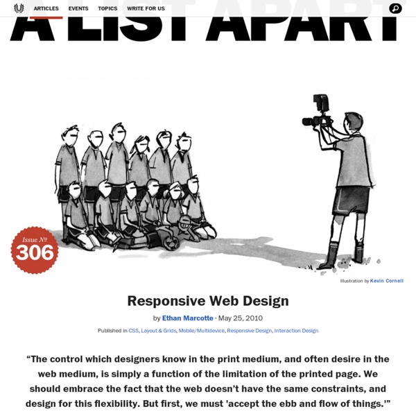
Responsive Web Design, A Book Apart
foreword by Jeremy Keith From mobile browsers to netbooks and tablets, users are visiting your sites from an increasing array of devices and browsers. Are your designs ready?
38 jQuery And CSS Drop Down Multi Level Menu Solutions
Hello again, it’s time for the comprehensive programming article. Here you’ll find 38 mainly CSS and jQuery dropdown menu or just multi level menus with downloadable files and explanations as well. Mostly they are free.
Gestalt Principles Applied in Design
By Michael Tuck Web designers, like other artists and craftsmen, impose structure on the environment. We enforce order and beauty on the formless void that is our blank computer screen.
32 Examples of Usable Mobile Website Layouts
The mobile web is clearly changing the way we think about layout design. Even back just 5 or 10 years ago there were barely any developers working on a solution for mobile. Now it seems everybody is doing their Internet surfing on some type of smartphone device. And because of this it’s a good idea to consider adapting your current layouts to fit a changing market.
Elastic Image Slideshow with Thumbnail Preview
Today we want to show you how to create a simple elastic slideshow with a thumbnail preview. The slideshow will adjust automatically to its surrounding container and we can navigate through the slides by using the thumbnail previewer or the autoplay slideshow option. View demo Download source
Beginner’s Guide to Responsive Web Design
Whether you’re a beginner or a seasoned web professional, creating responsive designs can be confusing at first, mostly because of the radical change in thinking that’s required. As time goes on, responsive web design is drifting away from the pool of passing fads and rapidly entering the realm of standard practice. In fact, the magnitude of this paradigm shift feels as fundamental as the transition from table based layouts to CSS.
Basic Web Page Background Techniques with CSS
The good old background property is one of the core elements we can play around with in our web designs. Here’s an overview of the four most common approaches to styling your web page body, from the basic solid colour through to large detailed background images. If you’re just starting out in web design, you’ll find some basic CSS techniques for you to put into practice into your future projects.
Redirecting to url
Erhvervsakademiet Copenhagen Business Academy Your Web browser "Firefox 17.0 for Ubuntu" may not be fully supported by Fronter. Please refer to the Fronter support site (frontersupport.com) for a list of supported browsers. <blockquote class="message error"> Warning: Javascript is turned off. Fronter recommend to turn on javascript to get a better user experience.
Bring Basecamp with you
Highly recommended. Primarily through word-of-mouth alone, Basecamp has become the world’s #1 project management tool. For the last 10 years, companies have been switching to Basecamp because it’s famously easy-to-use, reliable, and It Just Works™. Combine that with our best-in-the-biz customer service, and you’ve got a unique and delightful package. Just last week, another 6,119 companies started using Basecamp.

Must read recommendations of design for touch devices under Fitt's Law on Wikipedia by vikasjee Jan 5