
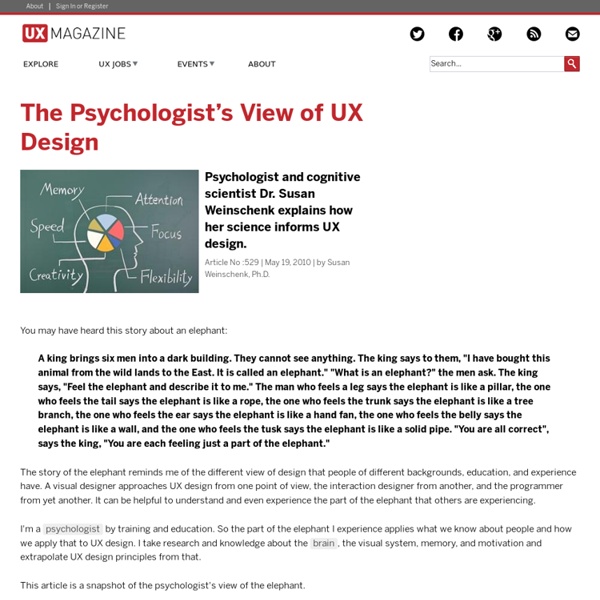
Design with Intent Toolkit Realism in UI Design The history of the visual design of user interfaces can be described as a gradual change towards more realism. As computers have become faster, designers have added increasingly realistic details such as color, 3D effects, shadows, translucency, and even simple physics. Some of these changes have helped usability. In other areas, the improvements are questionable at best. Details and realism can distract from these concepts. The image on the left is a face of a specific person. At the same time, it’s obvious that some details are required. The circle on the left clearly shows a face. Let’s look at a symbol we actually see in user interfaces, the home button. The thing on the left is a house. The thing on the left is a home button. Let me explain this concept using an entirely unscientific graph: People are confused by symbols if they have too many or too few details. The button on the left is too realistic. The same applies to these toggles. An Exception Conclusion
COM : Technology I always think you should have some sort of philosophy when you design your software , this may not be a a opinion just related to UIs but i think it is important. I think it is very good if you have a simple concept that a user can understand. The ideal case is if the two first pages of your Documentation makes the user "get it" and everything after that is following that rule. Classics is of course the UNIX concept of "Everything is a file", Or in HTML everything is done by tags, and even if you have to most fancy HTML tool in the world it helps to know a bit about what a tag is and some basics of how to write HTML manually. It makes the user understand what the application does, and makes it more predictable. Don't ever try to hide the the basics of the software, even though the user will almost only use high level functions to do fancy things, He or She will sooner or later want to do something by hand, just to have total control and then the app should let them!
8 ways to reduce cognitive load: Part 2 In the previous part of the article I described 5 major design techniques that help to reduce cognitive load. This notion refers to the total amount of mental effort that is required from a user to complete a task. Increase of this phenomena above the level that is acceptable for user can cause serious usability issues such as: rise of bounce rateshallow visit depthlower conversion than expected to name a few. Yet, even if a service or product requires complex activity from a user, there are ways to make the design help people go through the process smooth and clear. 5. When people read on paper, eye movement create a Z-shaped path from left to right and diagonally down or right to left for Arabic or Japanese speakers. Do we read in a zig-zag pattern online to? How the awareness about this pattern can be used by designers to help users consume the content? 6. Are there any doubts what is the main CTA on this site? And just for the comparison… 7. 8. Reading list
The Difference Between Information Architecture and UX Design - UX Booth Information architects form the blueprints of the web Next to explaining what I do for a living, the second question I most frequently hear is: “What’s the difference between Information Architecture and User Experience?” The line always seems to blur between the two, even though there’s clearly a difference. How should I go about explaining it? Information Architecture, according to Wikipedia, is “the art and science of organizing and labelling websites … to support usability.“ According to the same source, User Experience is “the way a person feels about using a product, system or service. [This includes] a person’s perceptions of the practical aspects such as utility, ease of use and efficiency of the system.” Even with regards to its definition, User Experience takes Information Architecture as its foundation and brings it to the next level. Information Architecture concerns structure Information Architecture is a relatively old term. User Experience concerns emotion Being easy and cool
A Brief Rant on the Future of Interaction Design So, here's a Vision Of The Future that's popular right now. It's a lot of this sort of thing. As it happens, designing Future Interfaces For The Future used to be my line of work. I had the opportunity to design with real working prototypes, not green screens and After Effects, so there certainly are some interactions in the video which I'm a little skeptical of, given that I've actually tried them and the animators presumably haven't. My problem is the opposite, really — this vision, from an interaction perspective, is not visionary. This matters, because visions matter. This little rant isn't going to lay out any grand vision or anything. Before we think about how we should interact with our Tools Of The Future, let's consider what a tool is in the first place. I like this definition: A tool addresses human needs by amplifying human capabilities. That is, a tool converts what we can do into what we want to do. In this rant, I'm not going to talk about human needs. That's right! So then.
Review: UX Archive Buttons, scrollbars, drop-down menus, borders, windows, rollers, cursors, and all sorts of other widgets are the playthings of UI designers. Buttons are for pushing, rollers are for rolling, and knobs are for turning. User experience deals with how these individual actions feel, but more importantly, a user’s overall experience on web or mobile. Essentially an archive of successful user flows, UX Archive shows a cycle of specific events through individual high-definition screen shots of each process. The chain of events shown on the site helps to clarify the architecture of the apps as well as exhibiting the general feel, with events split in to five different sections: exploring, onboarding, searching, sharing and sign up. The fact that the events are not combined—no single group of photos showing all five events together—actually makes the site more useful. At present there are only a handful of applications listed (and, as I mentioned, they are limited to those for iPhones).
How Google Unified Its Products With A Humble Index Card If you hadn’t noticed, every Google service has been trending toward a certain understated elegance. The company’s infamous era of championing 41 shades of blue is long over, as the company has learned to embrace clean lines, airy typography, and liberal white space across their platforms. But amidst implementing these long-established good design practices, Google rediscovered an old idea: index cards. Just like index and business cards of yore (or at least the late '90s), Google’s cards are plain, white rectangles peppered with nothing more than a little bit of type and maybe a photo. Are cards the epitome of flat modernism, or are they subconscious skeuomorphism? Even Google’s designers debated this point when I posed the question. We first saw cards returning results through Search’s Knowledge Graph, as Google began summarizing Wikipedia entries into condensed blurbs. Yes, Google is even developing cards on cards. Are Cards Good Design, Or A Foregone Conclusion?