
Tips. 8 Ways To Make Beautiful Financial Charts and Graphs in Excel. Regardless of what you use data for, you need it to be convincing and if you display data poorly, the meaning of your data is more likely to get lost.
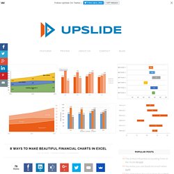
It is vital to be able to clearly visualise your words and thoughts with your data. Thanks to UpSlide Product Expert, Jules Touya, for his help on this post. Always pick the right chart type Before you start tweaking design elements, you need to know that your data is displayed in the optimal format. Bar, pie, and line charts all tell different stories about your data, you need to choose the best one to tell the story you want. Remove Unnecessary Axes In the before chart below we use a bar chart for absolute numbers like net sales and we use a line to display percentages like gross margin. Distribute bars evenly By default, we have thin bars and wide spaces in Excel, but for the best design and understanding of your charts we need the opposite. Stacked column flow chart - Franken's Team. Freddy: This is the moment.
Well, dear, are you ready? Inga: Yes, Doctor.Freddy: Elevate me.Inga: Now, right here? Freddy: Yes, yes, raise the platform.Inga: Oh, the platform, oh that, yeah, yes. How to do a doughnut chart ? (Chandoo) Posted on February 20th, 2014 in Charts and Graphs - 23 comments Today lets take a stroll outside what Excel can do and make something fancy, fun and may be useful.
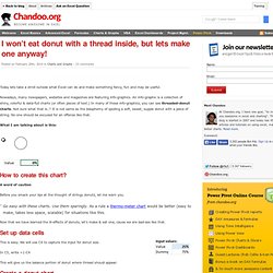
Nowadays, many newspapers, websites and magazines are featuring info-graphics. An info-graphic is a collection of shiny, colorful & data-full charts (or often pieces of text.) In many of these info-graphics, you can see threaded-donut charts. Not sure what that is..? What I am talking about is this: How to create this chart? A word of caution Before you smack your lips at the thought of stringy donuts, let me warn you. Go easy with these charts. Cosmograph in Excel - World migration with bilateral flow chart - E90E50fx. Igor: What is this?
Freddy: Schwarzwalder KirschtorteMonster (OS): MmmFreddy: Oh, do you like it? Jon's Excel Charts and Tutorials - Index. Butterfly Chart – Excel Chart with Dual Converging Scales. A Butterfly chart is a chart where two entities are compared side by side using scales meeting at the center.
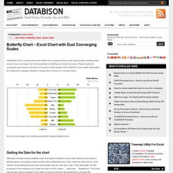
Due to its shape, the chart resembles a butterfly and hence the name. These charts are sometimes also known as Funnel or Tornado Charts though I find “butterfly” to be a better description as it allows for a greater variation in shape than a funnel or a tornado does ! So let’s jump straight into creating a beautiful looking butterfly chart. How to Create a Panel Chart in Excel. To show a concise, clear summary of data for several departments or cities, you can create a panel chart in Excel.
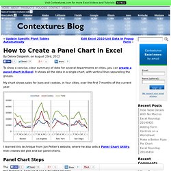
It shows all the data in a single chart, with vertical lines separating the groups. My chart shows sales for bars and cookies, in four cities, over the first 7 months of the current year. I learned this technique from Jon Peltier's website, where he also sells a Panel Chart Utility, that creates dot plot and bar panel charts. Panel Chart Steps The instructions for making a panel chart look long and complicated, and I've avoided learning this technique, because it was a daunting process. Last week, I finally took the plunge, and it's not so bad, once you get the big picture in your head. Gantt chart (MSO template) The Daily Graph. "The Daily Graph" re-creates charts from The Economist's Graphic Detail blog using standard run-of-the-mill Excel techniques without macros. We do try to milk Excel for all it's worth and apply techniques that may not have been intended in the way we use them.
In the end, it's the result that counts. "The Daily Graph" is published whenever we spot an interesting chart on The Economists's blog that looks like it cannot be done in Excel. Typically once or twice a week if we can find the time.The Daily Graph blog comes with a dowloadable version of an Excel workbook so that you can follow what we did... or you can "borrow" our work and use it for something entirely different.
"The Economist" is a trademark of The Economist Newspaper Limited. A Periodic Table of Visualization Methods. How to Find the Right Chart Type to Represent your Numeric Data. 22 Feb 2016.
Build a Dynamic Chart. There are many instances when one wants to create a chart that reflects a growing data set or a chart that shows only part of a data set.
These are easily accomplished in Excel by creating named formulas and using these named formulas in charts. Download the zipped workbook containing the examples below Once the basic concepts illustrated below are well understood, Advanced Examples contains solutions to more complex requirements. An extension to the above ideas so that the user can specify the data to be shown using business terminology. How to Create Funnel Charts in Excel. Reporting Strategies (Download the workbook.)
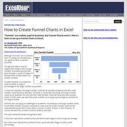
Although “funnels” are a common term in selling, the concept also can apply to other business activities. The general idea is that an organization begins with a large number of something and then goes through a series of stages to winnow that number down to a smaller number. Usually, the goal is to make the small number as large a percentage of the large number as possible. In sales for example, the large number could be all possible prospects and the small number could be those who buy. Funnels also can apply to challenges or problems.