
The globe of economic complexity. About close x The Globe of Economic Complexity The globe of economic complexity dynamically maps out the entire world production of goods to create an economic landscape of countries around the globe.

The original Atlas of Economic Complexity The Globe is built upon The Atlas of Economic Complexity, a powerful interactive tool that enables users to visualize a country’s total trade, track how these dynamics change over time and explore growth opportunities for more than a hundred countries worldwide. The Center for international development (CID) Associated Paper This project will be featured at the 2015 IEEE VIS conference in Chicago.
Data Used Technology This visualization was built with webGL, a new graphics library that enables to create new 3D worlds in the browser. Contact Aknowledgements We would like to thank Marcela Escobari, Ricardo Hausmann, Gus Wezerek, Tim Cheston and Greg Shapiro for their insight and support. Full Stack Web Developer. Web Development. Fibonacci Numbers and The Golden Section in Art, Architecture and Music. This section introduces you to some of the occurrences of the Fibonacci series and the Golden Ratio in architecture, art and music.
Contents of this page The icon means there is a Things to do investigation at the end of the section. 1·61803 39887 49894 84820 45868 34365 63811 77203 09179 80576 ..More.. The Golden section in architecture The Parthenon and Greek Architecture The ancient Greeks knew of a rectangle whose sides are in the golden proportion (1 : 1.618 which is the same as 0.618 : 1). Chrome Experiments - WebGL Globe. 7 Data Viz Sites to Inspire Your Creative Eye. In the age of data overload, "big data" and "data visualization" are major buzzwords, and they'll likely grow even bigger as we gather more information on a daily basis.
With data visualization on the rise, we rounded up seven sites to help you find useful ways of interpreting big data, as well as infographics that parse information into visually pleasing graphics. These sites range from aggregation blogs to how-tos to tools that allow you to create your own visualizations. Check out the list, and let us know in the comments below what your favorite site is for data visualizations.
The History of Television. WikiMindMap. Rcmap.hatnote. 50 Informative and Well-Designed Infographics. It’s impossible to comprehend complex data or analyze large amounts of information, if we only use words or texts.
Information graphics or better known as infographics are visual explanation of data, information or knowledge. These graphics are excellent visual tools for explaining huge amounts of information where complex data needs to be explained immediately and clearly. Let me show you how Rick Mans explain how infographics ease the process of communicating conceptual information Image credit. Infographic is one of the most challenging types of graphic design because the creation process alone is pretty intensive. We are truly delighted to show you these brilliant and informative infographics created by various talented individuals. Recommended Reading: More Infographic related posts. 50 Years of Space Exploration.
Disney vs Marvel. Grand Mosque. High Rise. Relief Wells & Subsea Containment.
Maestro Social Media. Social media (social networking) is content created by people using accessible and free Internet online resources.
Social media allows people to discover and share information, including text, pictures and video. It’s a relatively new and innovative way for people to connect and form relationships, both personal and business. Social media web sites include blogs, Facebook, Twitter, YouTube, Google+, Linked In, FourSquare, Pinterest, and many more. [list style="arrow"] (Eager to get started? [/list] [toggle title="Facebook"] …currently has more than 845 million users, making it the most well known and popular social media site. …is a free, online social media service that allows users to send short text messages (up to 140 characters long), to other users.
…is the popular and well-known video sharing social media site, on which users can view, upload and share videos, all for free. Is a business-related social media website. [divider top="1"]
Tools. Infographic Journal. Visualizing Data: 15 Examples (2010) + further research. The Internet map. The map of the Internet Like any other map, The Internet map is a scheme displaying objects’ relative position; but unlike real maps (e.g. the map of the Earth) or virtual maps (e.g. the map of Mordor), the objects shown on it are not aligned on a surface.
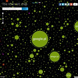
Mathematically speaking, The Internet map is a bi-dimensional presentation of links between websites on the Internet. Every site is a circle on the map, and its size is determined by website traffic, the larger the amount of traffic, the bigger the circle. Users’ switching between websites forms links, and the stronger the link, the closer the websites tend to arrange themselves to each other. Charges and springs To draw an analogy from classical physics, one may say that websites are electrically charged bodies, while links between them are springs.
Also, an analogy can be drawn from quantum physics. Cool Infographics - Blog. Infografica.