
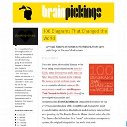
Behind the Glass: Video Clips. 100 Diagrams That Changed the World. Since the dawn of recorded history, we’ve been using visual depictions to map the Earth, order the heavens, make sense of time, dissect the human body, organize the natural world, perform music, and even concretize abstract concepts like consciousness and love. 100 Diagrams That Changed the World (public library) by investigative journalist and documentarian Scott Christianson chronicles the history of our evolving understanding of the world through humanity’s most groundbreaking sketches, illustrations, and drawings, ranging from cave paintings to The Rosetta Stone to Moses Harris’s color wheel to Tim Berners-Lee’s flowchart for a “mesh” information management system, the original blueprint for the world wide web.
It appears that no great diagram is solely authored by its creator. Most of those described here were the culmination of centuries of accumulated knowledge. Most arose from collaboration (and oftentimes in competition) with others. Christianson offers a definition: Learning Visually. Infographics work in the classroom because they grab students and allow an entry point to learning — and because they sum up pages and pages, even chapters, of information that would take a reader hours to process.
Interactive infographics make kids want to immediately start clicking around to see what’s what. For a teacher who prioritizes an inquiry-driven classroom, that’s a great starting point. Infographics and Data visualization are not just for consumption though, teachers and students can also challenge the learning process by creating original graphics for themselves. Go here –> Consuming the information is one portion of the equation when discussing data visualization. 15 New Extremely Creative Infographics. With the help of evolution and progress, people’s lives become easier day by day.
Today everything is simpler than it used to be in the past. Let’s take information for example. Information is displayed everywhere we go and to make it easier to read it, people have created special graphics that help us get is faster. The way information is displayed is very important; because this is how someone would interpret something you wanted to say. Information graphics. 10 Awesome Free Tools To Make Infographics. Advertisement Who can resist a colourful, thoughtful venn diagram anyway?

In terms of blogging success, infographics are far more likely to be shared than your average blog post. This means more eyeballs on your important information, more people rallying for your cause, more backlinks and more visits to your blog. In short, a quality infographic done well could be what your blog needs right now. Designing An Infographic. 10 Lame Documents that Would Be Better as Infographics. Infographics, it seems, have taken the media by storm.
Because they are visually attractive, eye-catching, accessible, fun, and–if done well–quickly and effectively informative, people are drawn to them. InfoGraphic Designs: Overview, Examples and Best Practices. The Anatomy Of An Infographic: 5 Steps To Create A Powerful Visual. Information is very powerful but for the most bit it is bland and unimaginative.

Infographics channel information in a visually pleasing, instantly understandable manner, making it not only powerful, but extremely beautiful. Once used predominantly to make maps more approachable, scientific charts less daunting and as key learning tools for children, inforgraphics have now permeated all aspects of the modern world. I designed a couple of infographics back in college, the need arising especially around the time Soccer World Cup fever spiked. It was a fun process representing the different groups, predicting winners in each group at each stage and creating a mock pairing of teams that would clash all the way leading upto the finals.
I was a devout Argentinian supporter at the time. Infographics can appear daunting to some with the sheer amount of data they present, but designed in the right manner and step by step, they can actually be one of the most fun things you will ever create. 1. 2. 10 Steps To Designing An Amazing Infographic.
Information can be useful—and even beautiful—but only when it’s presented well.
In an age of information overload, any guidance through the clutter comes as a welcome relief. That’s one reason for the recent popularity of information graphics. Infographics are visual designs that help to explain complicated data in a simple way (mental-health emergencies at Burning Man, anyone?). The Ultimate Guide To Infographics.
Cool Infographics - Blog. » ChartGeek.com. 40 Useful and Creative Infographics. Six Revisions Menu Main Categories CSS HTML JavaScript Web Design WordPress Web Development Design Inspiration UX Design UI Design Freebies Tutorials Tools Links About Contact Advertise RSS Twitter Facebook 40 Useful and Creative Infographics.
The Do's And Don'ts Of Infographic Design - Smashing Magazine. Advertisement Editor’s Note: You might want to read Nathan Yau’s article The Do’s And Don’ts Of Infographic Design: Revisited1 here on Smashing Magazine which is a response to this article.
Since the dawn of the Internet, the demand for good design has continued to skyrocket. From Web 1.0 to Web 2.0 and beyond, designers have remained on their toes as they define the trends and expectations of our online universe. Infographic: How to Use Colors in Graphic and Web Designing. The Art of Complex Problem Solving. An HTML5 Interactive Infographic featuring Dribbble.