
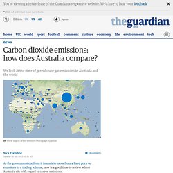
Climate Explorer: Starting point. World Climate: Weather rainfall and temperature data. Global Warming Art. Interactive - How hot will it get in my lifetime? CO2CRC - Leaders in research into Carbon Capture and Storage. Global Carbon Footprint. Australian Carbon Dioxide Emissions. As the government confirms it intends to move from a fixed price on emissions to a trading scheme, now is a good time to review where Australia sits with regard to carbon emissions.
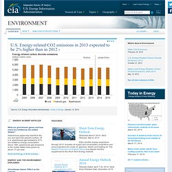
The most recent data on Australia's carbon emissions comes from the latest quarterly update of Australia's National Greenhouse Gas Inventory, released in April this year. The report shows a small, 0.4% increase in the emissions "trend" figure for December 2012 over the previous quarter. The trend line smooths out "background noise" in emissions measurements from seasonal and weather changes. Click here for the graph on mobile. The report puts the cause of this increase down to a rise in "fugitive emissions", which are gases produced during the production of fossil fuels, such as coal mining, and emissions from "stationary energy excluding electricity", which results from burning fuel during manufacturing and mining processes.
Google Public Data Explorer. Australian Emissions by State. Climate Change in Australia. Australia Climateimpacts.jpg. NT ClimateImpacts.jpg. BoM - Latest Climate Trends. The spring of 2013 has been Australia’s warmest on record.
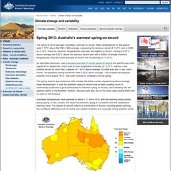
Mean temperatures for the season were 1.57°C above the 1961–1990 average, surpassing the previous record of 1.43°C (set in 2006) by 0.14°C. Daytime maximum temperatures were also the highest on record, coming in 2.07°C above average and 0.24°C above the previous record (also set in 2006). Overnight minimum temperatures were the fourth-warmest on record with an anomaly of +1.07°C. As described previously (see Australia’s warmest 12-month period on record) the warmth was most significant in September, which saw a mean temperature anomaly of +2.75°C, setting a new monthly record by more than a degree.
At 1.43°C above average, October was also a very warm month. ABC - Climate Change. CSIRO - Cape Grim CO2 Data. Cape Grim Baseline Air Pollution Station Cape Grim, on Tasmania’s west coast, is one of the three premier Baseline Air Pollution Stations in the World Meteorological Organization-Global Atmosphere Watch (WMO-GAW) network.
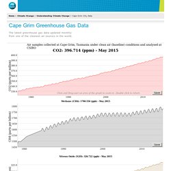
Baseline stations are defined by the WMO to meet a specific set of criteria for measuring greenhouse and ozone depleting gases and aerosols in clean air environments. These baseline stations are crucial points of reference for the larger global network of atmospheric gas observing stations. The Cape Grim Baseline Air Pollution Station monitors Southern Hemispheric air. In the Northern Hemisphere, the Mauna Loa Observatory in Hawaii has been continuously monitoring and collecting data related to atmospheric change since the 1950s. The Cape Grim station is positioned just south of the isolated north-west tip (Woolnorth Point) of Tasmania. History What is measured? Since sampling began at Cape Grim, more that 3 billion measurements have been taken. EIA. Energy In Brief Articles What are greenhouse gases and how much are emitted by the United States?
Mauna Loa CO2 Data. Contents Recent Monthly Average Mauna Loa CO2 March 2015: 401.52 ppm March 2014: 399.58 ppm Last updated: April 6, 2015 PNG Version PDF Version The graph shows recent monthly mean carbon dioxide measured at Mauna Loa Observatory, Hawaii.

NASA 2011 Ninth Warmest Year on Record. NASA Finds 2011 Ninth Warmest Year on Record Jan. 19, 2012 The global average surface temperature in 2011 was the ninth warmest since 1880, according to NASA scientists.

The finding continues a trend in which nine of the 10 warmest years in the modern meteorological record have occurred since the year 2000. NASA's Goddard Institute for Space Studies (GISS) in New York, which monitors global surface temperatures on an ongoing basis, released an updated analysis that shows temperatures around the globe in 2011 compared to the average global temperature from the mid-20th century. The comparison shows how Earth continues to experience warmer temperatures than several decades ago. Global temperatures have warmed significantly since 1880, the beginning of what scientists call the "modern record. " "We know the planet is absorbing more energy than it is emitting," said GISS director James E.
CO2 Scorecard. WorldBank emissions data. Australia. OECD Stats. Vital Climate Change Graphics. Temperature trends and projections The global average surface temperature has increased over the 20th century by about 0.6 degrees Celsius.

This increase in temperature is likely to have been the largest for any century in the last 1000 years. Evidence from tree ring records, used to reconstruct temperatures over this period, suggests that the 1990s was the warmest period in a millennium. It is very likely that nearly all land areas will warm more rapidly than the global average, ... 17 May 2005 - by Philippe Rekacewicz, UNEP/GRID-Arendal CO2 emissions from industrial processes and land use changes Shows the different levels of CO2 emissions from industrial processes and land use changes from different regions. 17 May 2005 - by UNEP/GRID-Arendal Modeled temperature compared to observed temperature for the last 150 years As we can see from models of temperature changes caused by natural forcing, we should have observed a decrease in the global average temperature lately, but we have not.
Information Is Beautiful. How Many Gigatons of CO2? Climate Arguments Flowchart.