
Interactive Guide to Blog Typography. The majority of websites are composed of a bright, usually white background and dark text. Then there's the small minority of the web: dark websites, colorful websites. Why is the bright background used by the majority of websites? Utilitarian Motivation The common use for small caps is for abbreviations longer than 2 letters, such as CSS, HTML and WYSIWYG excluding AM, PM, BC and similar. Research shows that consumers with a utilitarian motivation find a low-arousal environment more pleasurable than a high arousal one. Hedonistic Motivation Hedonism is defined as the pursue of pleasure, especially the pleasure of our senses. Example outside the web: nightclubs. The Typography of Sanborn New York City Maps. NEW YORK Staten Island.
Atlas 159, 1885 BROOKLYN New York. Atlas 80. Vol. 6, 1888 Variations of this design appeared between 1886 and 1988. NEW YORK Brooklyn Suburbs. Fonts, typefaces and all things typographical — I love Typography (ILT) WhatTheFont! Home. LetterMpress: A Virtual Letterpress on Your iPad by John Bonadies.
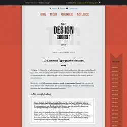
Experience the Art and Craft of Letterpress Printing on your iPad LetterMpress™ will be a virtual letterpress environment—released first on the iPad—that will allow anyone to create authentic-looking letterpress designs and prints.
The design process is the same as the letterpress process—you place and arrange type and cuts on a press bed, lock the type, ink the type, and print. You will be able to create unlimited designs, with multiple colors, using authentic vintage wood type and art cuts. And you can print your design directly from LetterMpress or save it as an image for import it into other applications. So why bother re-creating what’s considered to be an obsolete process for the new technology of the iPad? Actually, a letterpress and an iPad operate similarly when it comes to manipulating objects in a composition. A growing interest in letterpress—but difficult to access In fact, letterpress has had a growing interest over the past decade amongst designers, artists, and printmakers. 10 Common Typography Mistakes. The goal of this post is to help designers and clients understand the importance of good type skills, while avoiding some of the common mistakes.
Please keep in mind that most of these mistakes are subjective and can be changed varying on the project, goals or circumstances. Below is a list of 10 common mistakes used in type design/layout that can make a large impact in the effectiveness and appearance of your designs, in addition to saving you time and money when dealing with printers. 1. Not enough leading Leading/linespacing can improve the overall readability of large blocks of text on a page, making it easier on readers to follow lines of text without losing their place. 2. Tracking/letterspacing is applied to a group of letters. 3. 15 sites to find free fonts. Every great designer knows that the wrong font can totally change the direction of a project.
It’s why we use Helvetica instead of Comic Sans and why we should stop using fonts like Lobster (yea…I said it!). Designers just have to know fonts. Choosing the right font is a task. If you choose something too round, you risk making it look too youthful. Or if you choose something too bold, you may end up taking out the cheer in a design. There are tons of font sites out there that offer us free fonts for our designs. ОСТРОМИРОВО ЕВАНГЕЛИЕ. Shape Type, the letter shaping game.
Typography tutorials: 50 clever ways of working with type. The web is brimming with typography tutorials, but many are low quality and others are very out of date.
So we’ve trawled the internet to uncover the diamonds in the rough, in the form of 50 top-quality typography tutorials, to bring your knowledge and skills up to speed. Get Creative Cloud Perhaps you’re looking for a good introduction to the fundamentals of typography? Or perhaps you want to develop and push your type abilities further? Either way, you’re sure to find just what you’re looking for on this list, which includes typography lessons in the form of traditional text-and-image tutorials, animations and video, and even games. We’ll be adding to this list as time moves on, so make sure you bookmark this fantastic resource, and come back from time to time to see what’s new in the world of typography tutorials.
653 free typography resources. From free learning resources to free fonts, free apps and beyond.
We all love free stuff, and the internet is full of it. But the time taken to sift through all the low-quality free tutorials, fonts and other resources can often be a false economy. To help you out, we consistently trawl the web and find the diamonds in the rough. Then we collect them together in articles that let you find what you're looking for quickly and easily. In this mega-post, we bring together all the best freebies for typography - all 653 of them!
Type Foundry Index. Best Free Fonts of 2011. With only a month and a half left in 2011, it’s hard to believe another year is drawing to a close.
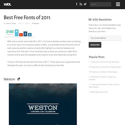
If you’re a long time reader of WDL, you probably know that at the end of each year we publish a series of posts that highlight our favorite freebies and resources from that year. It’s an excellent way to show you what you might have missed, and to give the designers and creators some well deserved recognition. To kick it off, here are the best free fonts of 2011. There were tons of great free fonts released this year, so it was a difficult task choosing our favorites. Weston Infinity Ostrich Sans Fabrica Wisdom Script Pacifico RBNo2 Five Minutes Hyperbola Dock 11 About the Author Henry Jones is a web developer, designer, and entrepreneur with over 14 years of experience.