
New Poster Makes Understanding Type As Easy As Learning The ABCs. Many of us learned our ABCs in elementary school from big alphabet posters tacked up by our kindergarten teachers on the walls.
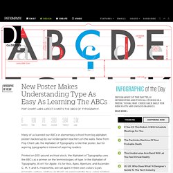
New from Pop Chart Lab, the Alphabet of Typography is like that poster, but for aspiring typographers instead of aspiring readers. Printed on 100-pound archival stock, the Alphabet of Typography uses the ABCs as a primer on the terminologies of type. In the Alphabet of Typography, A isn't for Apple; it's for Axis, Apex, Aperture, and Ascender. C, M, Y, and K, meanwhile, are set apart in their own colors (cyan, magenta, yellow, and key or black), to represent the four-color printing process. Although the design seems simple at first glance, there's actually a lot to discover here. It's a great poster for type-loving adults, but it'd also be a great thing to hang in your kid's room if you'd like him or her to grow up just as literate about the way letters are designed and printed as they are about the letters themselves.
10 Infographics That Will Teach You About Typography. Typography is a crucial component of great designs involving text, so knowing as much as you can about it is an important step to becoming a great designer.
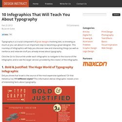
This roundup of infographics will help you discover new and interesting things (as well as reinforce and reiterate stuff you already know) about typography. Click the Go to Source link under each infographic to navigate to the source of the infographic and to see the larger version provided by the creator of the infographic. 1. Bold & Justified: The Huge World of Typography Infographic Did you know that Israel is the source of the most expensive typefaces? Go to Source 2. This beginner’s guide to type shows you some popular font categories (like monospaced fonts and script fonts), the anotomy of a typeface, a few typography principles, and more. Combining Fonts. A palette with wit Use typefaces with complementary moods to evoke an upbeat, energetic air.
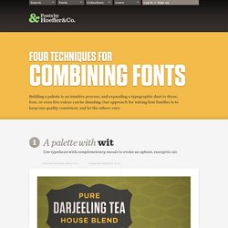
It’s the interplay between fonts that gives them energy. The more distant the moods in a typographic palette, the friskier the design will be. Here, three fonts with distinctive silhouettes have been chosen for their contrasting dispositions: the unabashed toughness of Tungsten is a foil for both Archer’s sweetness, and the cheekiness of Gotham Rounded. Tungsten Gotham Rounded Archer A palette with energy Mix typefaces from the same historical period whose families have different features. Three type families with nineteenth century roots, thrown together in a cheerful typographic riot.
. Proteus Project. Default Fonts. Operating system defaults ↩ What fonts can you assume Windows users will have?
Mac users? And how about (gulp!) Linux & other UNIX users? Oh, & don't forget mobile users: iOS (iPhone, iPad, iPod Touch), Android, & Windows Phone 7! One answer can be found at Code Style Font Sampler, which asks visitors to fill out a survey asking them about the fonts they have on their computers. Visit the site,agree to take the survey, &are able to correctly determine the fonts on their computers Still, it provides some useful results. Various resources also exist that give web developers some hard numbers & lists they can use when determining the fonts available on various operating systems. Windows ↩ The number of fonts Microsoft includes with its OS has been steadily increasing: Windows XP: 133Windows Vista: 191Windows 7: 235 For more info, you can look at various webpages: Mac OS X ↩ You can find out information about the fonts that come with Mac OS X from various websites: UNIX & Linux ↩ iOS ↩
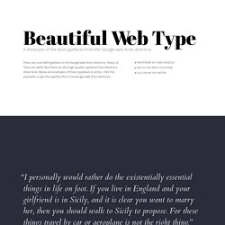
Typography That Works: Typographic Composition and Fonts. Thinking with Type. Kern Type, the kerning game. Fonts. Beautiful web type — the best typefaces from the Google web fonts directory. Lucius Annaeus Seneca60 AD Among the numerous faults of those who pass their lives recklessly and without due reflexion, my good friend Liberalis, I should say that there is hardly any one so hurtful to society as this, that we neither know how to bestow or how to receive a benefit.
It follows from this that benefits are badly invested, and become bad debts: in these cases it is too late to complain of their not being returned, for they were thrown away when we bestowed them. Nor need we wonder that while the greatest vices are common, none is more common than ingratitude: for this I see is brought about by various causes. The first of these is, that we do not choose worthy persons upon whom to bestow our bounty, but although when we are about to lend money we first make a careful enquiry into the means and habits of life of our debtor, and avoid sowing seed in a worn-out or unfruitful soil, yet without any discrimination we scatter our benefits at random rather than bestow them.