
Offenbach Hospital Signage System. How do you choose the right font? Legibility, accessibility, flexibility, are among the many factors you need to take into account when picking a font for a new project.
But how do you start? Here, seven designers share their advice.. Keep a list "I keep a running list of fonts I'd like to use some day, and when a new project comes up, I revisit it to see if there's a good fit," says senior designer Mindy Wagner. "Lately I've been loving Adobe's Typekit integration.
Content is king "The first thing I do is ask myself: what kind of content do I have the most of? " "Generally, I'm always after something that is well made (by a skilled type designer and either created for the web or adapted well for the web) and stylish. Keep things simple Accessibility director Alastair Campbell comments: "In terms of accessibility, there is some general advice that certain typefaces – like Verdana and Tahoma – are designed to be readable. "However, it is what you do with it that counts. Finding versatility. The 100 best free fonts.
In this freshly updated free fonts for designers post, we bring you the world's best free fonts.
We've filtered out the diamonds from the thousands of less perfectly designed free fonts available online, for you to use in your designs and illustrations. Get Adobe Creative Cloud now This list represents the 55 best free fonts we've found in eight categories. You can use the drop-down menu at the top of the page, or the boxout, right, to jump to the section you want. Font book. 5 top typography tips for your home page. We all know a bad home page when we see it.
But, if we all tried to express what makes for "a good home page," it would lead to a litany of design preferences – most often personal ones – versus an in-stone evergreen guide. Download the best free cursive fonts There's one element of a home page, however, that holds some consistent truths from site to site that most of us can agree on. Typography. This post will provide some great tips to nailing down the key essentials to the most effective typography for your home page. 01. It's a bit pointless for marketers and analysts to spend any amount of time developing a brand voice for their company if the site experience doesn't echo that voice.
Typography is a great way to give your brand an added layer of personality. Acclaimed marketing marvel Ann Handley likes brands to ask themselves, "If you covered your logo, would you recognize yourself from your content alone? " 02. Sequi - FREE Typeface on Behance. Font of the day: Home Brush. Font of the day: Kelso. Here at Creative Bloq, we're big fans of typography and we're constantly on the hunt for new and exciting typefaces – especially free fonts.
The 12 Best Fonts For Design: Inspired by Massimo Vignelli - Creativity 101. Celebrated Italian designer Massimo Vignelli controversially claimed “we use too many typefaces“.
Depending on where you stand on typography/design will depend on whether you agree with the statement or not, I personally whole-heartedly agree with Vignelli and call for a greater degree of discipline in the usage of fonts. You can read an opposing article about this statement and listen to an interview with Vignelli here. FreeTypography - The best free fonts, typefaces and typography. Gridlover. Colophon. Okay Type. Trivia Sans™ - Webfont & Desktop font. Actualidad y compra en lÃnea de productos culturales y técnicos. Download Type Sign Symbol by Adrian Frutiger (Art Design Ebook).pdf Torrent - KickassTorrents. Type, Sign, Symbol By Adrian Frutiger 1980 | 149 Pages | ISBN: 3855040605 | scanned PDF | 56.8 MB Text in English, French, and German.
Contents: Why new typefaces? The nature of sanserif and the significance of Univers (E. Ruder) Why Univers was designed and how it developed New possibilities for designers Typefaces and printing techniques: Meridien Constructivism in type design: on Serifa (E. The Best Typefaces of 2014. Sean Mitchell is an interactive designer based in Vancouver, British Columbia, and the editor of TypeRelease.
We’ve counted down our favorite fonts every month this year, and now it’s time to look back at what 2014 brought us in beautiful typography… in no particular order, of course. Lián Types: Selfie Selfie is a connected sans based on vintage signage scripts. Font Bureau: Input Input is a flexible system of fonts designed specifically for code. Latinotype: Texta Texta is a contemporary, rational, transparent and useful sans to compose all kind of texts.
Typotheque: Woodkit Woodkit is a playful fixed-width display series of typefaces inspired by wood type. Características de la Familia Tipográfica de Palo seco. La familia tipográfica de Palo seco, también llamada san serif, es la antítesis de la tipografía romana, pues presenta un estilo aparentemente limpio, funcional y aséptico.
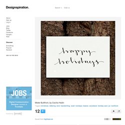
Dicho de otro modo es la tipografía por excelencia de la lectura, si bien es cierto y está demostrado que un corte a media altura dificulta mucho su lectura ya que no permite discernir bien los caracteres. Mister Bullfinch, by Cecilia Hedin. Tagged christmas, lettering, bird, handwriting, scarf, holidays, beanie, woodland, holiday card, jul, bullfinch.
Designopendata.files.wordpress.com/2014/05/thinkingwithtype_ellenlupton.pdf. Princeton Architectural Press. A List Apart: For People Who Make Websites. Caslon Font Combinations + Similar Fonts → Typewolf. Caslon is an old-style serif originally designed by William Caslon in 1722.
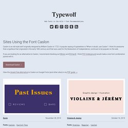
A popular saying of typesetters is “When in doubt, use Caslon”. I think it’s awesome that a typeface that originated in the early 18th century and that was used for the Declaration of Independence, continues to be popular on the web. If you are looking for an alternative to Caslon, I recommend checking out Minion and Ehrhardt. I think P22 Underground would make a nice font combination paired with it. Download Caslon → View the closest free alternative to Caslon on Google Fonts (and other sites) in my PDF guide → Typewolf → Typography Inspiration for the Modern Web.
Medium. Printed Smashing Books For Web Designers and Developers. We care about quality content and work hard to support and spread best practices, innovative techniques and forward-thinking ideas. Our printed Smashing Books are crafted to deliver in-depth knowledge and expertise shared by experts and practitioners from the industry. They are our editorial flagships—and they look damn good on a coffee table! Hardboiled Web Design: Fifth Anniversary Edition With new techniques being developed without a halt, there’s less time to keep up with them. “Hardboiled Web Design” brings them together, to help you craft better and smarter front-end. Beautiful_Books.pdf.