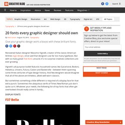

Habit releasers?? - katekisscoaching. MyFonts: Fonts for Print, Products & Screens. 100 best Typefaces of all times. 20 fonts every graphic designer should own. Renowned Italian designer Massimo Vignelli, creator of the classic American Airlines logo design, once said that designers use far too many typefaces.

But with so many great free fonts around, it's no surprise creatives collections are ever-growing. Vignelli's all-purpose toolkit features household names like Garamond, Bodoni, Helvetica, Univers, Futura, Caslon and Baskerville – between them spanning some three centuries of type design history. And few designers would disagree that all of the above are timeless, albeit well-worn classics. But sometimes something a little different is required of a display face for that extra punch. Sometimes the ubiquitous serifs of Times New Roman just don't quite cut it.
F37 Bella Based on letterforms of American typographers John Pistilli and Herb Lubalin, and Swiss typographer Jan Tschichold, F37 Bella is an award-winning display font by Rick Banks. Eames Black Stencil Otto Otto is a stunning font from talented design duo Non-Format. Poster Bodoni Bembo. 25 Classic Fonts That Will Last a Whole Design Career. Eric Gill, Adrian Frutiger and Max Miedinger are names we associate with the classic typefaces designers use on a daily basis.

Their font creations are timeless designs that look right at home no matter what century we’re in. This collection of 25 classic fonts is a round up of the best and most popular fonts every designer should own. You can be sure that they will last your whole design career. Who hasn’t heard of Helvetica? It’s probably the most recognised classic typeface.
Bodoni is a serif typeface designed by Giambattista Bodoni in 1798. Clarendon is a fantastically fat slab serif, created by Robert Besley in 1845. Akzidenz Grotesk was designed in 1896 by the H. Avenir is a geometric sans-serif typeface designed by Adrian Frutiger (recall the name? FF Din is a relatively new typeface compared to the veterans mentioned so far with it being created in 1995 by Albert-Jan Pool. Futura is another widely used font that can be seen in countless logos. Remember Adrian Frutiger? 25 Classic Fonts That Will Last a Whole Design Career. 5 Graphic Design Heavyweights Pick Their Favorite Font. Article by Adam Welch This article originally appeared on MR PORTER.

Mr. Eddie Opara: Partner, Pentagram To work at Pentagram, the influential company that has, over four decades of industry-leading work, rebranded Faber & Faber, Sotheby’s and The Guardian to name a few, is a dream for a great many young creatives. But it was never a particular goal for London-born designer Mr. Mr. What inspired you to work in design? When I was a teenager I designed a logo for one of my mum’s women’s associations—she was my first client.
When did you first encounter the Albertus typeface? On the street signs in the City of London. Mr. As associate art director at New York-based publishing imprint Knopf, Mr. Mr Kidd’s nominated font is Blender, as seen (in pale yellow) on his design for Neil Gaiman’s Make Good Art How do you know when you’ve really nailed it with a cover? When it looks like a book I’d like to read, even if I don't know anything about it. What do you like about Blender? Four Random Files - Experimental Jetset. The Top 3 Favorite Typefaces of Influential Designers → Typewolf. Gotham is popular for a reason.

Its ability to be the most neutral typeface in my arsenal keeps me coming back to it time and time again. It’s able to get a message across without saying anything other providing a bit of sturdy simplicity. I truly believe that Gotham has managed to be more neutral and pedestrian than Helvetica, which, in the type world, is a truly remarkable feat.
DIN-Medium has just enough modern angles to keep it clean and current, but can also work as a very vintage, standard typeface. I can use it for clean collateral, but also arched over top of a vintage stamp style piece.