
Simple Map D3. All you need is a dataset.
Installing with Bower is easy: bower install simple-map-d3 Include dependencies (Topojson if you are using that format). Include library: Make a container: Make a map: Population of Minnesota by County Minnesota census data per county, colored by population. Europe Population Density Map A simple map of European countries and their population density using a different projection, a slight rotation, custom color set, ability to pan, and a custom tooltip output. Basic US Map. Dimple - A simple charting API for d3 data visualisations. Retour d’experience : AngularJS + D3.js au service de la DataViz.
Contexte et enjeux du projet Pour le compte d’un grand groupe industriel français cherchant à faire de la veille et de l’innovation sur des sujets de pointe, j’ai été amené à réaliser une application permettant de représenter graphiquement des informations structurées issues d’analyses sémantiques.

Ces données étaient rangées par catégories, et parfois liées les unes aux autres. Pour faciliter la navigation dans les données, il fallait permettre de réordonner, filtrer, zoomer et consulter facilement toutes ces informations. Il était acquis que l’application serait développée sur des technos web, notre client ayant été sensibilisé aux nouvelles technos HTML5 et CSS3. Aperçu du résultat Parce qu’une DataViz sans « viz » n’est pas une DataViz, voici enfin un aperçu de l’application (où les données ont été anonymisées) et des différents graphes dans lesquels on peut naviguer en filtrant, triant ou recherchant des informations, tout en ayant des graphes mis à jour en temps réel.
AngularJS. Choropleth. Biovisualize.github.io/d3visualization/ Castle Black->deserted wildling village (0) 3.0 · mbostock/d3 Wiki. How to Make an Interactive Network Visualization. Networks!
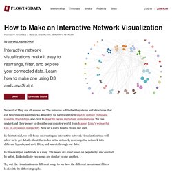
They are all around us. The universe is filled with systems and structures that can be organized as networks. Recently, we have seen them used to convict criminals, visualize friendships, and even to describe cereal ingredient combinations. We can understand their power to describe our complex world from Manuel Lima's wonderful talk on organized complexity. Now let's learn how to create our own. In this tutorial, we will focus on creating an interactive network visualization that will allow us to get details about the nodes in the network, rearrange the network into different layouts, and sort, filter, and search through our data. In this example, each node is a song.
Try out the visualization on different songs to see how the different layouts and filters look with the different graphs. Technology This visualization is a JavaScript based web application written using the powerful D3 visualization library. jQuery is also used for some DOM element manipulation. Functions. Vis. Jim Vallandingham. Update: I moved the code to its own github repo - to make it easier to consume and maintain.
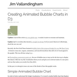
Update #2 I’ve rewritten this tutorial in straight JavaScript. So if you aren’t that in to CoffeeScript, check the new one out! Recently, the New York Times featured a bubble chart of the proposed budget for 2013 by Shan Carter . It features some nice, organic, animations, and smooth transitions that add a lot of visual appeal to the graphic. This was all done using D3.js . As FlowingData commenters point out , the use of bubbles may or may not be the best way to display this dataset. In this post, we attempt to tease out some of the details of how this graphic works. #Simple Animated Bubble Chart In order to better understand the budget visualization, I’ve created a similar bubble chart that displays information about what education-based donations the Gates Foundation has made. You can see the full visualization here And the visualization code is on github #D3’s Force Layout #nodes #gravity #friction. First steps in data visualisation using d3.js.
Programmation Python/Programmer en deux minutes/un serveur Web. API Reference · mbostock/d3 Wiki. D3 Tutorial: Axes. Last updated 2012 December 30 Having mastered the use of D3 scales, we now have this scatterplot: Let’s add horizontal and vertical axes, so we can do away with the horrible red numbers cluttering up our chart.
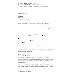
Introducing Axes Much like the scale functions, D3’s axes are actually functions whose parameters you define. Unlike scales, when an axis function is called, it doesn’t return a value, but generates the visual elements of the axis, including lines, labels, and ticks. Note that the axis functions are SVG-specific, as they generate SVG elements. Setting up an Axis.
Node-Link Tree. The tree layout implements the Reingold-Tilford algorithm for efficient, tidy arrangement of layered nodes. The depth of nodes is computed by distance from the root, leading to a ragged appearance. Cartesian orientations are also supported. Implementation based on work by Jeff Heer and Jason Davies using Buchheim et al. ’s linear-time variant of the Reingold-Tilford algorithm. Data shows the Flare class hierarchy, also courtesy Jeff Heer. Source Code. d3-js. Bl.ocks.org - 950642 - Force-Directed Layout (with labels) Home · mbostock/d3 Wiki.