
Find the graphic you need.
Marvel Cinematic Universe. Lisa Charlotte Rost sur Twitter : "Two years ago, I published a blog post in which I explained the most important color tools for data vizzers. Many people told me they found it helpful. So this week I took the time to update & improve it. Visualisations. Collection of data visualizations to get inspired and finding the right type.
Mapshaper. La datavisualisation pour les nuls (Thomas Fournaise) Concours de Cartographie. Dataviz.tools. Across U.S. Companies, Tax Rates Vary Greatly - Interactive Feature. Cartographie des métiers du digital en 2016. Comme l’an dernier, l’IAB a présenté son étude sur les “métiers et compétences du marketing et de la communication dans un contexte de transition digitale” lors de l’événement Experiences de Microsoft. Les spécificités du marketing digital L’IAB indique que les spécificités du marketing digital identifiées en 2015 s’affinent : Technicité : technologies variées, renouvellement des outils de travail…Temporalité courte : ancrage dans le présent, temps réel, pas de best practices pérennes, optimisation permanente, cycles de travail courts…Précision / Ciblage : multiplicité des canaux et touchpoints, variété de publics, personnalisation des stratégies, outils techniques…
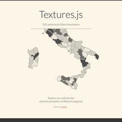
Textures.js. Textures are useful for theselective perception of different categories View on Github Getting started -- from the top of d3.js --
Wwsd/README.md at master · enjalot/wwsd. Comptes des ménages - Revenu disponible des ménages. Le revenu net réel disponible des ménages est défini comme la somme de leurs dépenses de consommation finale et de leur épargne, diminuée de la variation de leurs droits nets sur les fonds de pension.

Cet indicateur correspond également à la somme des salaires et traitements, du revenu mixte, des revenus nets de la propriété, des transferts courants nets et des prestations sociales autres que les transferts sociaux en nature, moins les impôts sur le revenu et le patrimoine et les cotisations de sécurité sociale payées par les salariés, les travailleurs indépendants et les chômeurs. Livre Blanc SAS - EBG 30 cas concrets de Datavisualisation / Dataviz. Battling Infectious Diseases in the 20th Century: The Impact of Vaccines.
ElasticSearch / Kibana / LogStash. Sample Diagrams for JavaScript and HTML, by Northwoods Software. Plateforme de visualisation de données ouvertes. Across U.S. Companies, Tax Rates Vary Greatly - Interactive Feature. Data Visualization 101: Pie Charts. In our Data Visualization 101 series, we cover each chart type to help you sharpen your data visualization skills.

Pie charts are one of the oldest and most popular ways to visualize data. This classic chart is the perfect example of the power of data visualization: a simple, easy-to-understand presentation that helps readers instantly identify the parts of a whole. Without further ado, here’s everything you need to know about the pie chart. What It Is The typical pie chart is divided into sections that illustrate a numerical proportion. Where It Came From Scottish engineer William Playfair is generally credited with creating the world’s first pie charts back in 1801. Playfair’s pie chart showed the proportion of land held by the Turkish Empire in Asia, Europe and Africa.
Although he invented the form, Playfair never called his invention a “pie chart.” Another series of Playfair’s pie charts in “Chart Representing the Extent, Population & Revenue of the Principal Nations in Europe in 1804.” Gapminder World. Bilevel Partition. D3plus Examples. Data Visualization Libraries Based on D3.JS - Mike McDearmon. There are a lot of ways to visualize data on the Web (with more emerging every day), but the flexibility, versatility, and energized development community surrounding D3.js makes it a great option to explore.
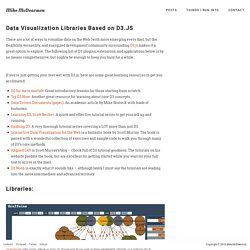
The following list of D3 plugins, extensions, and applications below is by no means comprehensive, but oughta be enough to keep you busy for a while.
D3js. Calendar View. Traduction des tutoriels de Scott Murray sur D3.js. Tutorials · mbostock/d3 Wiki. Wiki ▸ Tutorials Please feel free to add links to your work!!
Tutorials may not be up-to-date with the latest version 4.0 of D3; consider reading them alongside the latest release notes, the 4.0 summary, and the 4.0 changes. Introductions & Core Concepts Specific Techniques D3 v4 Blogs Books Courses D3.js in Motion (Video Course)Curran Kelleher, Manning Publications, September 2017D3 4.x: Mastering Data Visualization Nick Zhu & Matt Dionis, Packt. Creating Animated Bubble Charts in D3 - Jim Vallandingham. Update: I moved the code to its own github repo - to make it easier to consume and maintain.
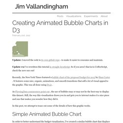
Update #2 I’ve rewritten this tutorial in straight JavaScript. So if you aren’t that in to CoffeeScript, check the new one out! Recently, the New York Times featured a bubble chart of the proposed budget for 2013 by Shan Carter . It features some nice, organic, animations, and smooth transitions that add a lot of visual appeal to the graphic. This was all done using D3.js . As FlowingData commenters point out , the use of bubbles may or may not be the best way to display this dataset. In this post, we attempt to tease out some of the details of how this graphic works. Explore Visualizations. L'évolution du Web. Color — Method of Action. RAW. NVD3. D3.js - Data-Driven Documents. Samples of Diagramming for HTML5/Canvas by Northwoods Software®