D3 in Depth. SankeyMATIC (BETA): A Sankey diagram builder for everyone. Cubism.js. Time Series Visualization foo7.6 bar−6.2 foo + bar1.4 foo - bar14 Cubism.js is a D3 plugin for visualizing time series.
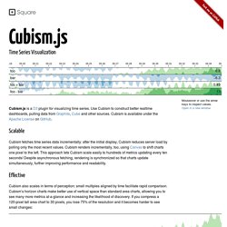
Scalable Cubism fetches time series data incrementally: after the initial display, Cubism reduces server load by polling only the most recent values. Effective Cubism also scales in terms of perception: small multiples aligned by time facilitate rapid comparison. The Pretty Graph Blog » Data visualisation libraries built on top of d3.js. D3.js - Data-Driven Documents.
Multiple Area Charts with D3.js. In this tutorial we will introduce some basics of D3.js and create an infographic with multiple area charts along with a context tool to zoom and pan the data.
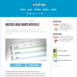
View demo Download source The D3.js website describes itself as “a JavaScript library for manipulating documents based on data.” It is but one of many in the ever growing list of visual data JavaScript libraries. D3 was created by Mike Bostock who was the lead developer on Protovis, which D3.js builds on. The reason I focus on D3 is because it is one of the most robust frameworks available, while also remaining flexible and web standard agnostic. So what kind of visualizations can you create with D3? Since area charts are pretty common, it’s a great place to start. The .CSV I downloaded from Gapminder contains electricity consumption per capita from 1960. With this data we will create 5 area charts. First thing we need to do is to set up an HTML page. Next we will want to add an SVG tag to the page.
D3.js. Gallery · mbostock/d3 Wiki. Wiki ▸ Gallery Welcome to the D3 gallery!
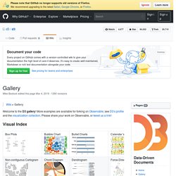
More examples are available for forking on Observable; see D3’s profile and the visualization collection. Please share your work on Observable, or tweet us a link! Visual Index Basic Charts Techniques, Interaction & Animation Maps Statistics Examples Collections The New York Times visualizations Jerome Cukier. D3 Tutorials. <div id="js_warning"><strong>JavaScript is turned off, so this page won’t be very interactive.
</strong> Switch JavaScript back on in your web browser for the full experience. </div> These tutorials have been expanded into a book, Interactive Data Visualization for the Web, published by O’Reilly in March 2013. Purchase the ebook and print editions from O’Reilly. Colony. Colony is a neat little visualisation tool for exploring Node projects and their dependencies using d3.js.
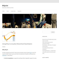
Each file is represented as a node in the graph. If one file depends on another, a link is made between the two files. Each file is coloured based on the module they belong to. By hovering over a node, you can see the file's name, the files it depends on (light), and the files that depend on it (dark). This demo is a visualisation of colony's own code and dependencies, but you can use the command-line tool to apply it to almost any NPM module or CommonJS project. Using D3.js to visualise Hierarchical Classification. Why D3.js?
I’ve been playing around with a fairly new visualisation library called D3.js for the last couple of weeks. Given my last post about how awesome the python plotting library matplotlib is, why bother? D3 is for visualisation, as opposed to plotting. Where matplotlib is great for easily generating publication quality plots (by calls like pylab.hist(data) to make a histogram), D3 is more general. The basic concept is that you create a collection of objects (usually shapes in an svg), and bind data to them. What are we trying to visualise? My current PhD research is in the area of classifying content of underwater images. My first paper was on how to make a system that detects whether a point in an image was kelp (a species of algae), or something else. One way to deal with this set of hierarchical classes (or taxonomy) is to create a network of binary classifiers.
How to interpret the visualisation. Visualizing Data with AngularJS. The D3 bits but new donut charts will all have the same data... demo demo demo (aka, small multiples)